Watch Me Build A Premium Clothing Brand Identity In 40 Minutes With Gemini
By Andrew Lane
Founder of Design Hacker
Watch the full tutorial here 👇
Want your clothing brand to look premium fast?
Here’s the AI workflow I use to go from idea to mood board to real ecommerce mockups in one afternoon.
⚡️ For better results, get my full library of Mood Board Prompts.
The Big Idea:
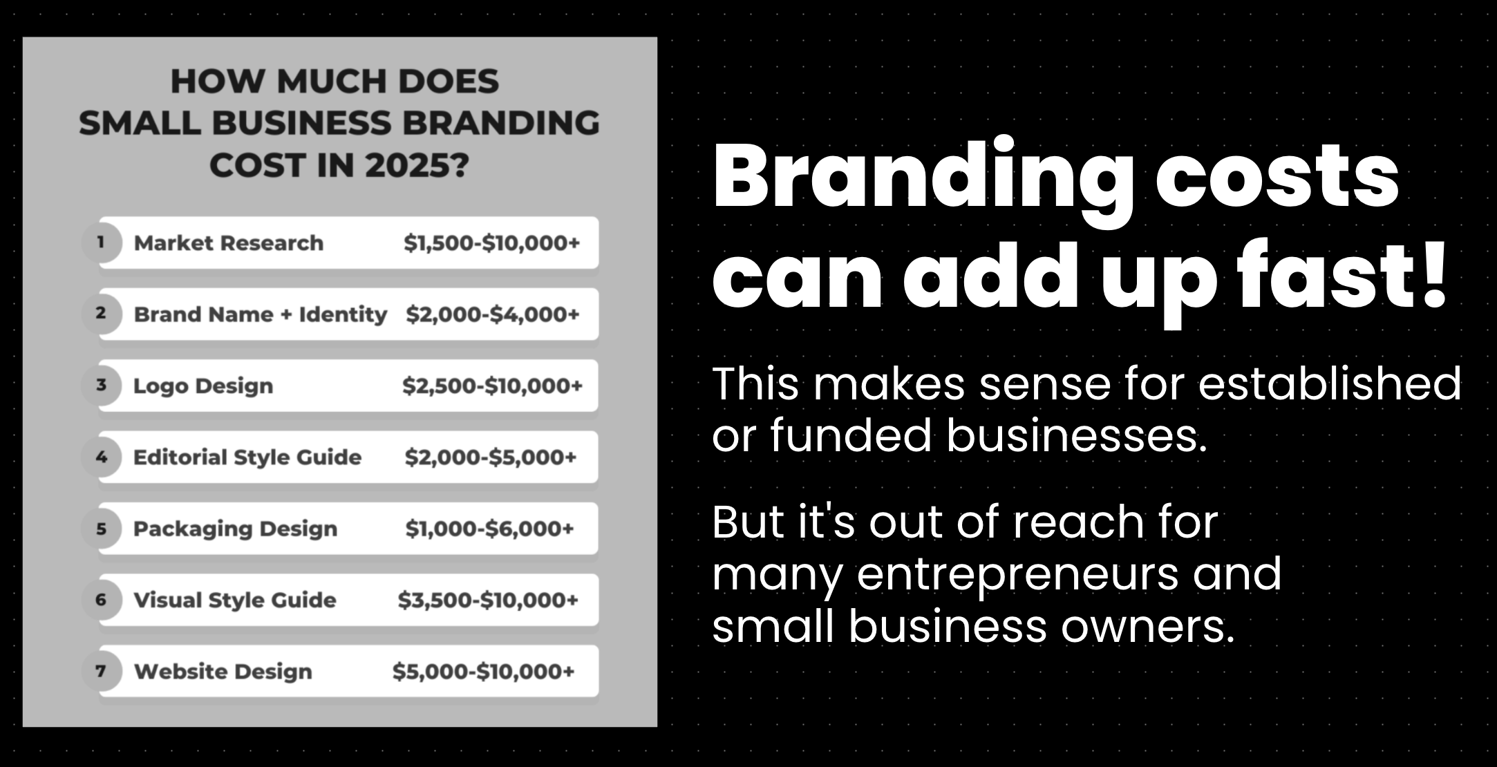
The fashion industry is crowded. Whether you are starting a print-on-demand t-shirt line or a high-end apparel label, standing out is the hardest part.
I see so many founders get stuck in the "setup phase." Agonizing over logos, fighting with designers, and spending months just trying to get a visual identity that looks halfway decent.
We need to move past that. The goal isn't just to "start a brand," it's to build an authority presence that actually sells products.
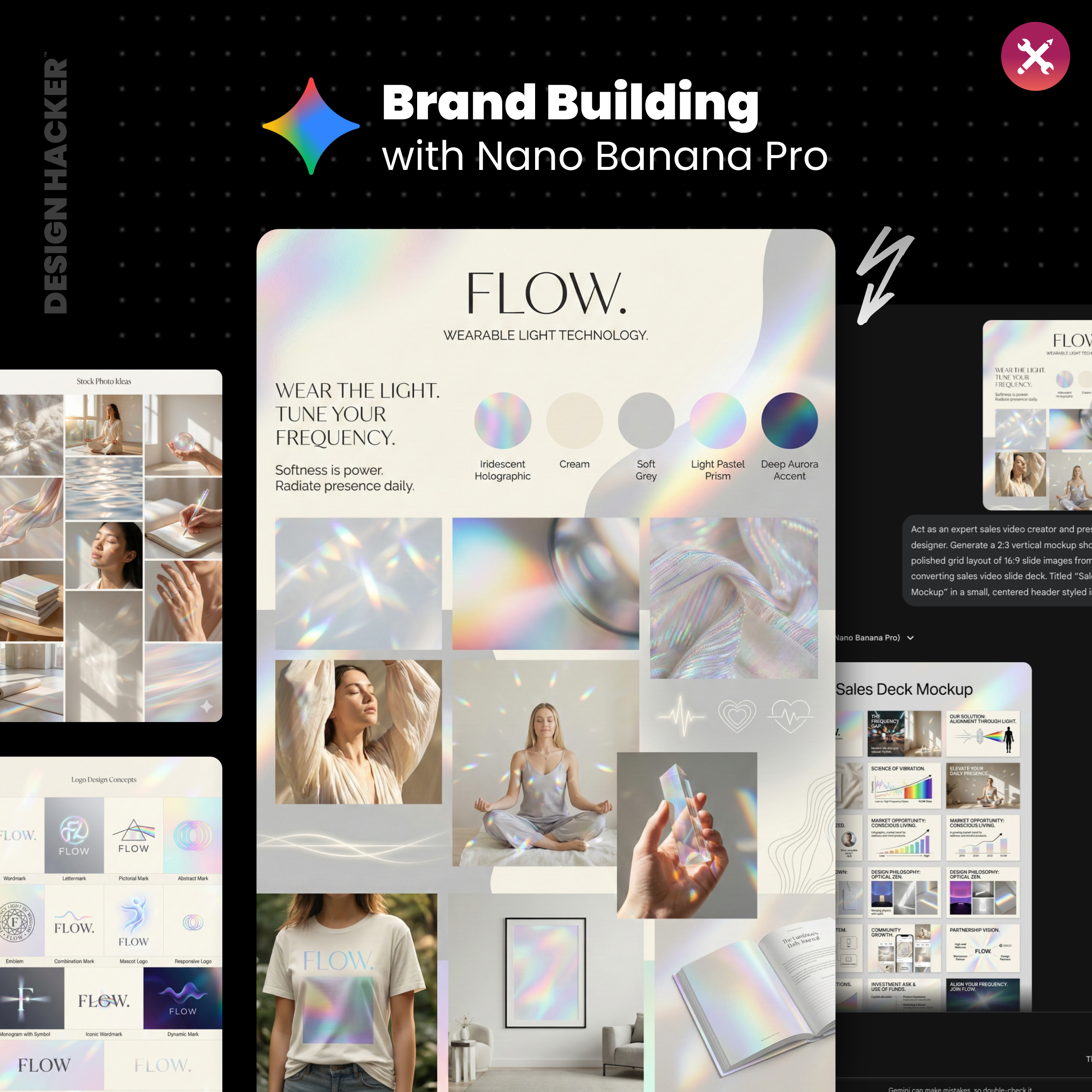
I recently sat down to build a brand from scratch using AI, specifically for a customer-submitted clothing line called "FLOW."
In under an hour, we went from a vague idea to a fully fleshed-out visual identity, including t-shirt mockups, a sales deck, and a founder photoshoot.
If you are trying to launch your clothing brand in 2026, you don't need a six-month timeline. You need a smart workflow. 👇
The old way usually looks like this:
Hours on Pinterest and Instagram saving “inspo” that never becomes a real system
Random fonts, random colors, random mockups, nothing matches from post to post
Staring at Shopify themes trying to force a look that was never defined
Spending money on design work before you even know the direction
Posting a ton, hearing crickets, wondering why “the product” isn’t enough
The new way looks like this:
You pick a clear visual direction first, fast
You generate a clean mood board that sets the rules
You turn that mood board into written guidelines AI can follow
You generate the exact asset layers apparel brands actually need
You test the brand in real mockups, then you build the funnel and content from there
This is the workflow I’ve been using with clients, and the reason it works for apparel is simple… clothing sells on taste, confidence, and consistency. Your visuals carry a huge chunk of that job.
Step 1: Define your apparel brand foundation for faster decisions
Before you generate anything, I recommend writing a simple “business details” block. Nothing fancy. Enough that AI can stop guessing and start collaborating.
For apparel, these details matter the most:
What category are you in… streetwear, athleisure, luxury basics, resort, workwear, kids
What’s the hero product… tees, sets, hoodies, dresses, jewelry, accessories
Who is it for… age range, style identity, where they shop now
Price point and positioning… premium, mid, accessible
What you want to avoid visually… examples help a lot
I’ve seen this go two ways and both can work. If you give AI a lot of detail, it gets more accurate and less experimental. If you keep it short, it explores more. Early on, exploration helps.
✅ Try This Checklist:
One sentence describing the brand and the buyer
Three words for the vibe
Two brands you feel aligned with
Three visual things you refuse to use
One sentence on why your product exists
📝 Definition: Brand foundation means the basic clarity that stops you from wandering. It includes the buyer, the offer, the proof, the story, and the “rules” for how the brand should feel.
Step 2: Generate three brand vibe directions with AI for your clothing line
This is where the timeline compresses.
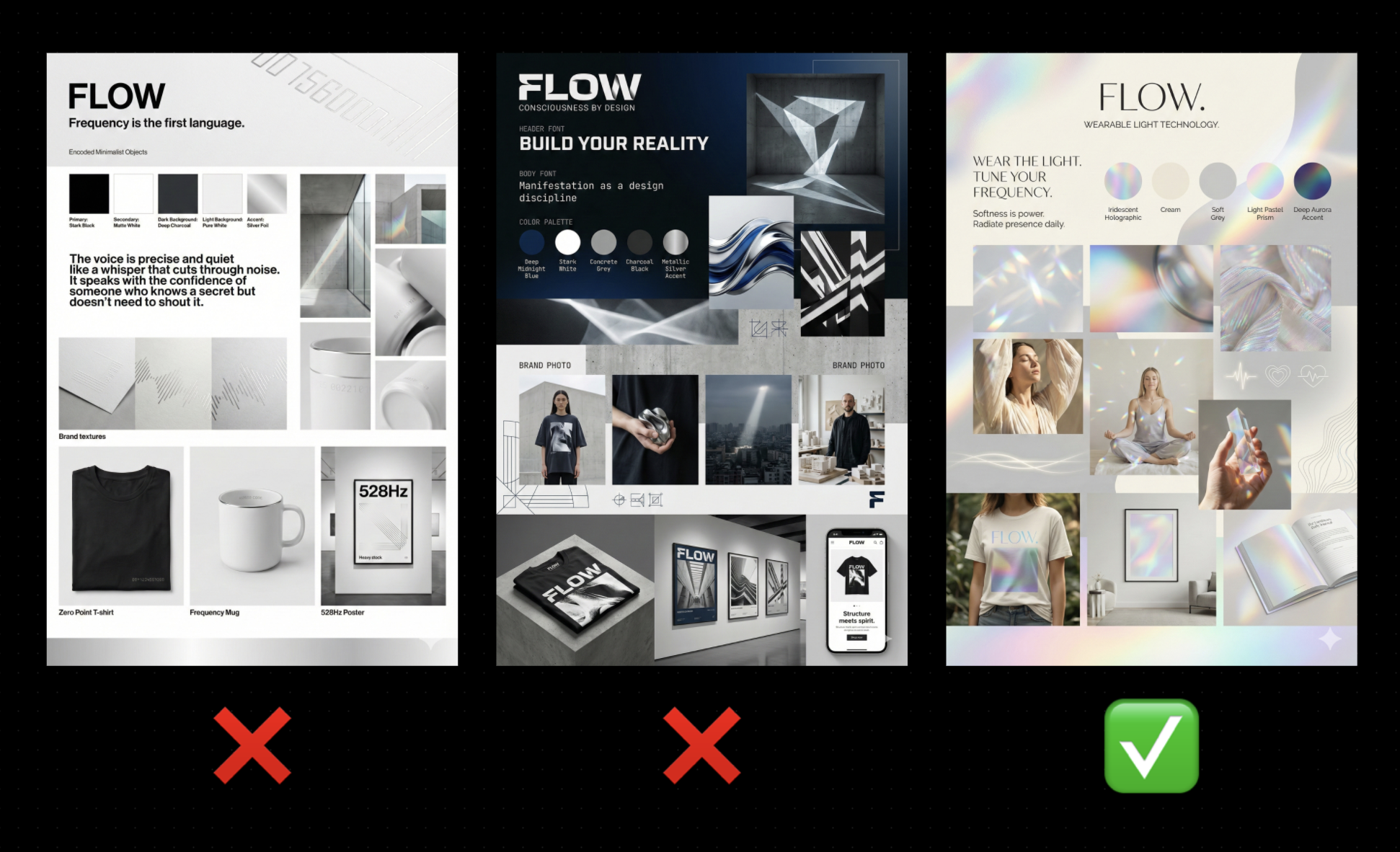
Instead of trying to force one “perfect” brand direction, generate three different vibes on purpose.
For apparel brands, this is huge because you can decide fast whether you’re building something more minimal, more bold, more feminine, more unisex, more editorial, more sporty.
When I do this, I’m looking for one thing… agreement. That moment where you see a direction and you feel it in your chest, like “yeah, that’s the one.”
👉 Try This Prompt:
“Based on the business details below, write three distinct brand vibe concepts for a clothing/apparel brand.
For each concept, describe the visual feel, typography direction, color palette style, photography style, and what the brand should feel like on a Shopify homepage, Instagram grid, and product page.
Keep it modern, premium, and specific. Avoid clichés and trends that will age fast.”
Then paste your business details underneath.

💡 Pro Tip: If your brand sells to women, you’ll often see one direction skew more luminous and elevated. If your brand is unisex, you’ll usually see one direction go more minimal and graphic. If your brand wants edge, you’ll see one direction lean darker and more contrast-heavy. Those patterns help you choose quickly.
⚡️ For better results, get my full library of Mood Board Prompts.
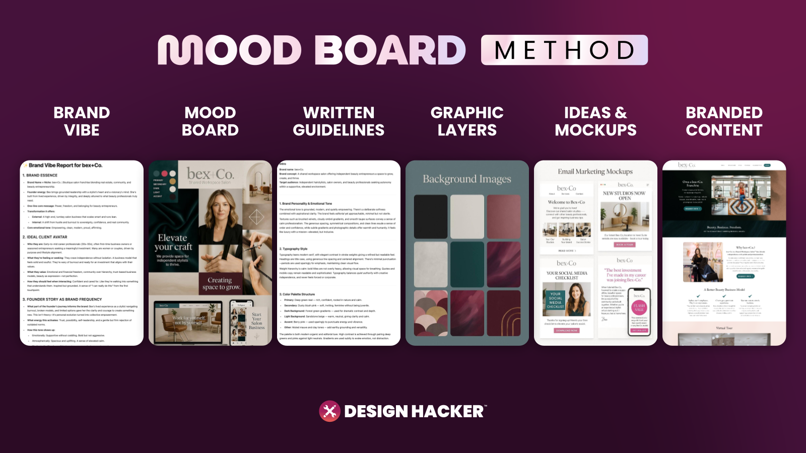
Step 3: Create a mood board that acts like a creative director
Once you pick the vibe you like most, generate a mood board image from it.
This mood board becomes the anchor for everything… your site, your ads, your lookbook, your product pages, even your email graphics.
When I’m judging a mood board for an apparel brand, I’m scanning for:
A usable color system that doesn’t explode into 12 colors
Typography that looks good on product pages and size charts
Background textures or gradients that feel ownable
Photo direction that matches the price point
A feeling that makes someone want to browse and add to cart
You’ll know the board is working when it instantly feels like a real brand that already exists in the market.
📝 Definition: Mood board is a single page that communicates the rules of the visual world. It saves you from reinventing the look every time you post.
Step 4: Turn the mood board into written brand guidelines AI can follow
This part feels boring until you see how useful it becomes.
When you have the visuals and the written guidelines, you can feed both into AI and get way more consistent outputs. Earlier in 2025, written guidelines mattered even more. Now the image models are stronger, but written guidance still helps when you want repeatable results.
For apparel brands, include these sections:
Brand personality in plain language
Typography rules (header font vibe, body font vibe)
Color intent (what colors do, where they show up)
Photography rules (lighting, location, framing, editing style)
Graphic style (icons, linework, symbols, patterns)
👉 Try This Prompt:
“Analyze this apparel brand mood board and write brand guidelines that a designer and a marketing team could follow.
Include typography direction, color system guidance, product photography style, lifestyle photography style, background textures/patterns, and layout style for ecommerce pages and ads.”
⚡️ For better results, get my full library of Mood Board Prompts.
Step 5: Lock your fonts and colors for ecommerce consistency
This is where the rubber hits the road.
A lot of mood boards look amazing, then you try to build the Shopify site and everything feels off because you never chose the actual font pair and the actual colors.
My preference for apparel brands is simple:
Two fonts max, one for headlines, one for body
A tight palette with a main color you can use for buttons and calls to action
A neutral base that supports product photography
Gradients and glow effects can be part of the aesthetic, especially for modern brands, but your functional system still needs a few dependable choices.
📝 Definition: Main brand color is the color that can “hold down the fort” across buttons, links, highlights, and calls to action. It keeps your marketing assets from feeling washed out.
Try This Checklist:
Pick one main CTA color that looks good on both desktop and mobile
Pick two neutrals for background and text
Pick one accent color for highlights or tags
Test the palette on a product page layout, not just a mood board
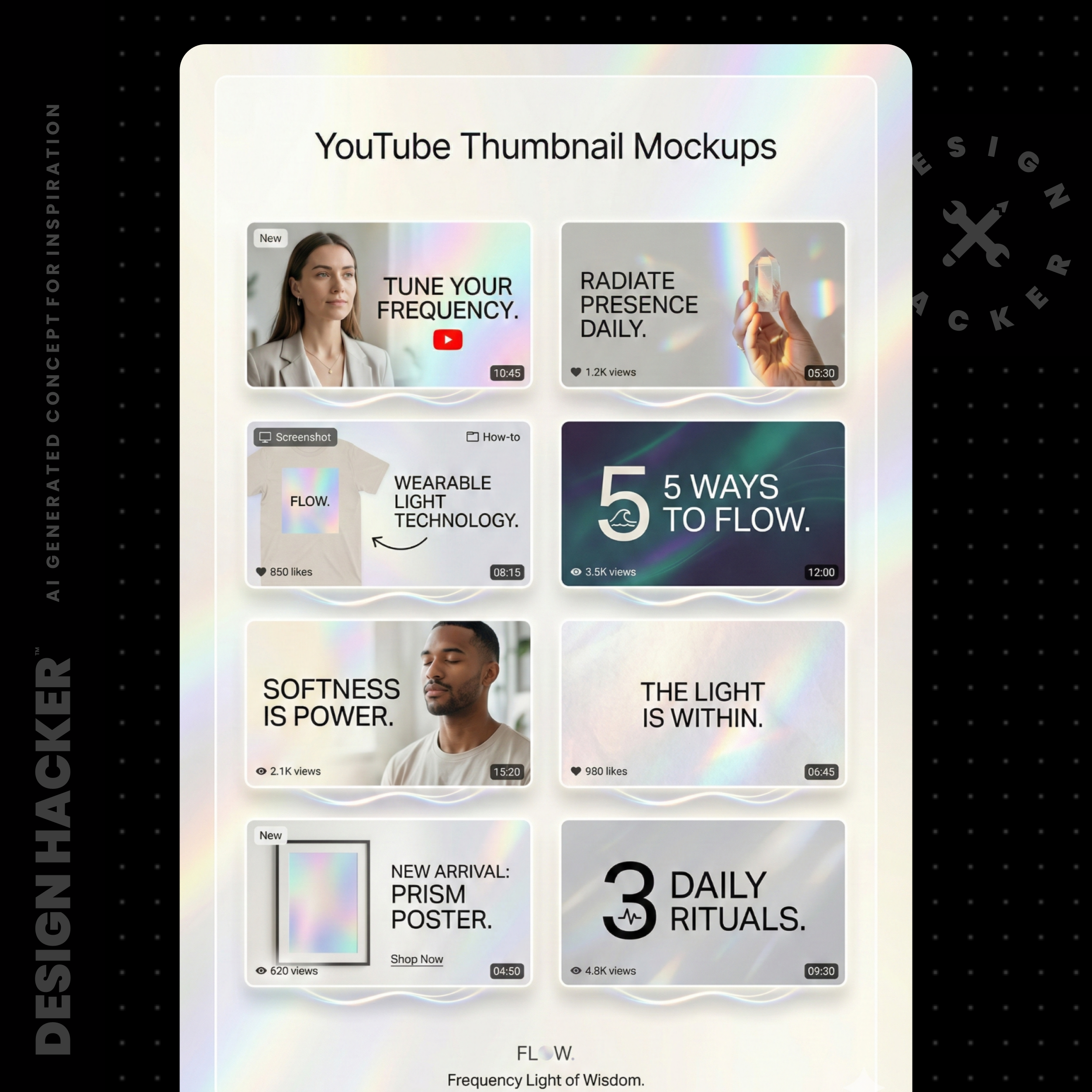
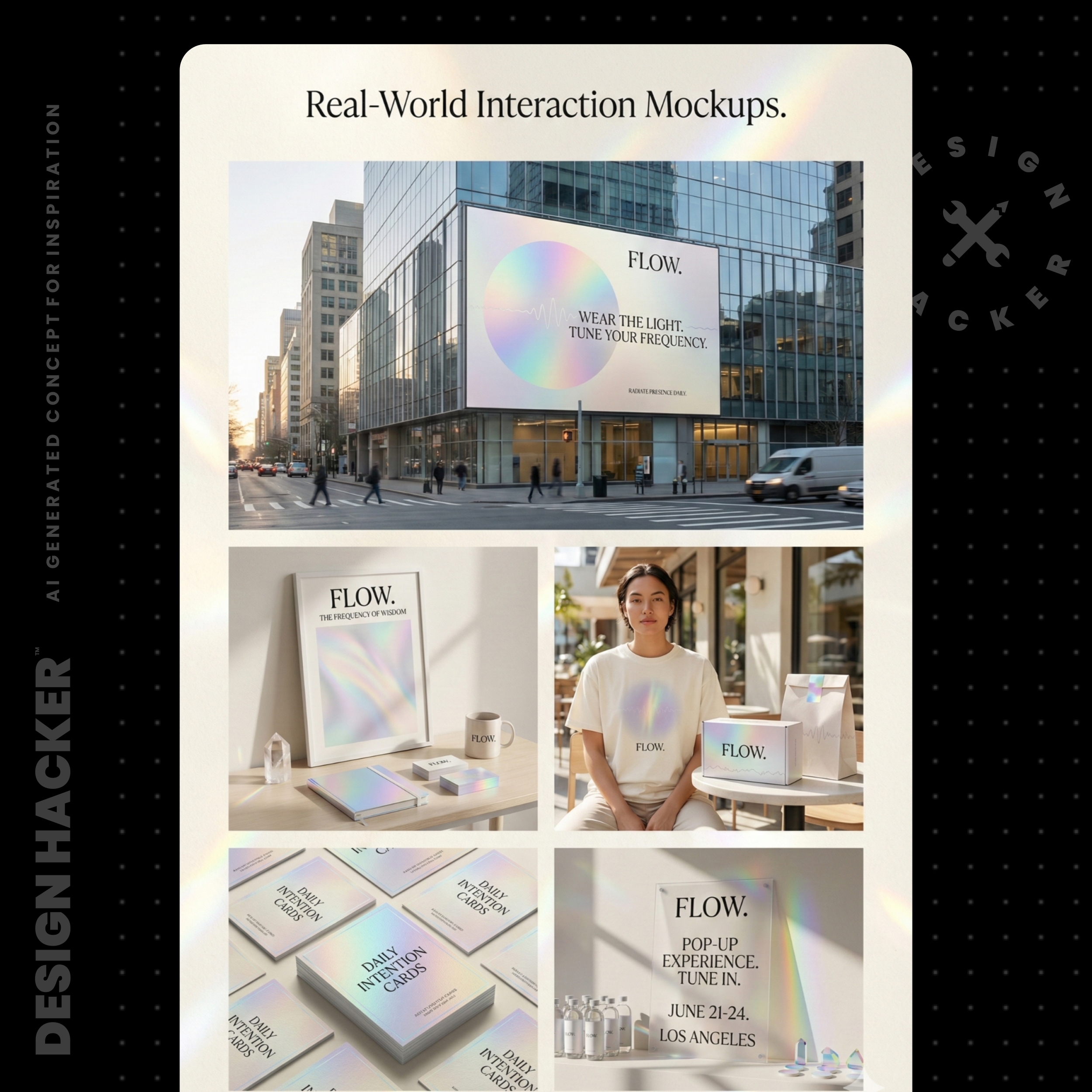
Step 6: Generate apparel-specific brand assets you can use immediately
This is the fun part, and it’s also where you build speed for content and launches.
Here are the “brand layers” I generate for clothing brands first:
Step 6A: Create a sales deck mockup to test the story
Even if you never use a deck, this is a fast way to see if the brand can communicate.
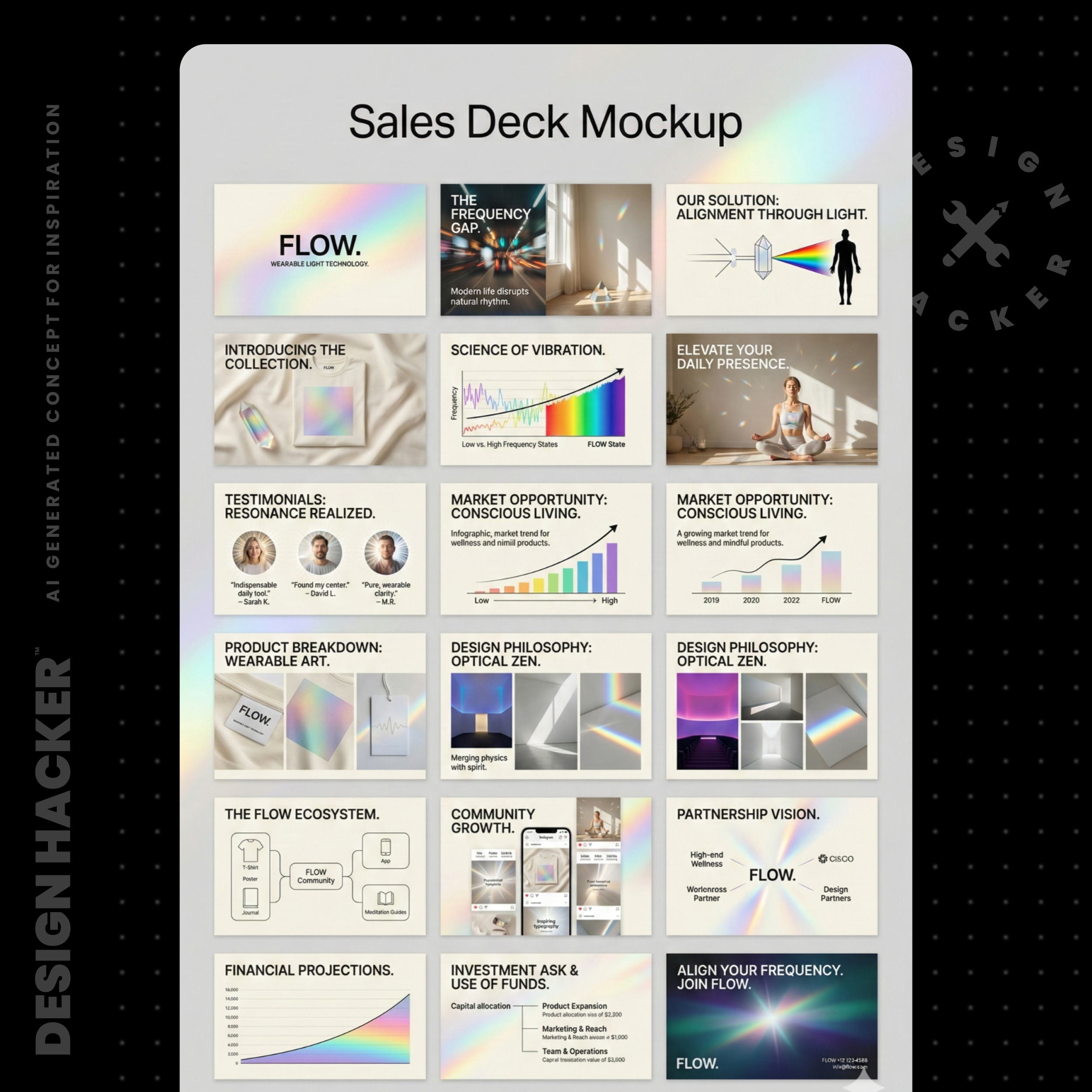
You’ll see headlines, layouts, and story flow. If the AI can make your brand feel believable in a deck, it usually means you’re on the right track.
Try This Prompt:
“Using this apparel brand mood board and business details, create a 10-slide sales deck mockup.
Include: the problem, the aesthetic promise, hero products, materials/quality cues, social proof placeholders, and a clean CTA slide.”
⚡️ For better results, get my full library of Mood Board Prompts.
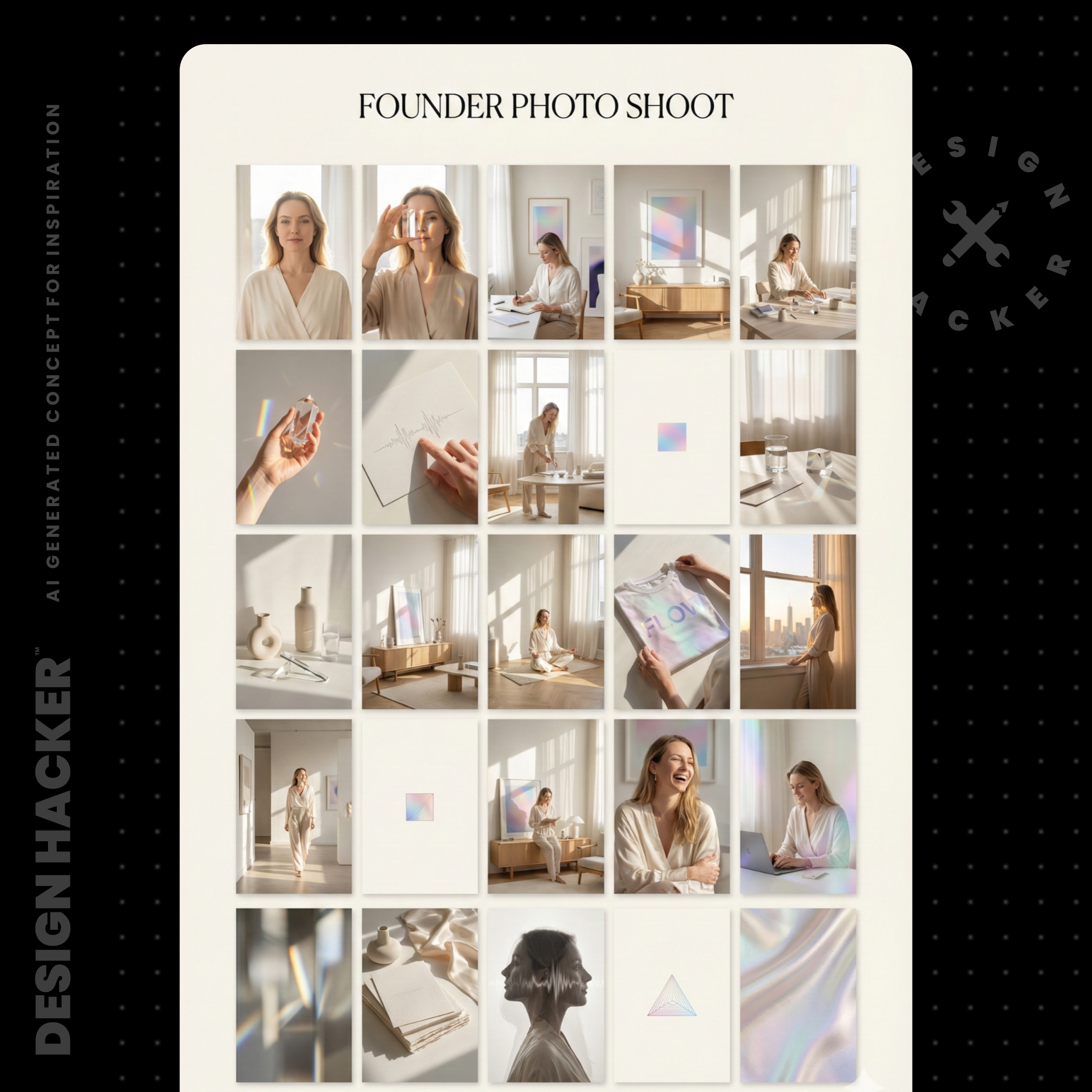
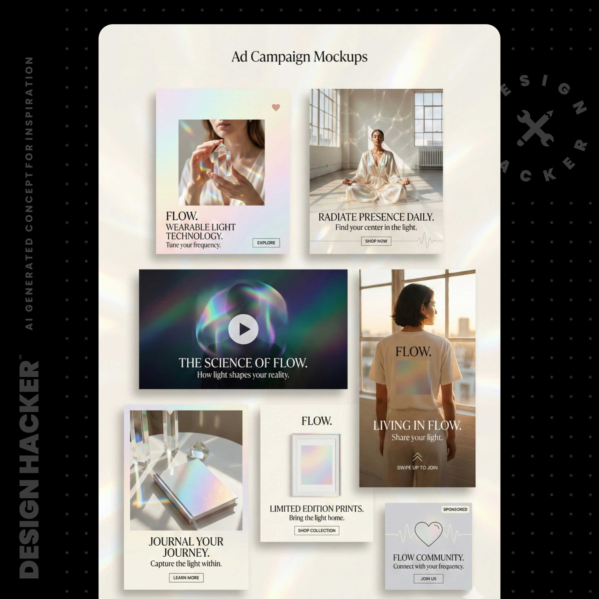
Step 6B: Create ecommerce funnel mockups for Shopify and ads
I love this because it forces the brand to “act real.”
Generate mockups for:
Homepage hero and collection grid
Product page layout with reviews and details
Email signup pop-up
Paid ad creative concepts (UGC-style and editorial-style)

Try This Prompt:
“Create ecommerce sales funnel mockups for this clothing brand using the mood board as the style reference.
Show: homepage, collection page, product page, and 2 ad creative layouts.”
⚡️ For better results, get my full library of Mood Board Prompts.
Step 6C: Create background textures and patterns
Apparel brands live on backgrounds. Your product shots need something to sit on, and your social graphics need a consistent base.
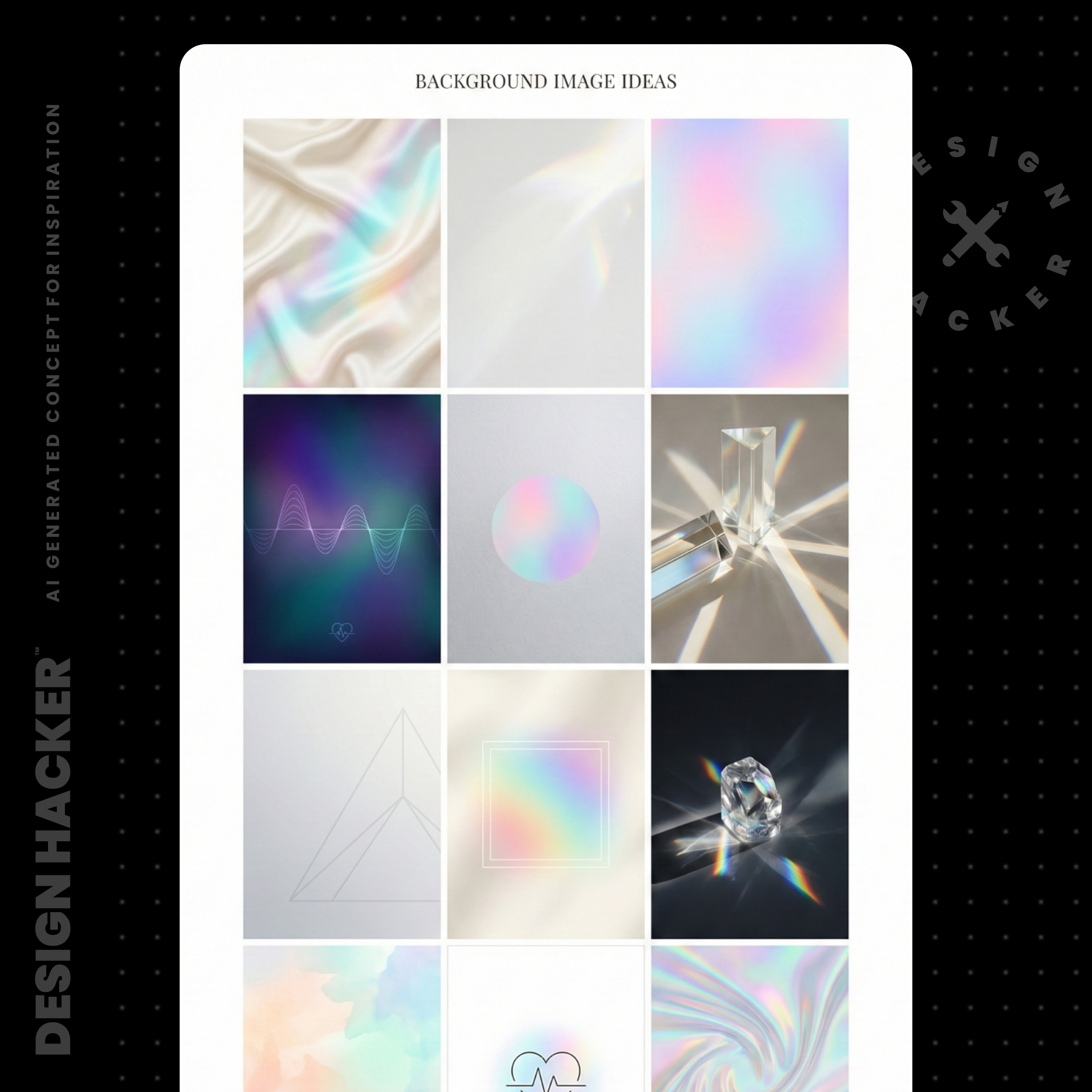
I used to waste hours hunting stock textures. Now I generate a set, pick favorites, then upscale them if needed.
Try This Prompt:
“Generate 12 background images for this apparel brand.
Keep them subtle, premium, and usable behind product photography and text.
Output in horizontal format suitable for website sections and ad backgrounds.”
⚡️ For better results, get my full library of Mood Board Prompts.
Step 7: Build your asset library so every drop feels cohesive
This is the part people skip, then they wonder why every post feels like it came from a different brand.
My workflow is simple:
I keep a mood board workspace where I can see everything at once
I keep a photo album for all generated assets, so I can scroll and pull ideas fast
I back up the final assets in a folder structure that matches how I build funnels
For apparel brands, your folders might look like:
Logos
Backgrounds and textures
Product mockups
Ad concepts
Email graphics
Photo shoot direction
When you sit down to build a new launch page or ad, you’re pulling from a library instead of starting from zero.
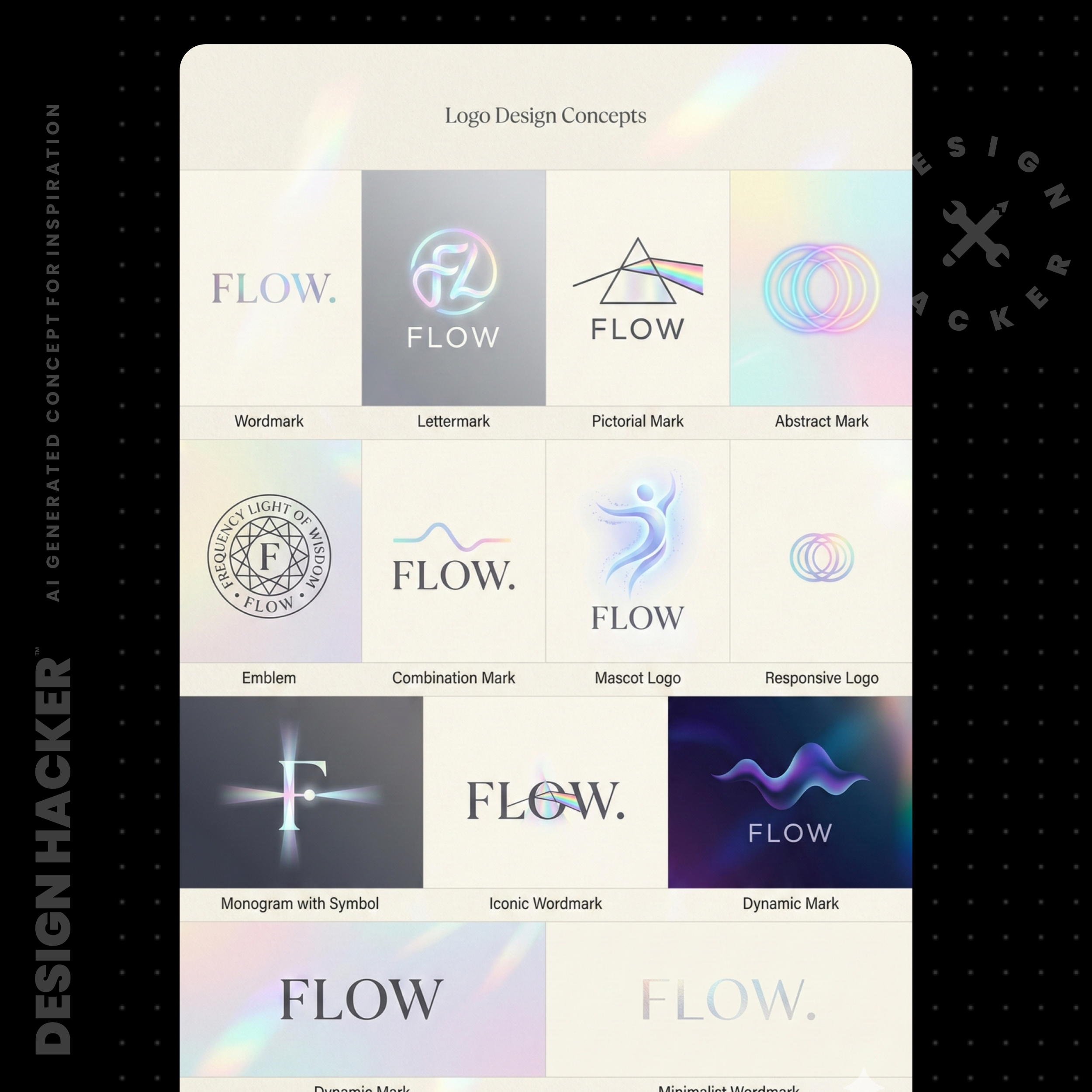
Step 8: Upgrade low-res logos and prep them for real-world use
Sometimes AI gives you a logo idea that’s close, but it’s low-res. You can still use it as a starting point.
Here’s the move:
Screenshot the logo concept
Ask AI to recreate it clean and high-res
Remove the background if needed
Vectorize it so it scales
Try This Prompt:
“Recreate this logo exactly the same, high-resolution, clean, and professional.
Make it black and white, simple, and ready to use on a website and clothing labels.”
📝 Definition: Vector means the logo can scale infinitely without getting blurry. It’s what you want for packaging, tags, embroidery files, and print.
Watch out for this
A few things I see all the time, especially with apparel brands:
Skipping the organization step: You end up with pretty outputs that don’t connect to the actual buyer or the actual product.
Too many colors too early: It becomes impossible to keep the site, ads, and IG consistent.
Mood boards that look cool but don’t sell product: Test the vibe on a product page mockup and an ad mockup. You’ll feel the difference immediately.
Relying on text files as inputs for image tools: In my tests, pasting the text directly tends to work better than attaching a file. It stays clearer.
Forgetting the CTA color: Ecommerce needs a button color that looks confident and obvious.
FAQs
How much info should I give AI for an apparel brand?
Start with a short business details block, then expand once you pick a direction. Short inputs help you explore. Longer inputs help you refine.
What if the mood board looks great but my Shopify theme still feels off?
That usually means the fonts and functional colors never got locked. Pick two fonts, pick a CTA color, then rebuild the page sections using those rules.
Do I need a designer if I use this workflow?
This workflow gets you clarity and assets fast. A designer can still help polish and systematize, especially for packaging and ecommerce UX. The difference is you show up with direction instead of guesses.
Conclusion
If you sell apparel online, the brand can’t be an afterthought. The visuals are part of the product experience, and AI finally gives you a way to move fast without guessing.
Get organized, pick the vibe, build the mood board, generate the asset layers, then test it in real ecommerce mockups. Once you see it working in a product page and an ad, everything gets easier… content, launches, even decisions.
🔥 RECOMMENDED TRAINING:
Turn ANY Idea Into a World-Class Brand Identity In MINUTES With AI
This 3-step system uses AI to build a complete brand foundation for ANY business in just a few clicks.

Hey, I'm Andrew Lane
Founder of Design Hacker
I’ve built multiple 7-figure brands from scratch over the past 15 years. Now I’m using AI to make that process faster, smarter, and way more fun. If you want your brand to feel premium without wasting months or thousands of dollars, then this is for you!