• Aug 2, 2025

How to Rebrand a Business: The Full Story of Mode Keyboards’ Brand Redesign

    Brand Builder Shortcuts Podcast with Andrew Lane

    Written by Andrew Lane
    View All Articles | Get Free Resources

    If you’ve ever wondered how to lead a real, professional rebrand from start to finish, this is the process.

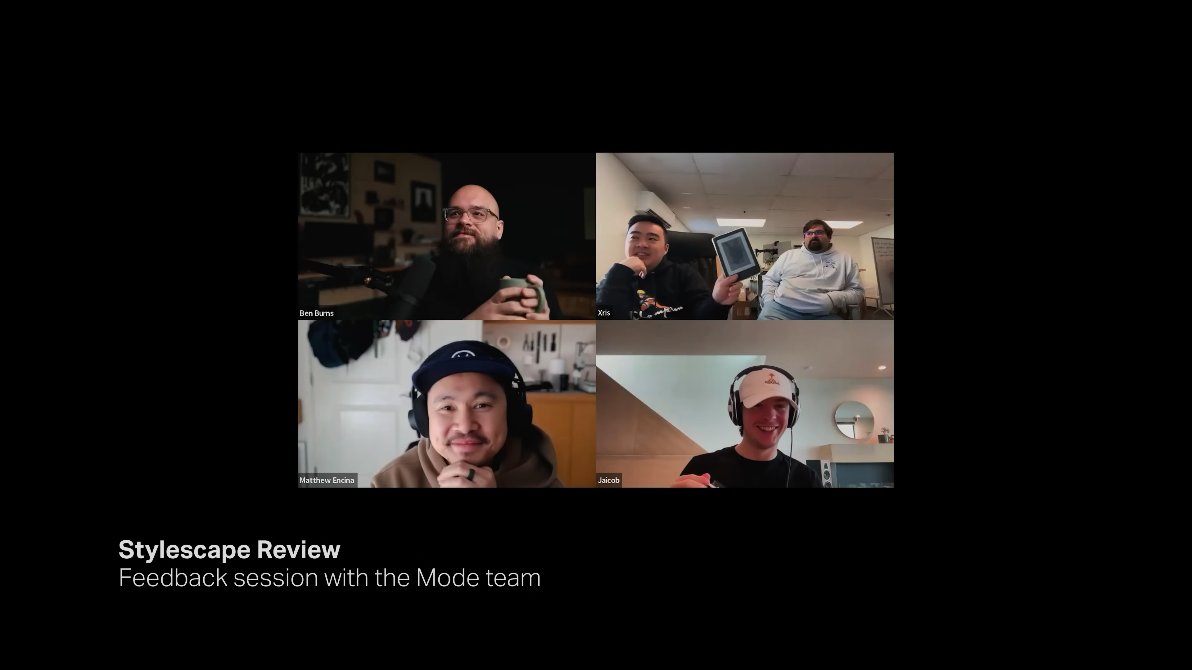
    I recently came across an outstanding video by Matthew Encina, where he shares exactly how he reimagined Mode’s brand as their Chief Design Officer. You can watch the video here 👇

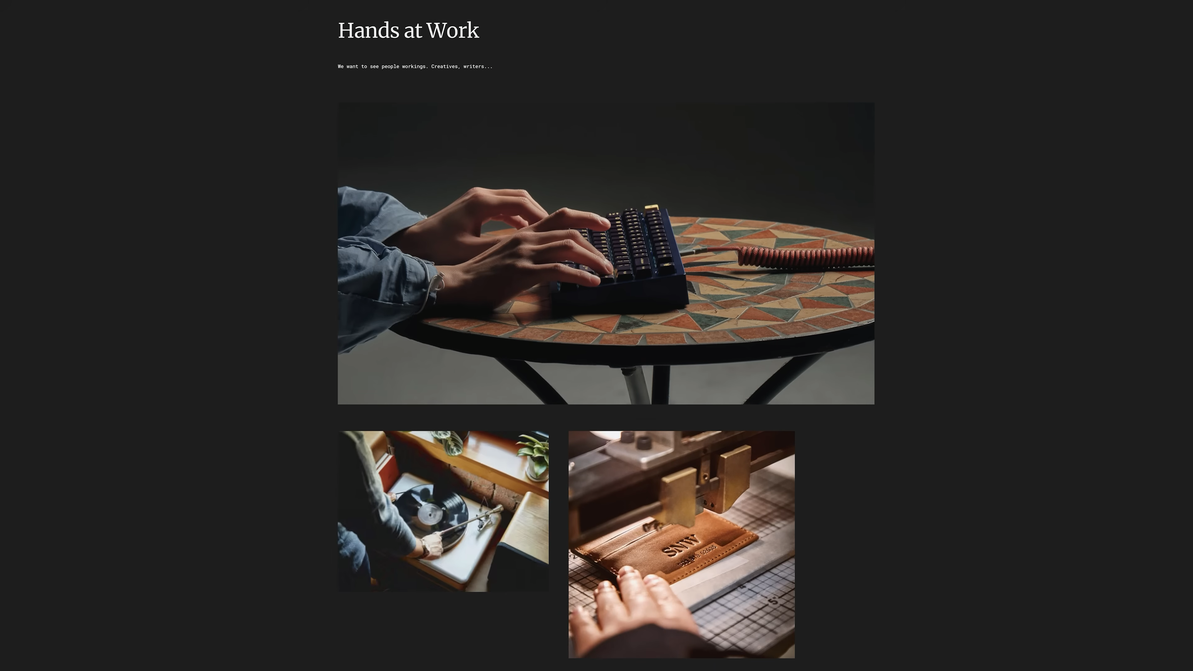
    Below, I’m breaking down the process he used into simple, actionable steps anyone can follow, whether you’re DIY-ing your own brand or working with clients. You’ll see screenshots from the video throughout this guide, so you can actually visualize how each step works.

    If you’re thinking about refreshing your own brand or helping a client do it, these are the steps you want to follow.

    The Four Key Steps to a Successful Rebrand


    Before jumping into Mode’s story, here’s the big picture. Every effective rebrand (whether you’re a startup or a household name) follows a similar path. The process can be broken down into four essential steps:

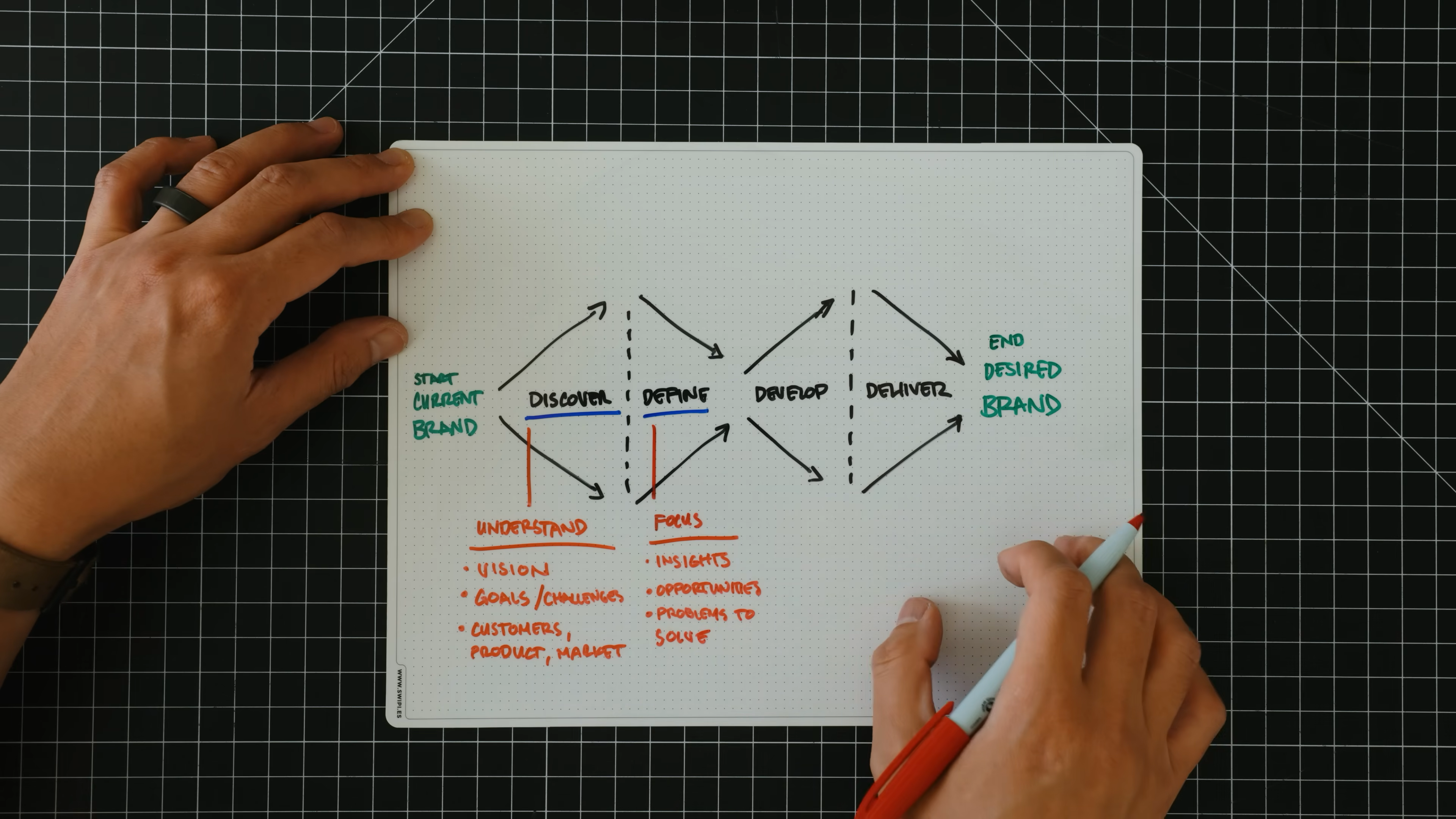
    1. Discover: Dig deep into your brand’s current reality, audience, and market. Listen more than you talk.

    2. Define: Identify what matters most, what needs to change, and what you want your brand to stand for.

    3. Develop: Explore creative directions, test out ideas, and build prototypes until you find what truly fits.

    4. Deliver: Launch your new brand to the world, refine details, and make sure every touchpoint feels consistent.

    Hand-drawn Double Diamond diagram illustrating the four stages of brand development—discover, define, develop, and deliver—from Matthew Encina’s Mode rebrand video.

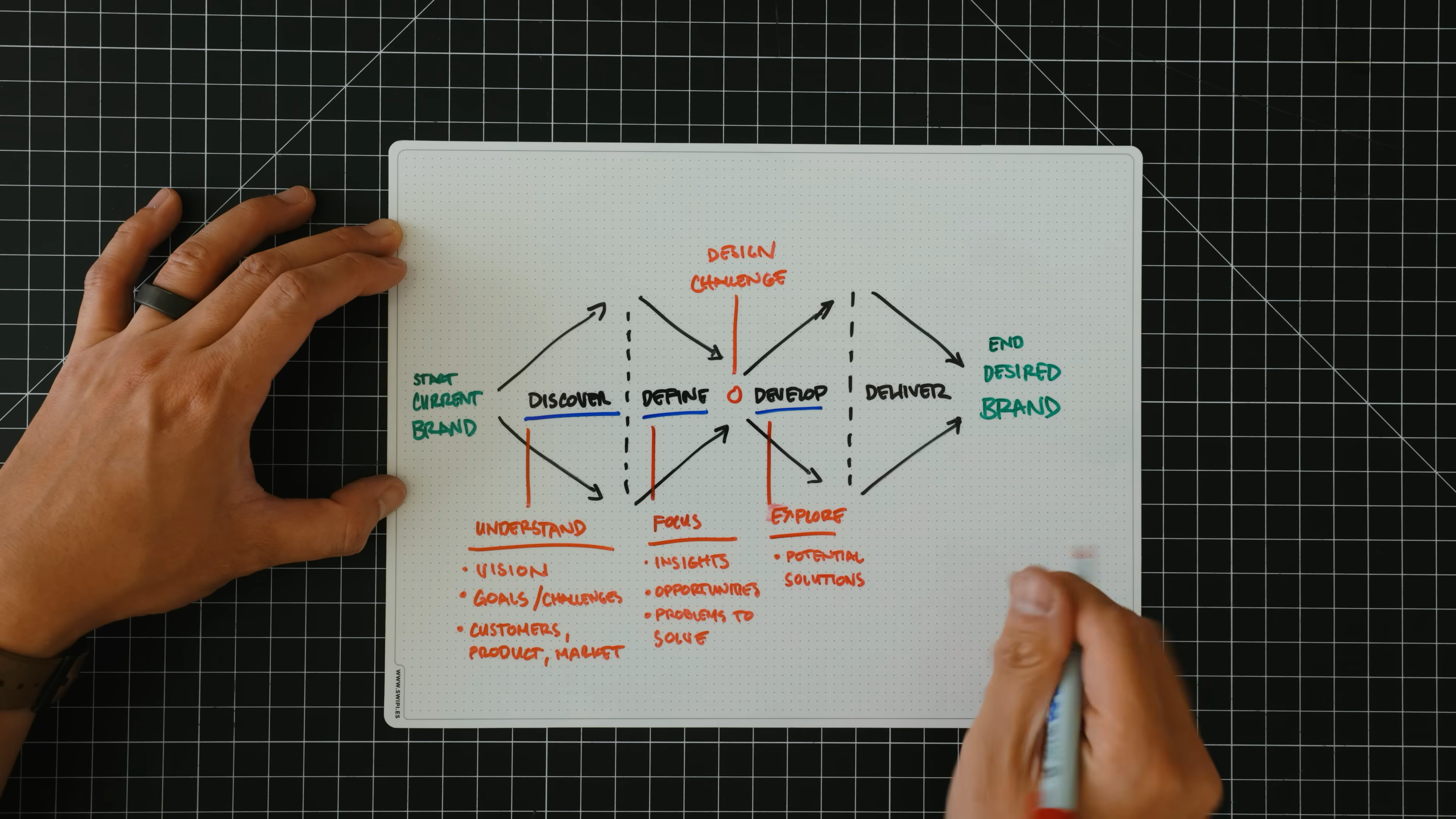
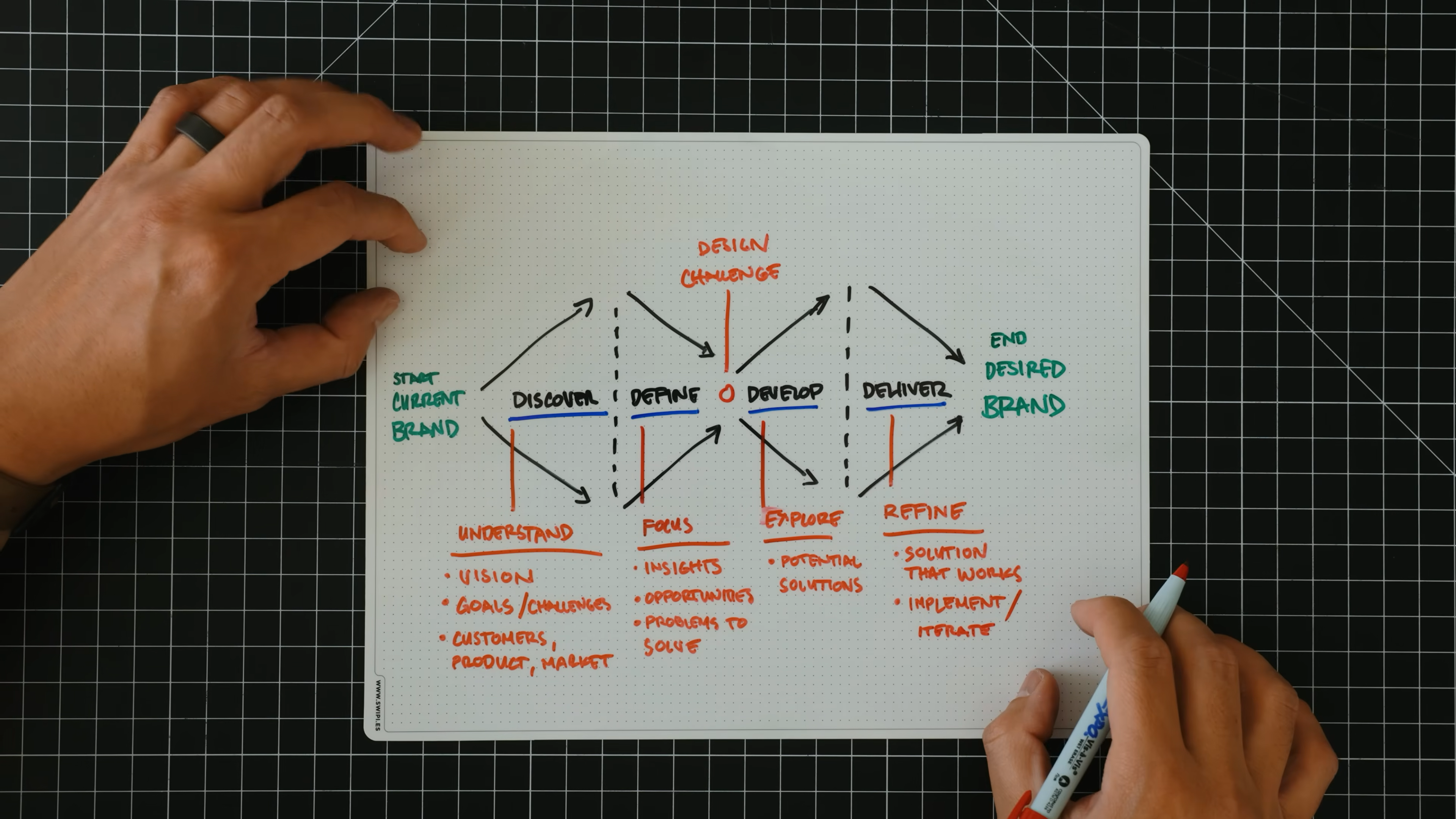
    This structure, known as the Double Diamond framework, helps teams avoid guesswork and keeps the focus on building a brand that actually works in the real world. Now, let’s see how Mode used these steps to transform their business.

    What Was the Mode Project All About?


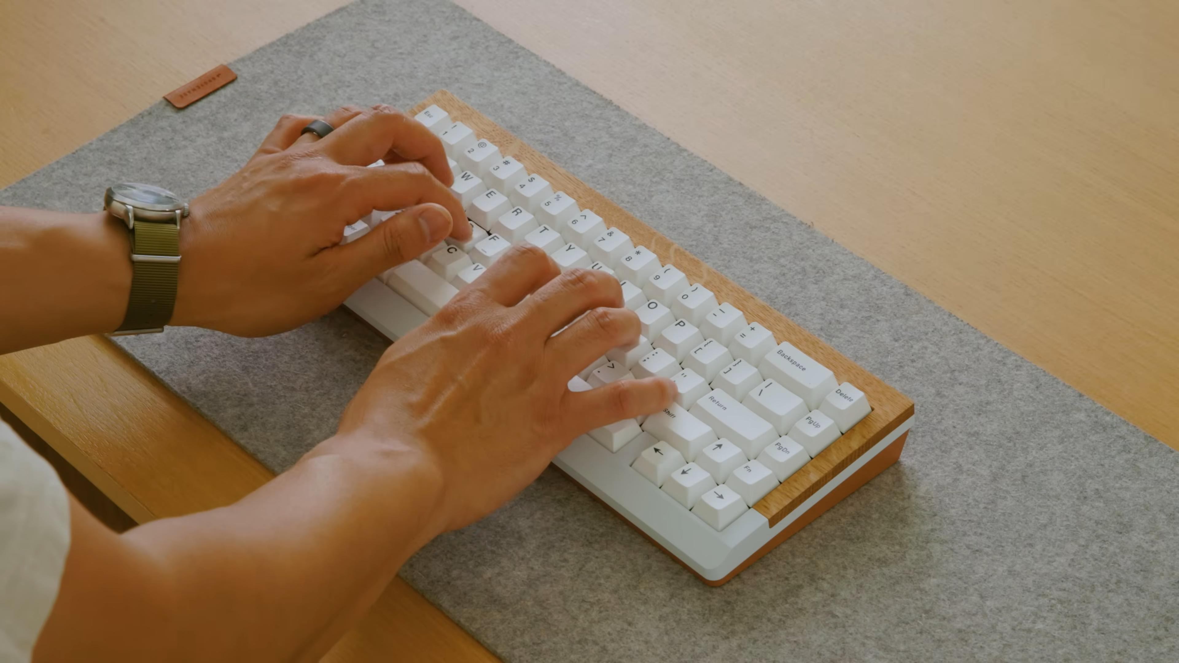
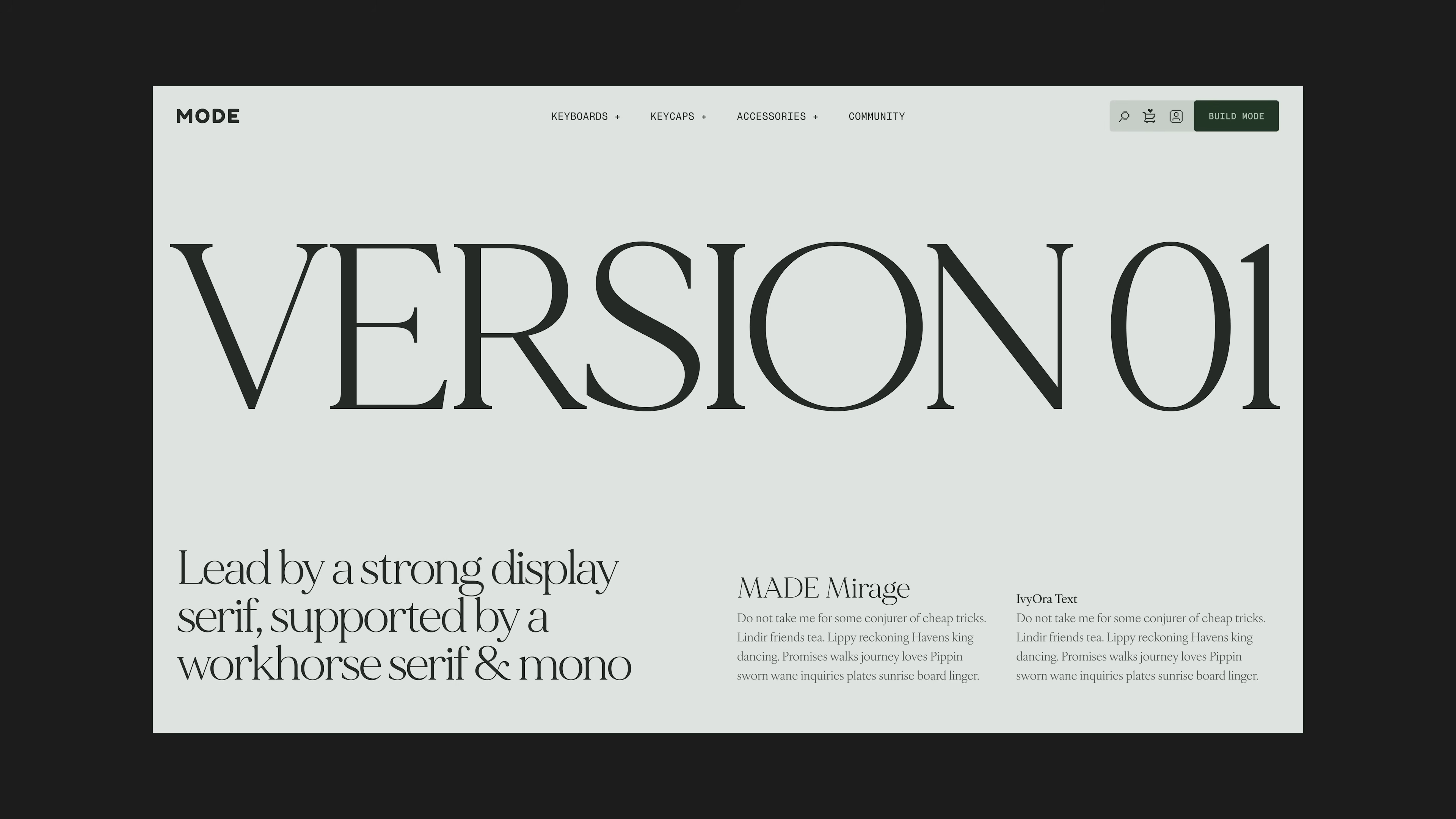
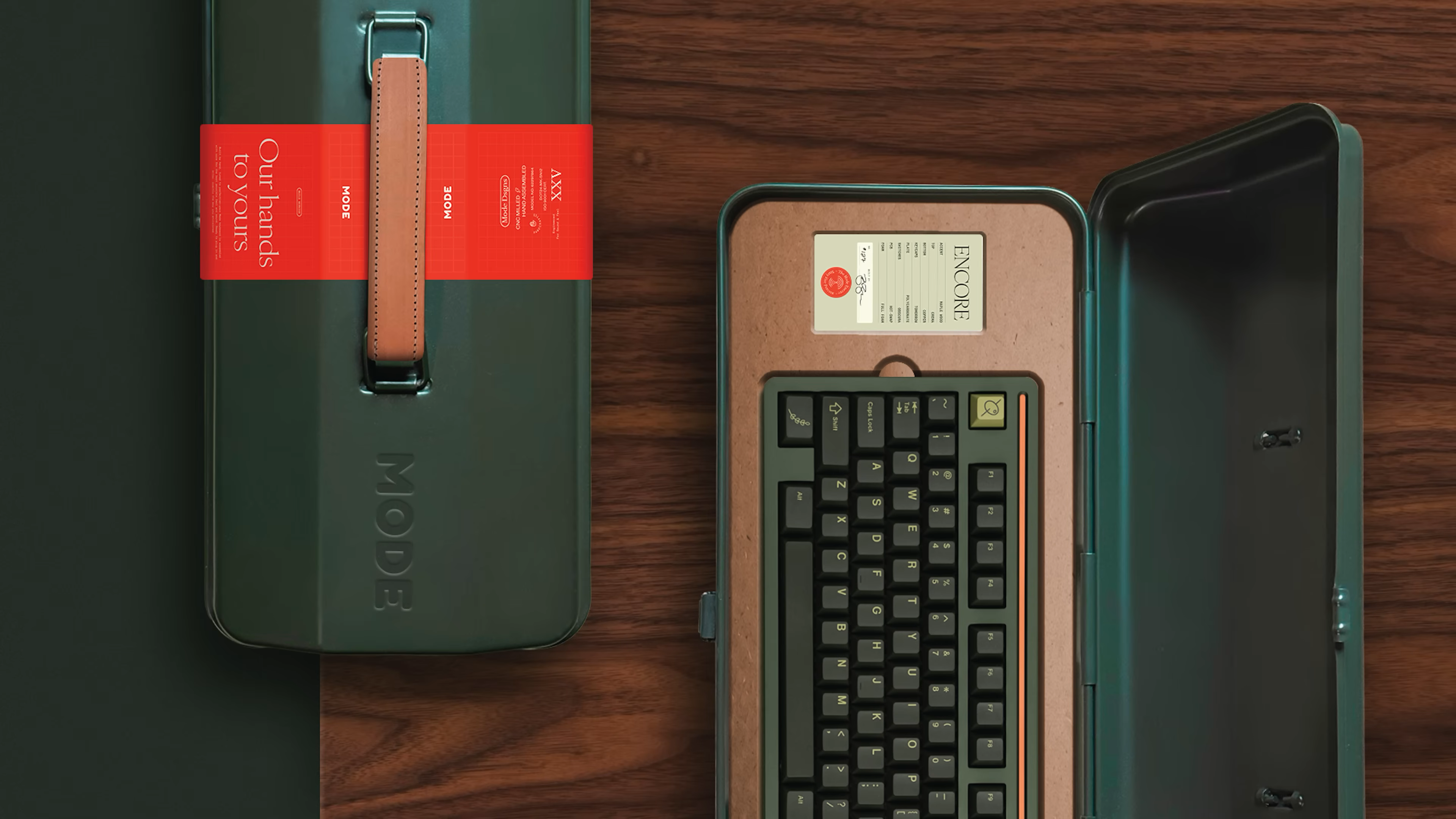
    Mode builds high-quality mechanical keyboards and accessories. By 2025, they’d outgrown their original brand. The company had new products, a bigger audience, and a sharper vision for what made them different.

    Hands typing on a Mode mechanical keyboard with a wood accent, as seen in Matthew Encina’s video on rebranding a business.
    A person stands in a bright, modern living room, thoughtfully looking over a table filled with Mode keyboards. This image introduces the Mode brand and highlights the moment of reflection that sparks the need for a rebrand, as shown in the video.        Ask ChatGPT

    Matthew Encina joined at a moment where the old look and feel didn’t match what Mode had become. The team wanted a brand that actually fit their new direction and made it easier to grow, stand out, and connect with people who care about thoughtful design.

    Why rebrand? Mode’s leadership saw that their current brand was holding them back. Their audience was changing. The competition was heating up. They needed to go deeper and clarify not just how they looked, but how they spoke, who they served, and what they wanted Mode to stand for.

    Handwritten notes on “What is a Brand?” with key points about reputation, value, and customer connection, from Matthew Encina’s Mode rebrand video.

    The Strategy: Why They Used the Double Diamond


    Instead of guessing or running straight to a logo refresh, Matthew used the Double Diamond framework. This is a creative process used by design teams around the world. It helps you stay focused, think deeply about what matters, and avoid chasing trends or copying competitors.

    The Double Diamond keeps you honest. It makes you pause, listen, and clarify before jumping to design or messaging. You end up with a brand that actually fits... not just a “new look” that wears off in a month.

    A diagram showing the 4 phases of the Double Diamond Model: Discover, Define, Develop, and Deliver. The process starts with a “Problem” on the left and moves through two diamonds—one red (Strategic Phase: Discover and Define) and one blue (Creative Phase: Develop and Deliver)—before reaching the “Solution” on the right. Each phase lists activities, such as research, organizing findings, design exploration, user testing, and launching the final product. The model emphasizes moving from problem exploration to solution delivery with clear, structured steps.        Ask ChatGPT

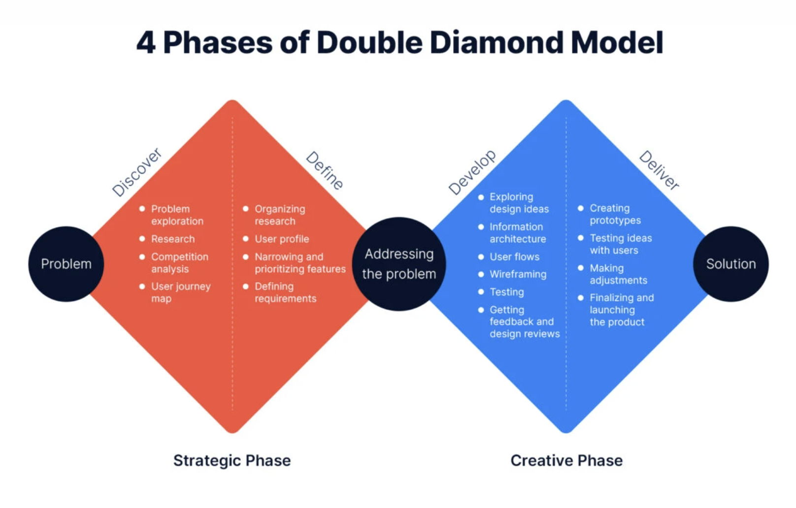
    Image source: https://artkai.io/blog/double-diamond-design-process

    Here’s how Mode’s rebrand lined up with the Double Diamond, and what you can take from it.
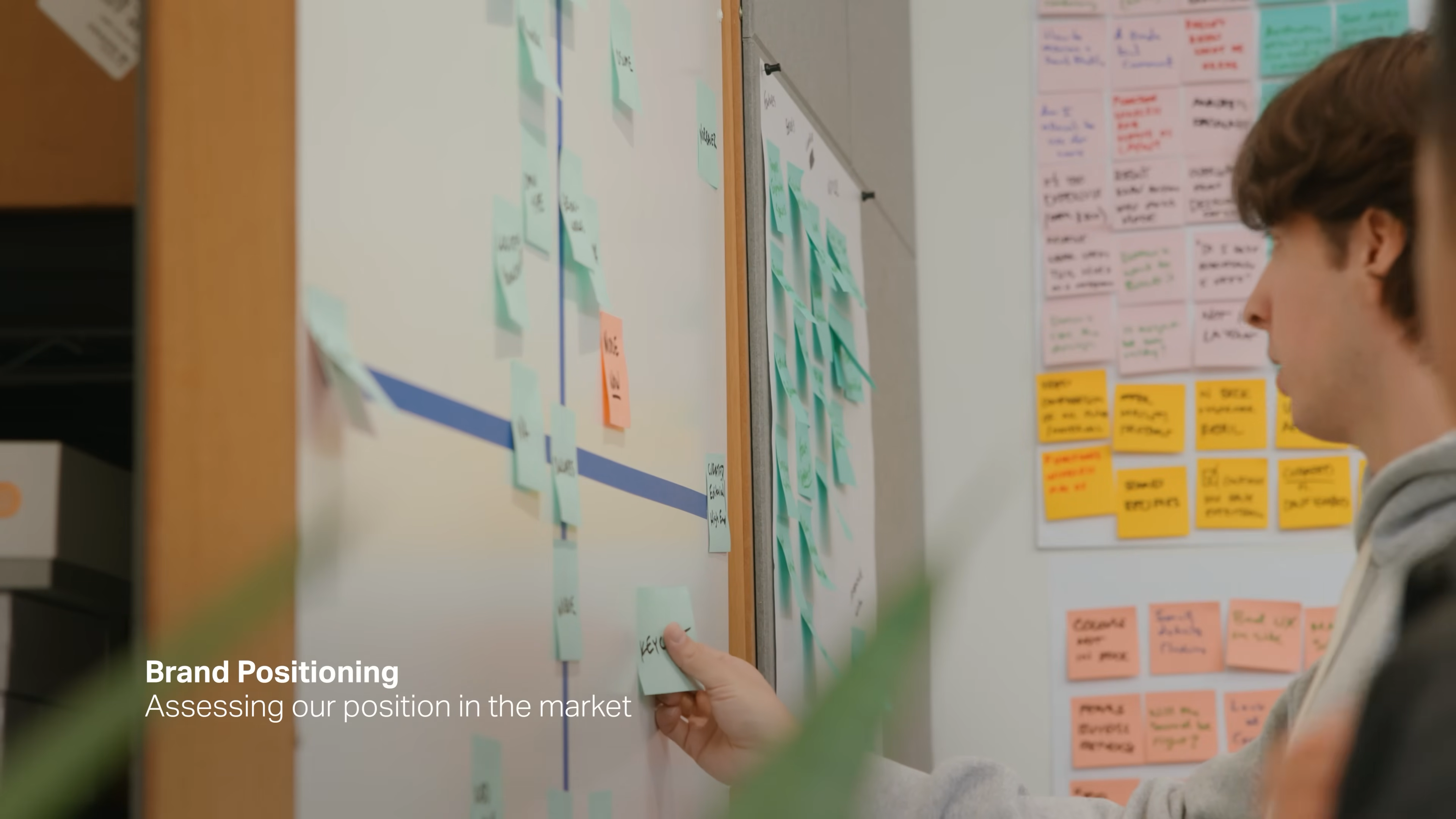
    1. Discover
    (Open Up and Explore)


    This is where you forget about solutions for a minute and just dig. The goal is to understand what’s really happening inside the business, with the product, and in the minds of your audience.

    How Matthew and the Mode team did it:

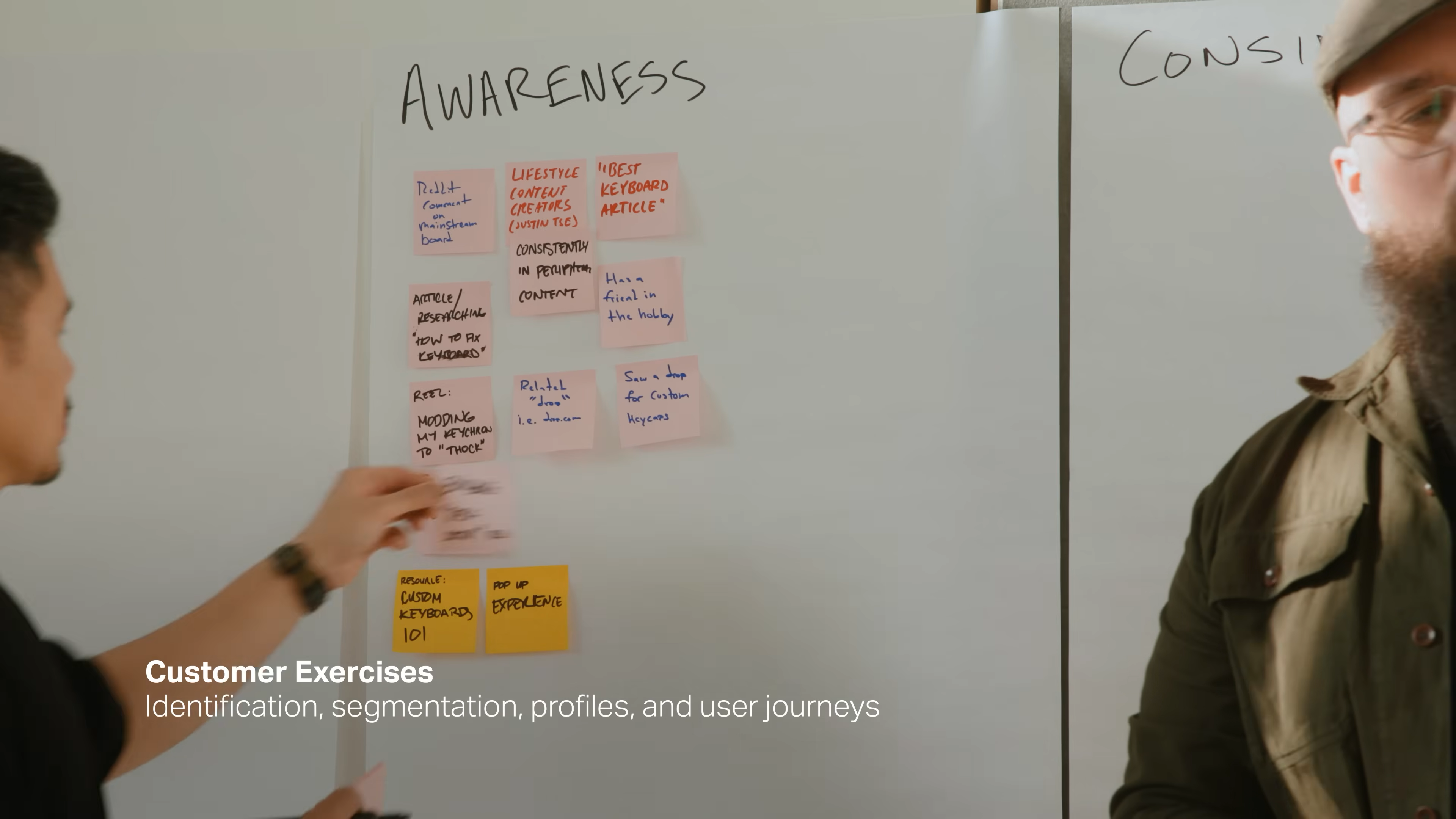
    • Collected real data: web traffic, sales, and customer feedback.

    • Talked to current and potential customers. Not just surface-level questions, but what they care about, why they buy, and where they struggle.

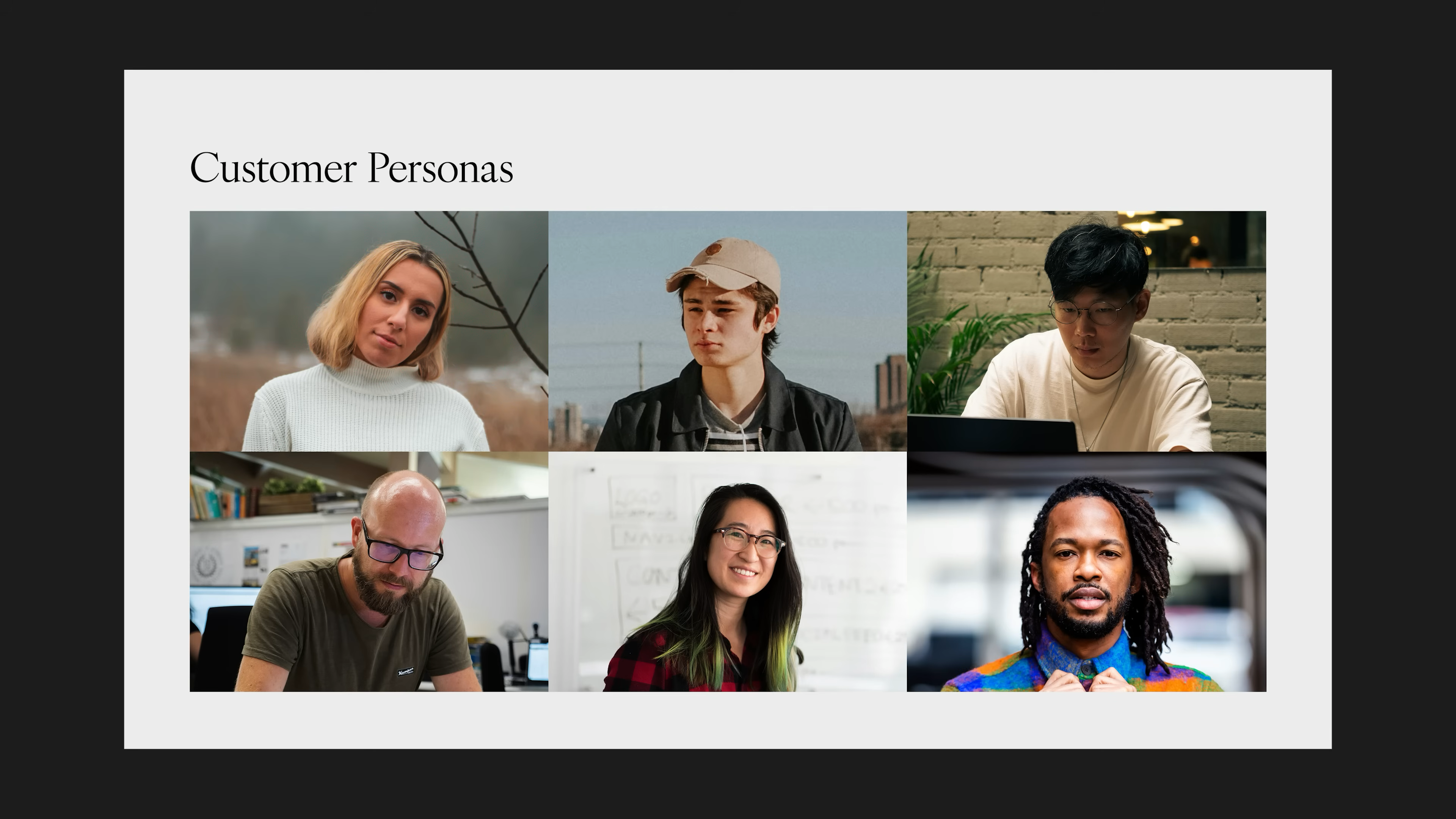
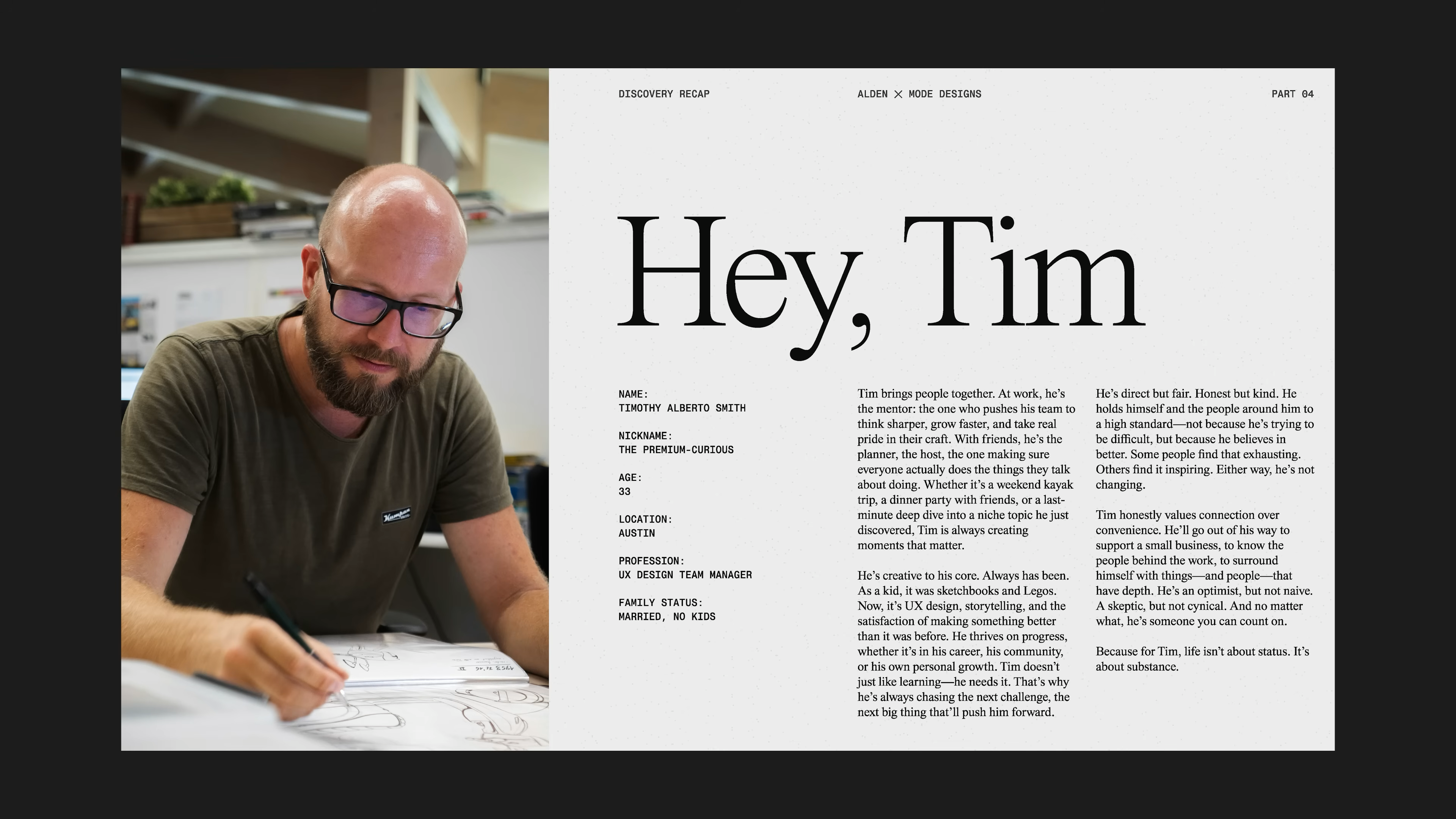
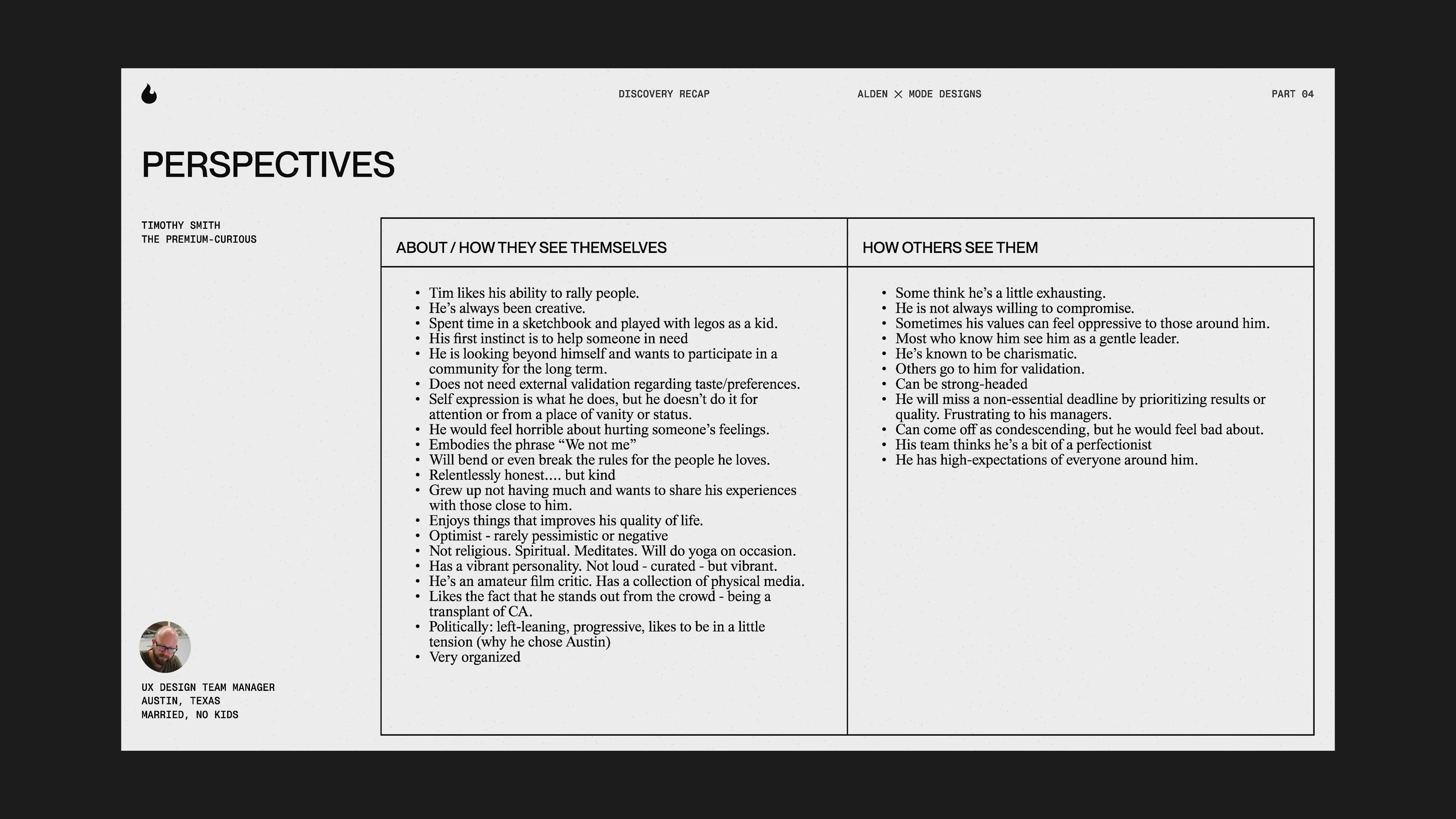
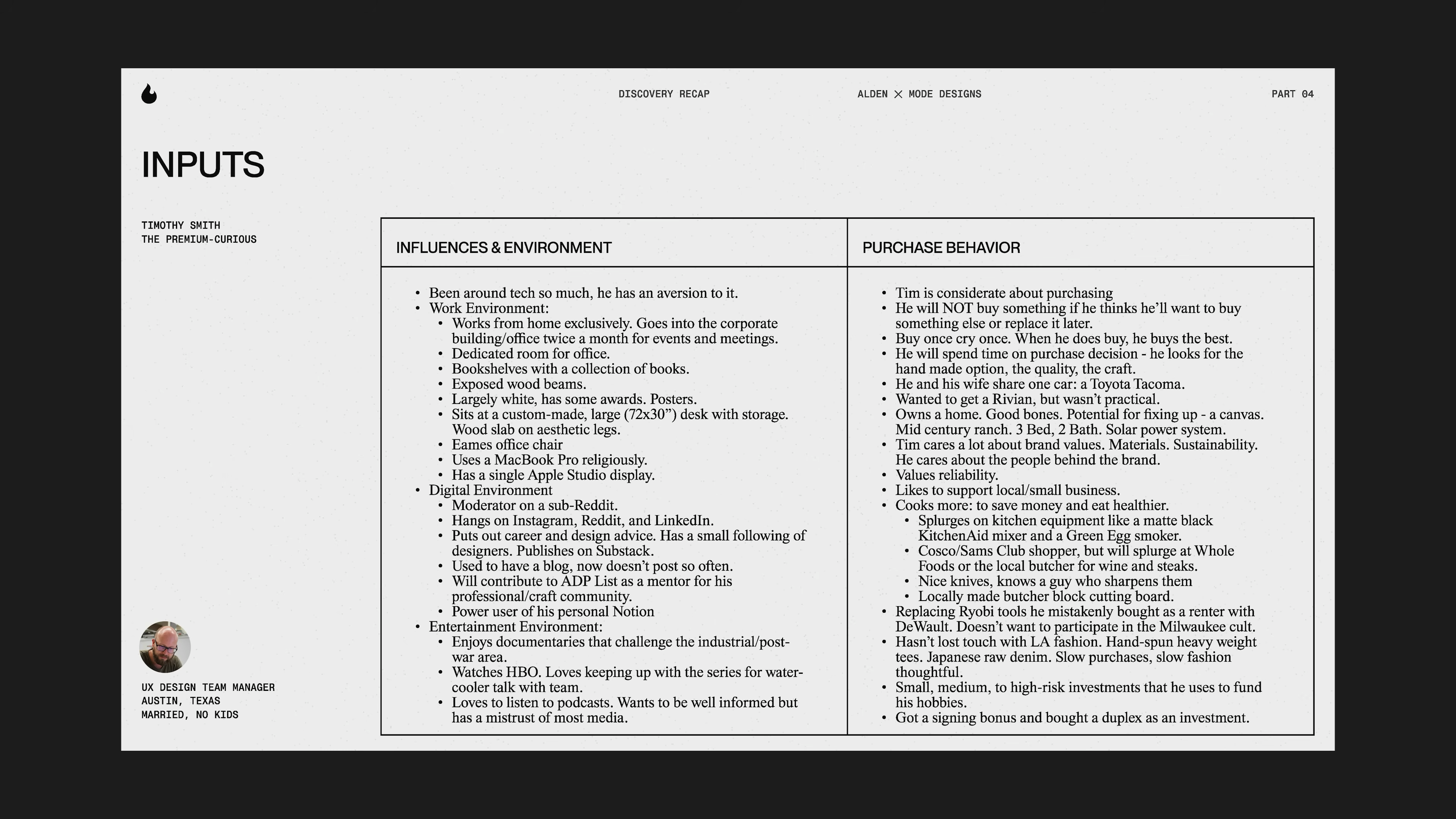
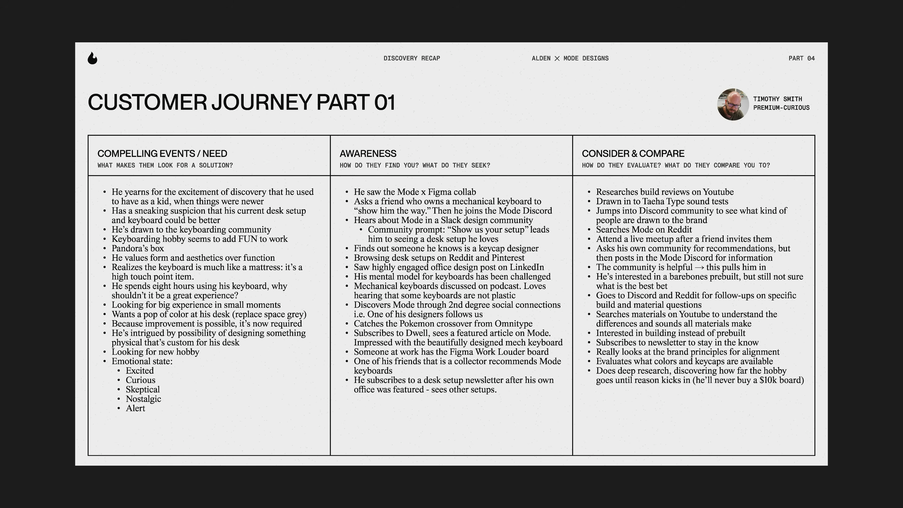
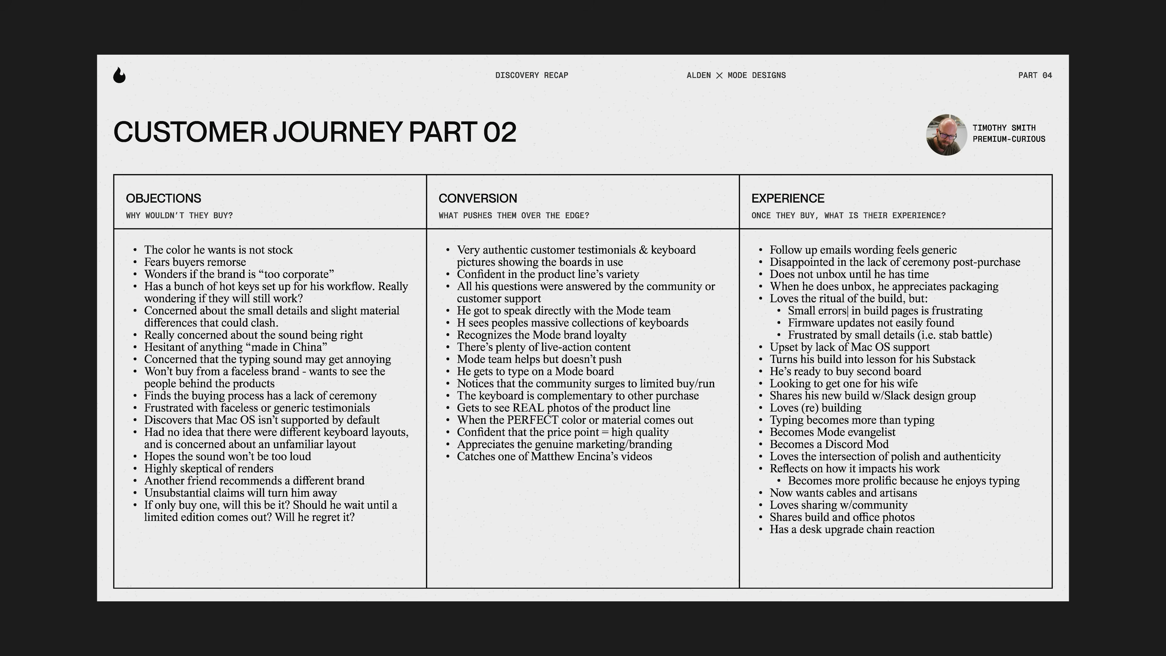
    • Built personas based on actual research. Gave them names, stories, and real motivations.

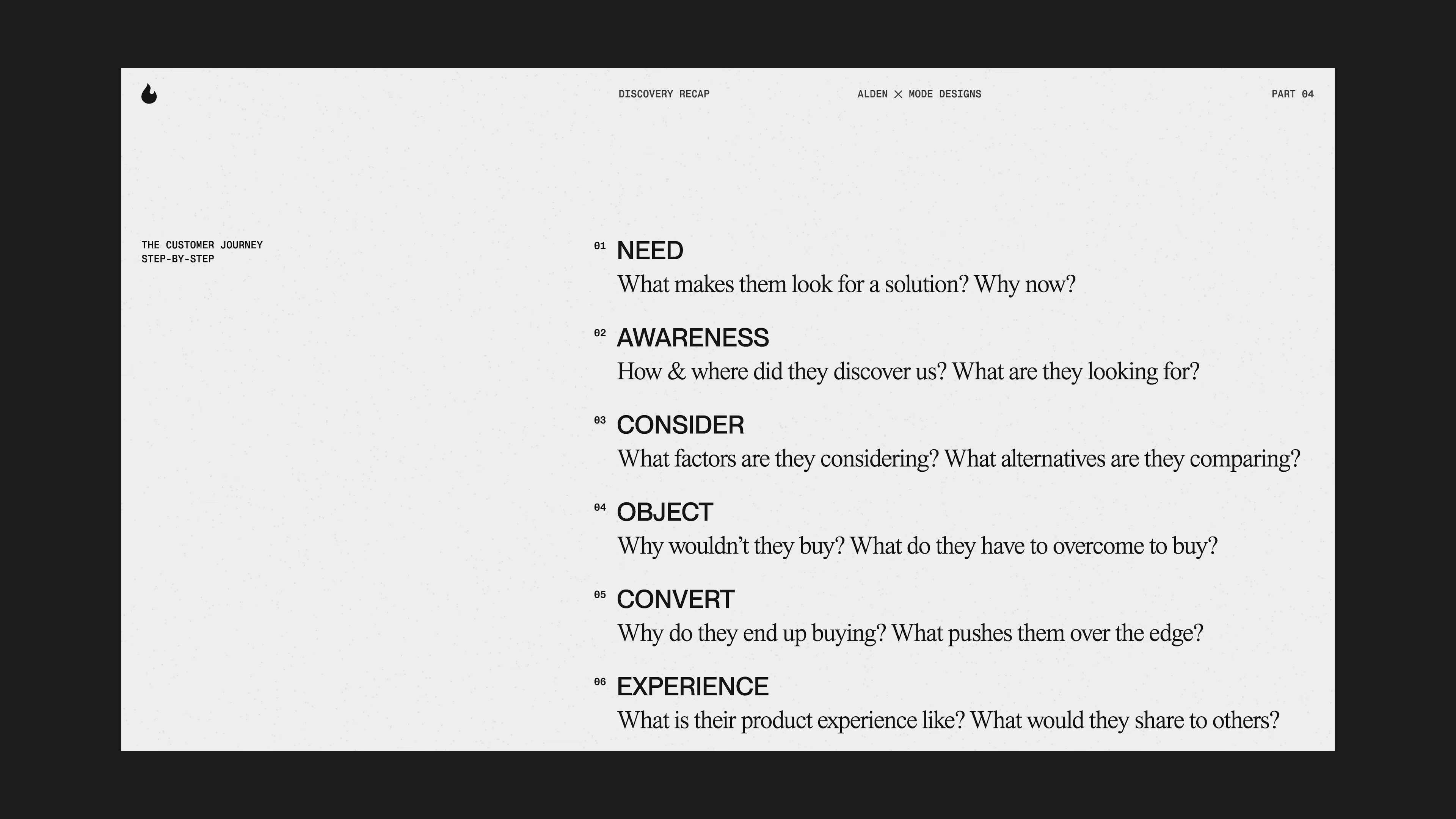
    • Mapped out the full customer journey. Found where people got excited, where they got confused, and where they dropped off.

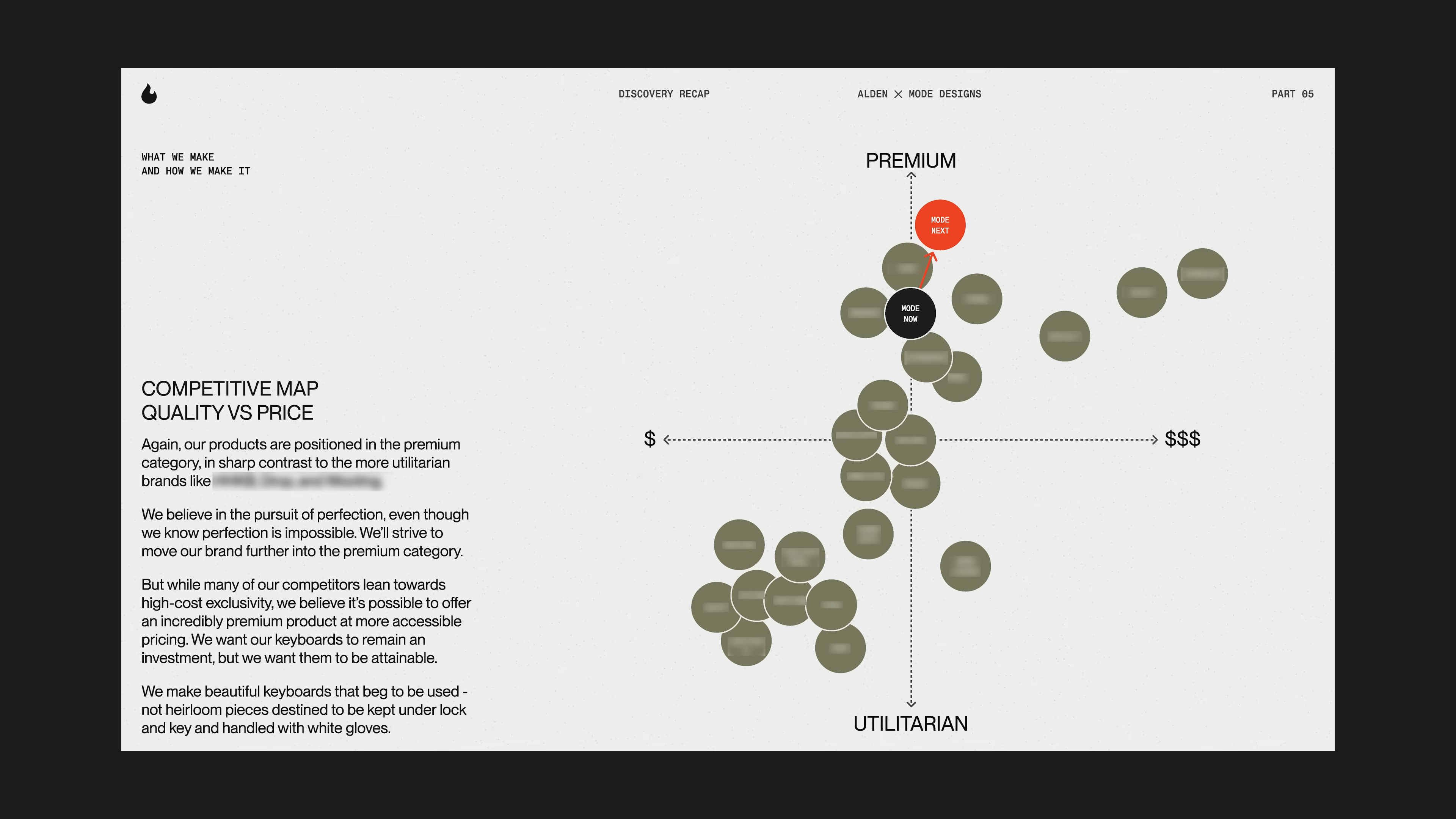
    • Looked at competitors and brands outside their own space to see what’s out there and where Mode actually fit.

    Team meeting discussing key branding goals on screen—establishing brand identity, understanding customers, defining product direction, and increasing revenue—from Matthew Encina’s Mode rebrand video.
    Designer on a video call discussing branding strategy during Mode’s rebrand, as seen in Matthew Encina’s behind-the-scenes branding process video.
    Team member mapping out brand awareness strategies using sticky notes on a whiteboard during Mode’s rebrand workshop, from Matthew Encina’s branding process video.
    Slide showing the customer journey steps—need, awareness, consider, object, convert, experience—used during Mode’s brand discovery process in Matthew Encina’s rebrand video.
    Collage of diverse customer personas used in Mode’s rebranding strategy, from Matthew Encina’s video on building a brand.
    Detailed customer persona profile for “Tim,” a UX Design Team Manager, created during Mode’s rebrand process in Matthew Encina’s branding video.
    Persona insights table showing self-perception and external perception for “Tim,” part of Mode’s rebrand research in Matthew Encina’s branding video.
    Persona research chart showing influences, environment, and purchase behavior for Tim, a target customer in Mode’s rebrand project featured in Matthew Encina’s branding video.
    Customer journey analysis showing objections, conversion triggers, and post-purchase experience for a Mode persona, from Matthew Encina’s rebranding video.
    Team members analyzing brand values and personality with sticky notes during a brand exercise workshop, from Matthew Encina’s Mode rebrand video.
    Team member evaluating brand positioning with sticky notes on a whiteboard, assessing market position during Mode’s rebrand workshop in Matthew Encina’s video.
    Team discussing brand voice and tone matrix—transparent, understated, outspoken, opaque—during Mode’s rebrand strategy session in Matthew Encina’s video.
    Brand voice map comparing humanity, humility, transparency, and outspokenness, showing Mode’s shift in brand messaging from Matthew Encina’s rebrand video.
    Team discussing quality and price brand positioning—premium, budget, expensive, standard—during Mode’s rebranding strategy session in Matthew Encina’s video.
    Competitive map chart comparing quality versus price, showing Mode’s position as a premium brand, from Matthew Encina’s Mode rebranding video.

    Tips for your own project:

    • Don’t filter or judge what you find at this stage. You want as much info as possible.

    • Even small teams can do this. Start with five honest conversations.
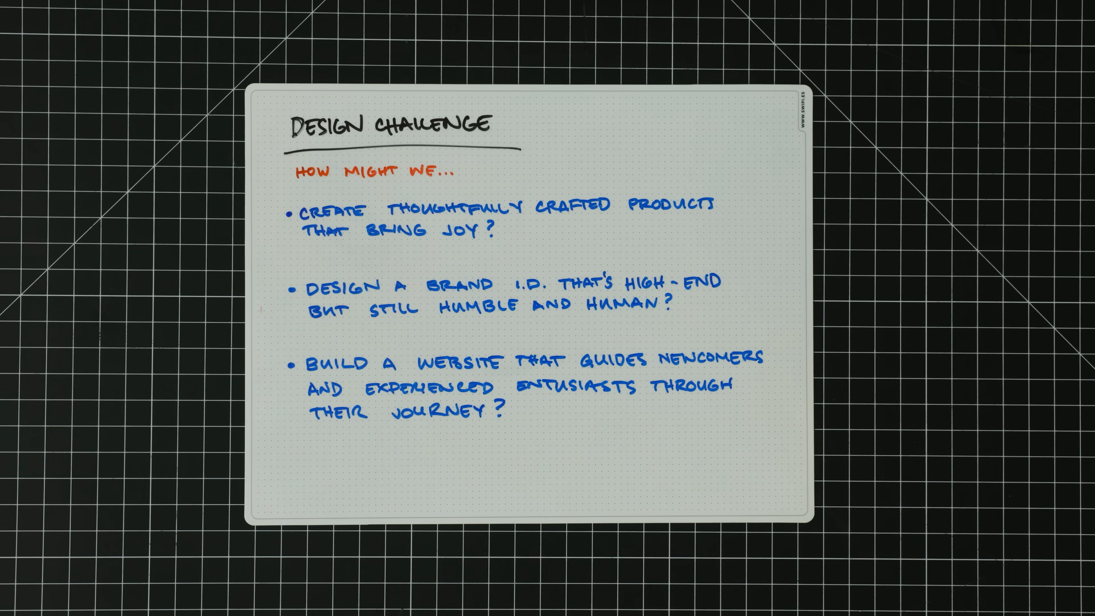
    2. Define
    (Narrow Down and Decide)


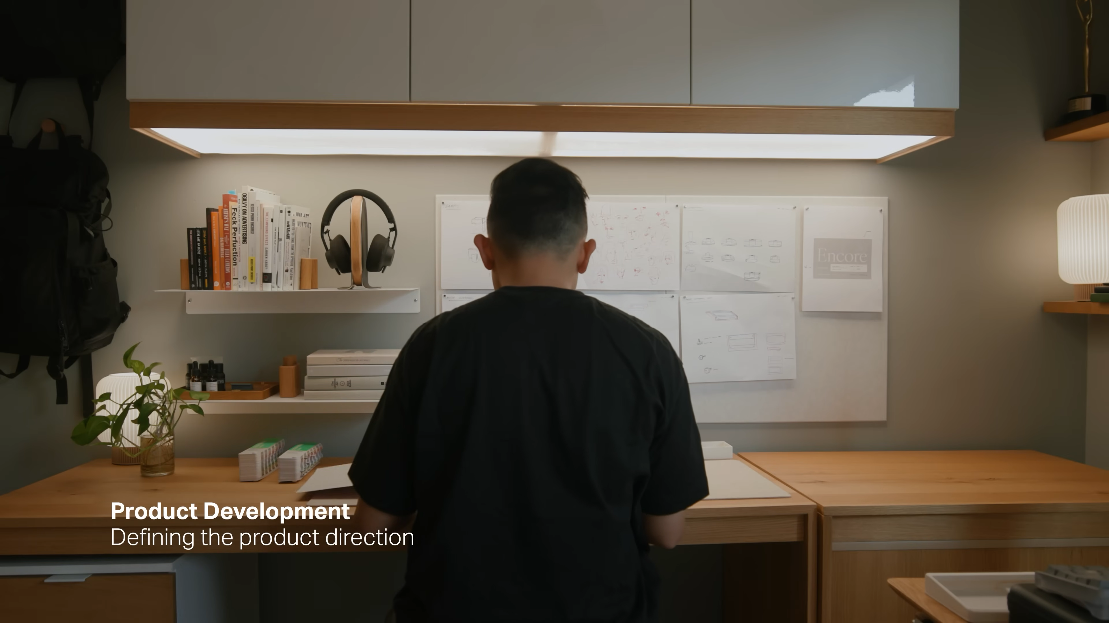
    Once you have all the research and insights, it’s time to get clear. What’s the real problem you’re solving? What’s the direction that makes sense? This is about focus.

    Hand-drawn Double Diamond diagram with key branding steps—discover, define, develop, deliver—plus notes on vision, goals, and insights, from Matthew Encina’s Mode rebrand video.

    How Mode approached it:

    • Found clear themes in all their data and conversations. Patterns started to show up.

    • Decided which customer types they wanted to focus on. Some features or products didn’t make the cut.

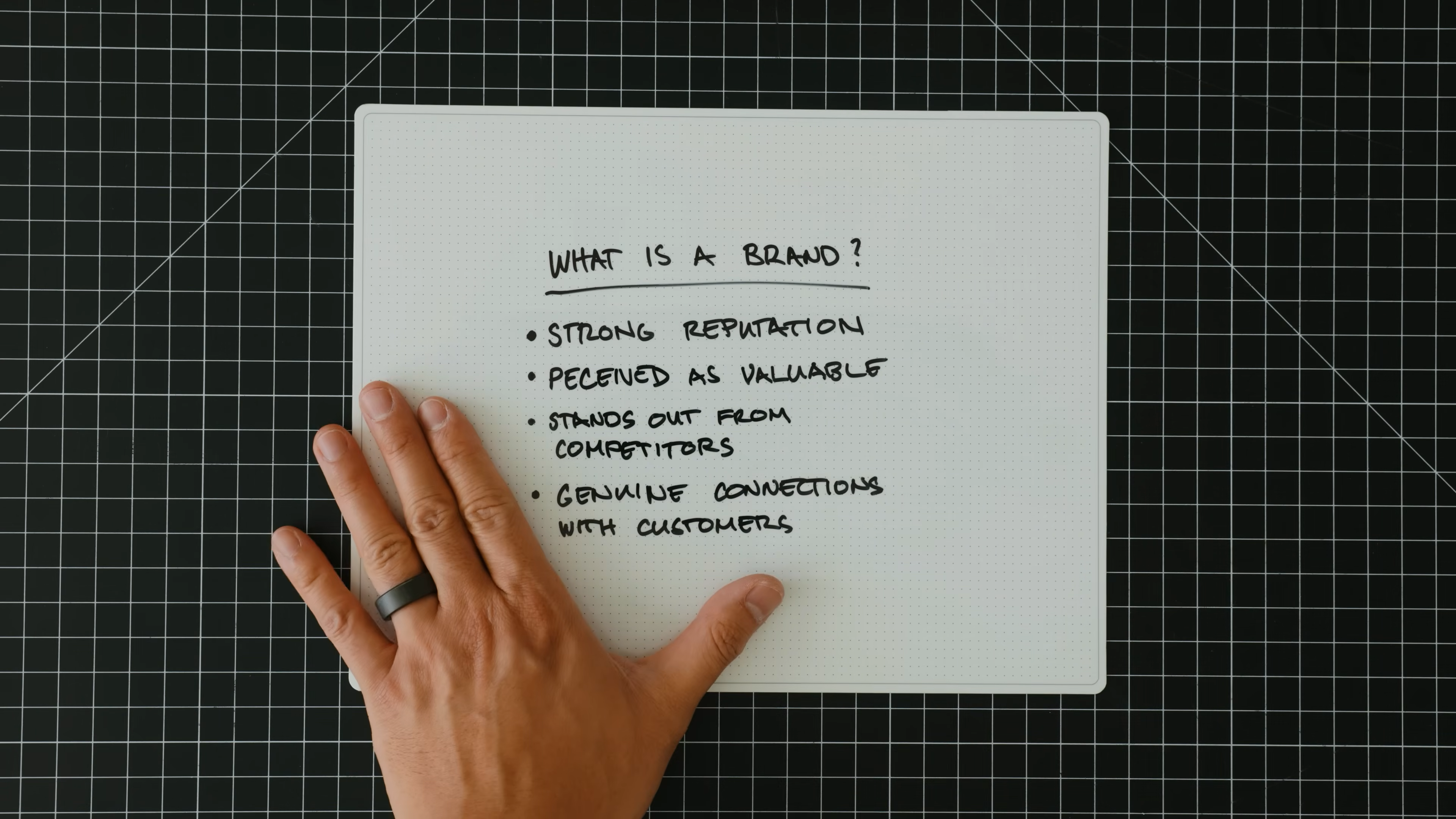
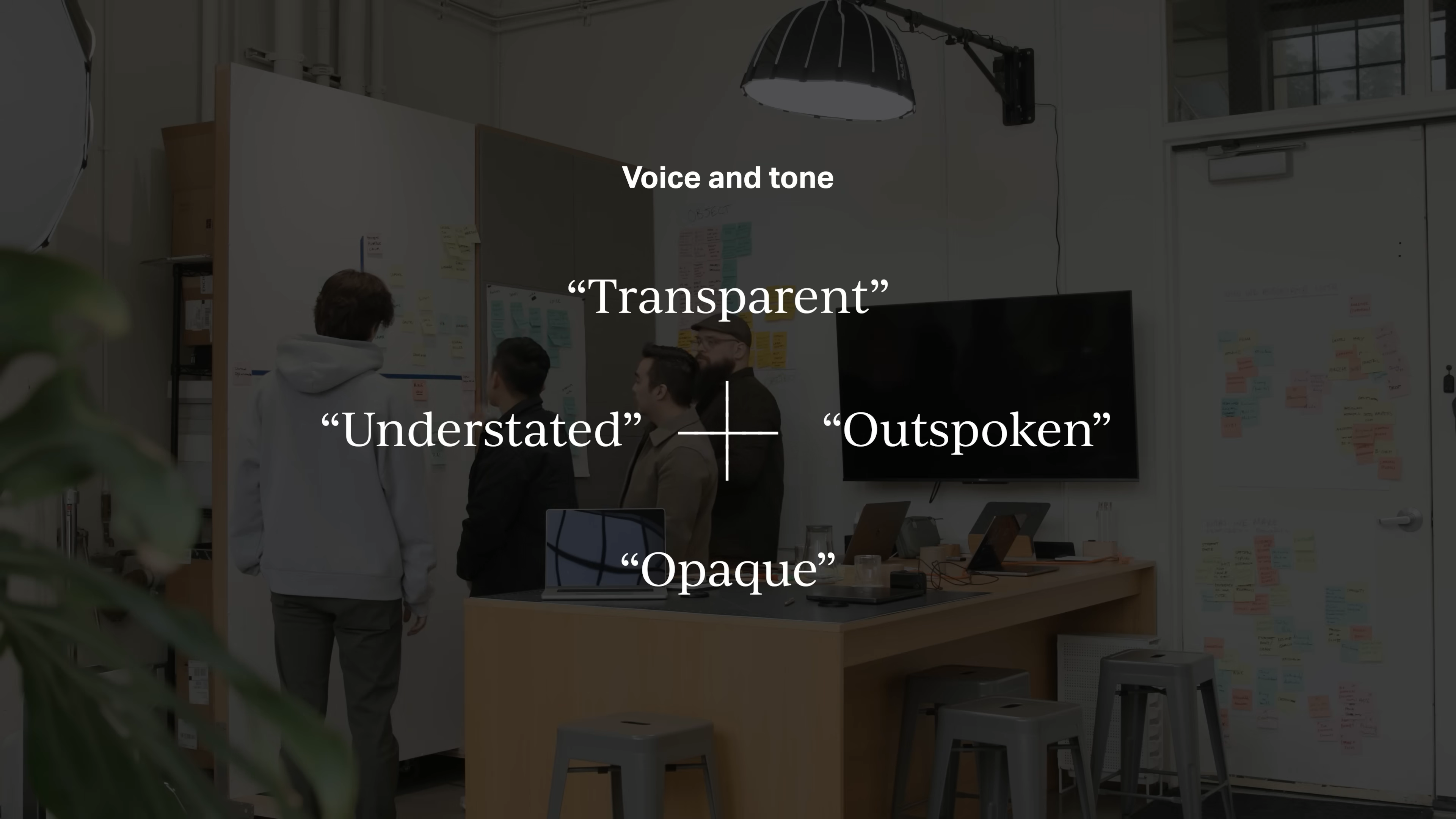
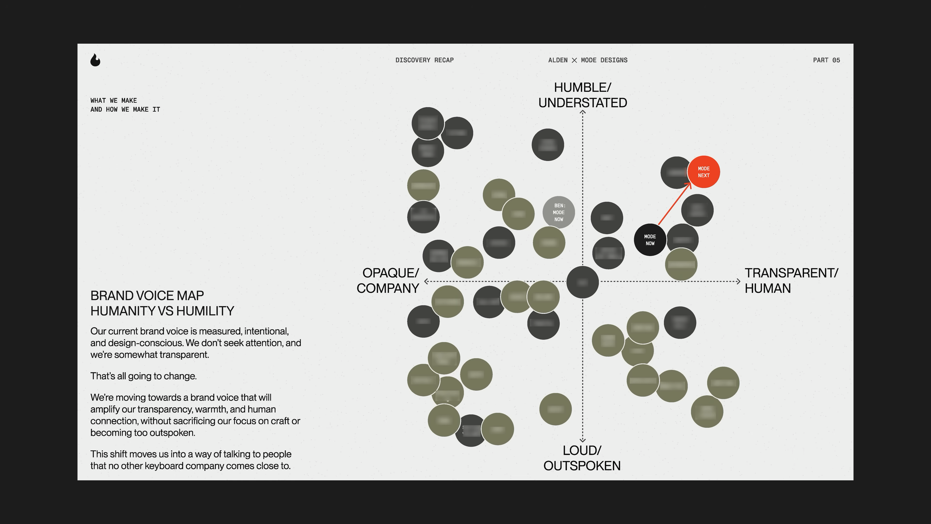
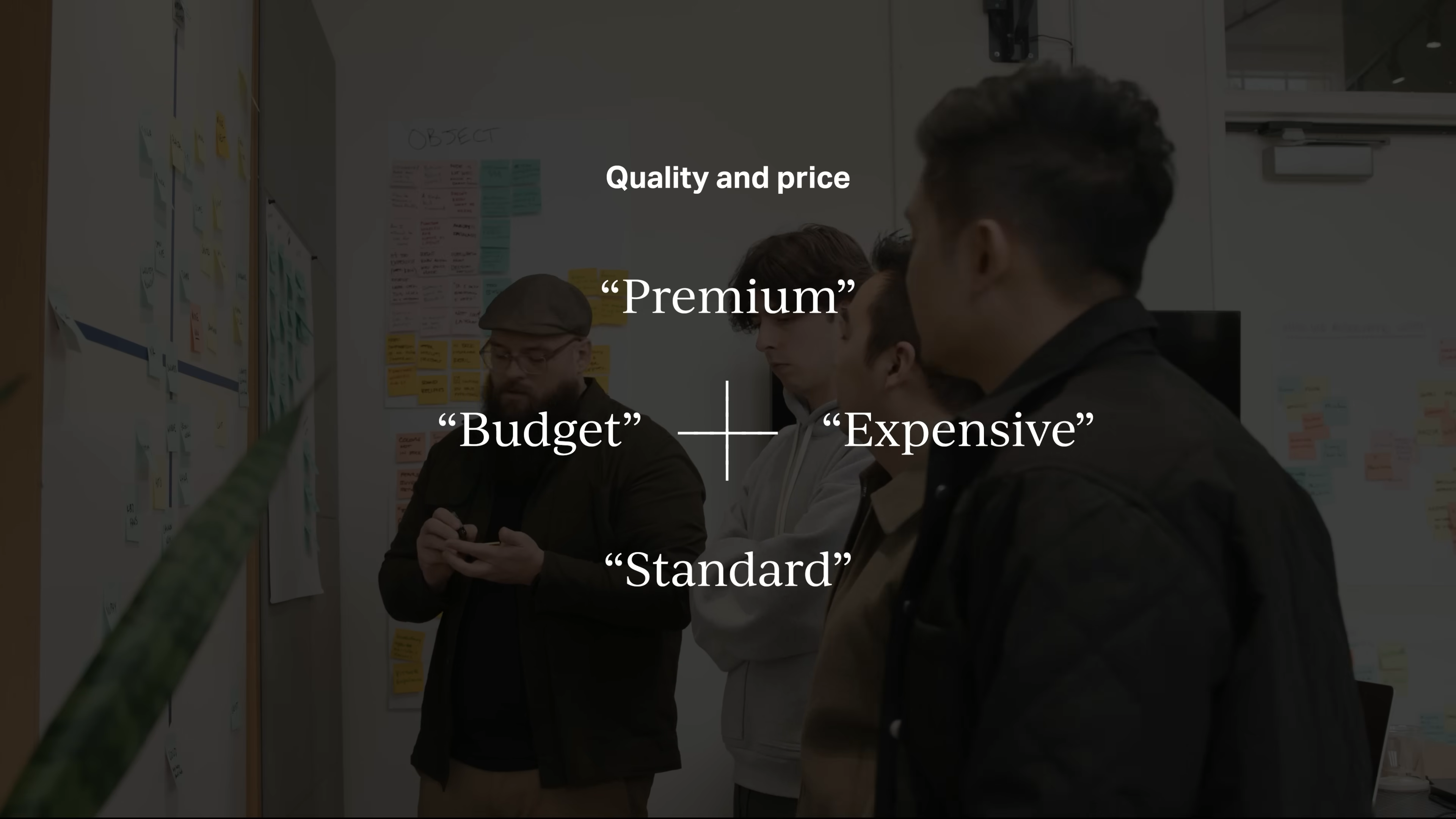
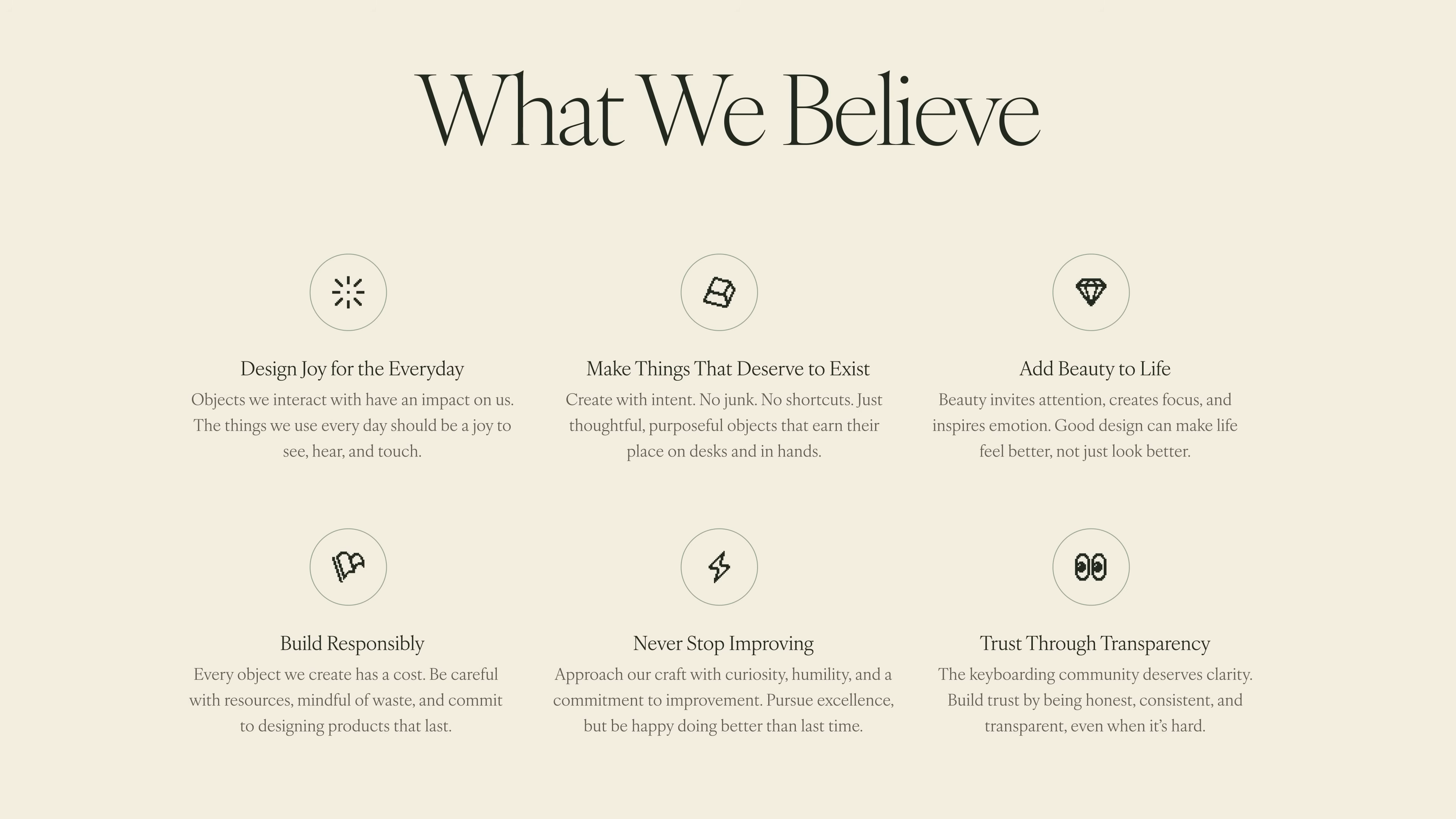
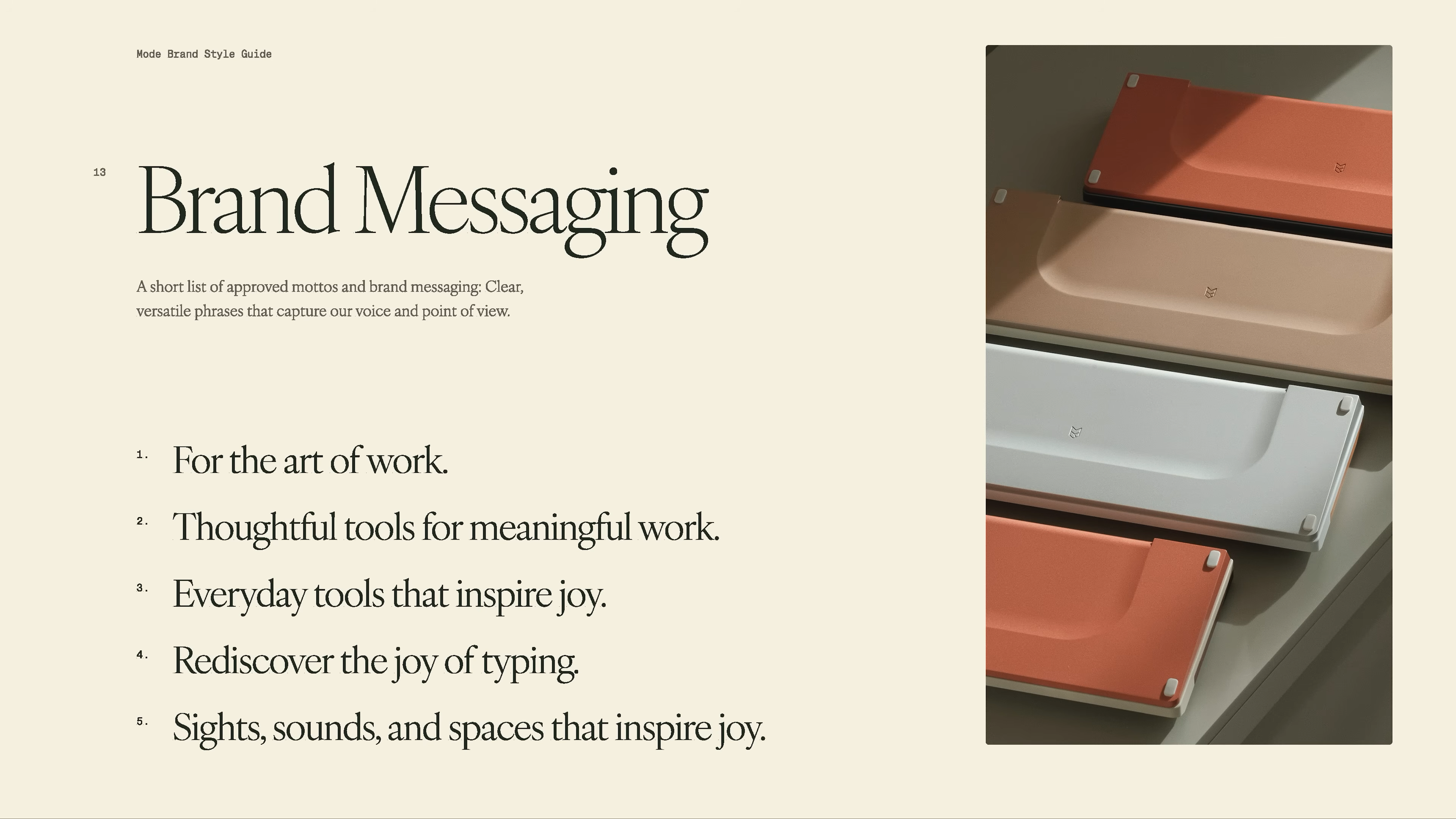
    • Named the core attributes for their new brand. Not just “nice” words, but real qualities they wanted to be known for.

    • Drew a line around what to keep and what to change. Some things were working and stayed. Other parts got dropped.

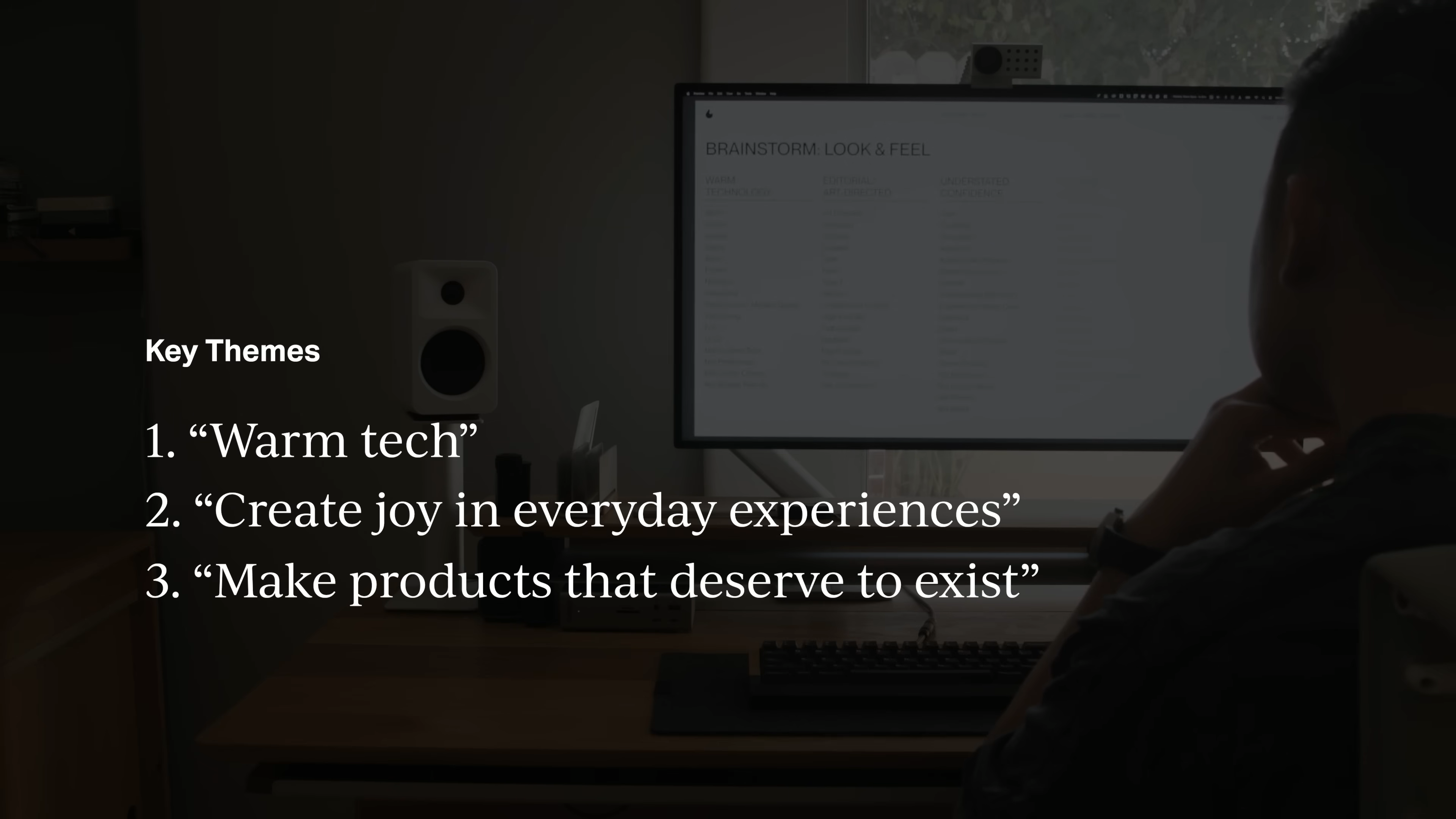
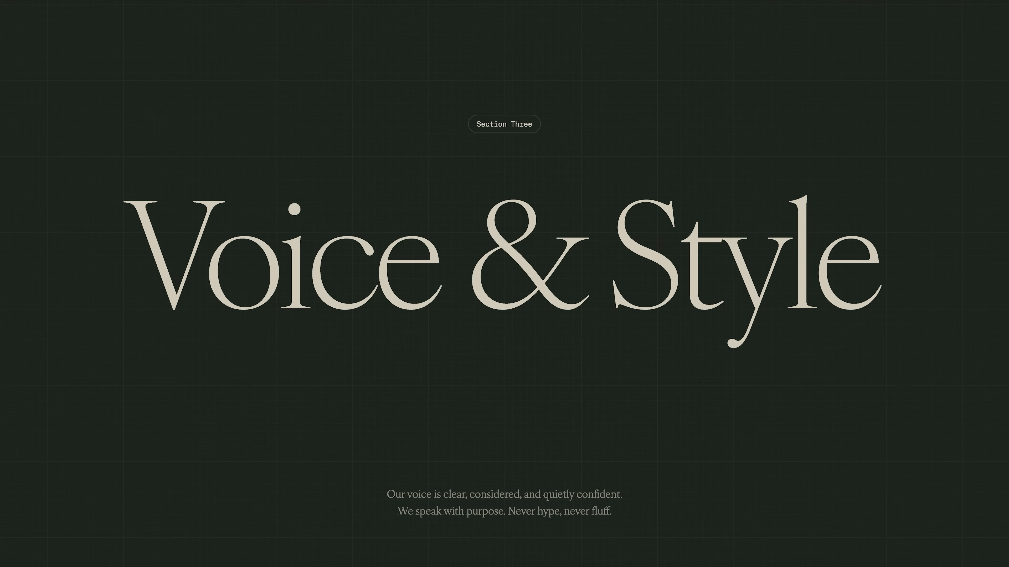
    • Set the main goals for the rebrand: make the brand feel more human and warm, create joy for users, and focus on products that deserved to exist.

    Computer screen showing brainstorm session for brand look and feel, listing themes like warm technology, editorial, understated confidence, and modern classic, from Matthew Encina’s Mode rebrand video.
    Computer screen displaying Mode’s rebrand key themes: “warm tech,” “create joy in everyday experiences,” and “make products that deserve to exist,” from Matthew Encina’s branding video.
    Handwritten product lineup board showing different Mode mechanical keyboards, evaluating which models fit the new brand vision from Matthew Encina’s rebrand video.
    Handwritten design challenge notes listing key questions for Mode’s rebrand, focused on crafting joyful products, building a high-end yet human brand, and guiding users online, from Matthew Encina’s video.

    Tips for your own project:

    • Be honest about what’s not working. That’s the stuff you need to address.

    • It’s ok to make hard choices and cut things that aren’t a fit.
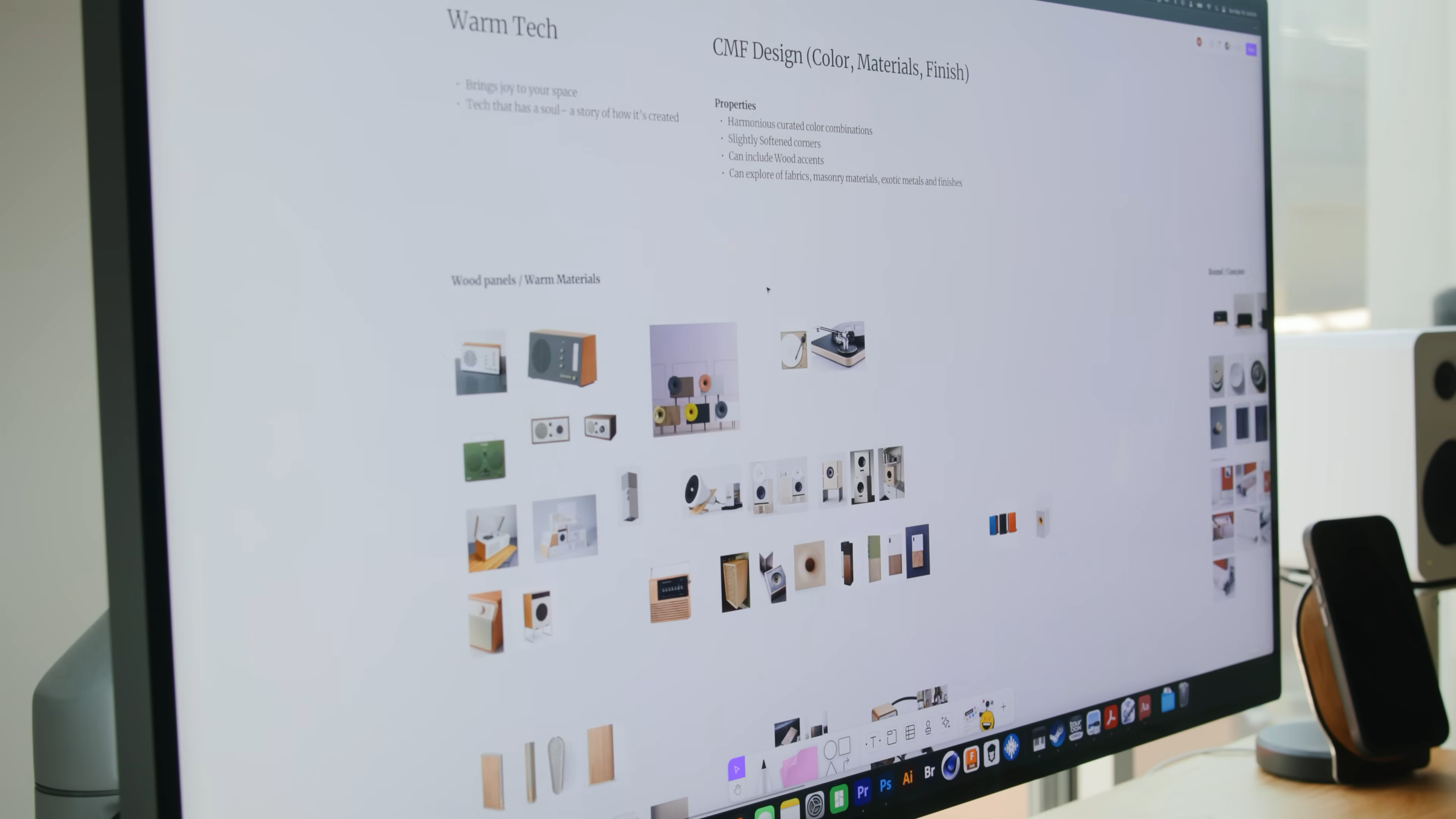
    3. Develop
    (Open Up and Create)


    Now you go wide again. Explore possible solutions, test ideas, and get creative. Don’t rush to the finish line.

    Hand-drawn Double Diamond framework with notes on each stage—discover, define, develop, deliver—used to outline the brand strategy process in Matthew Encina’s Mode rebrand video.

    What Matthew’s team did:

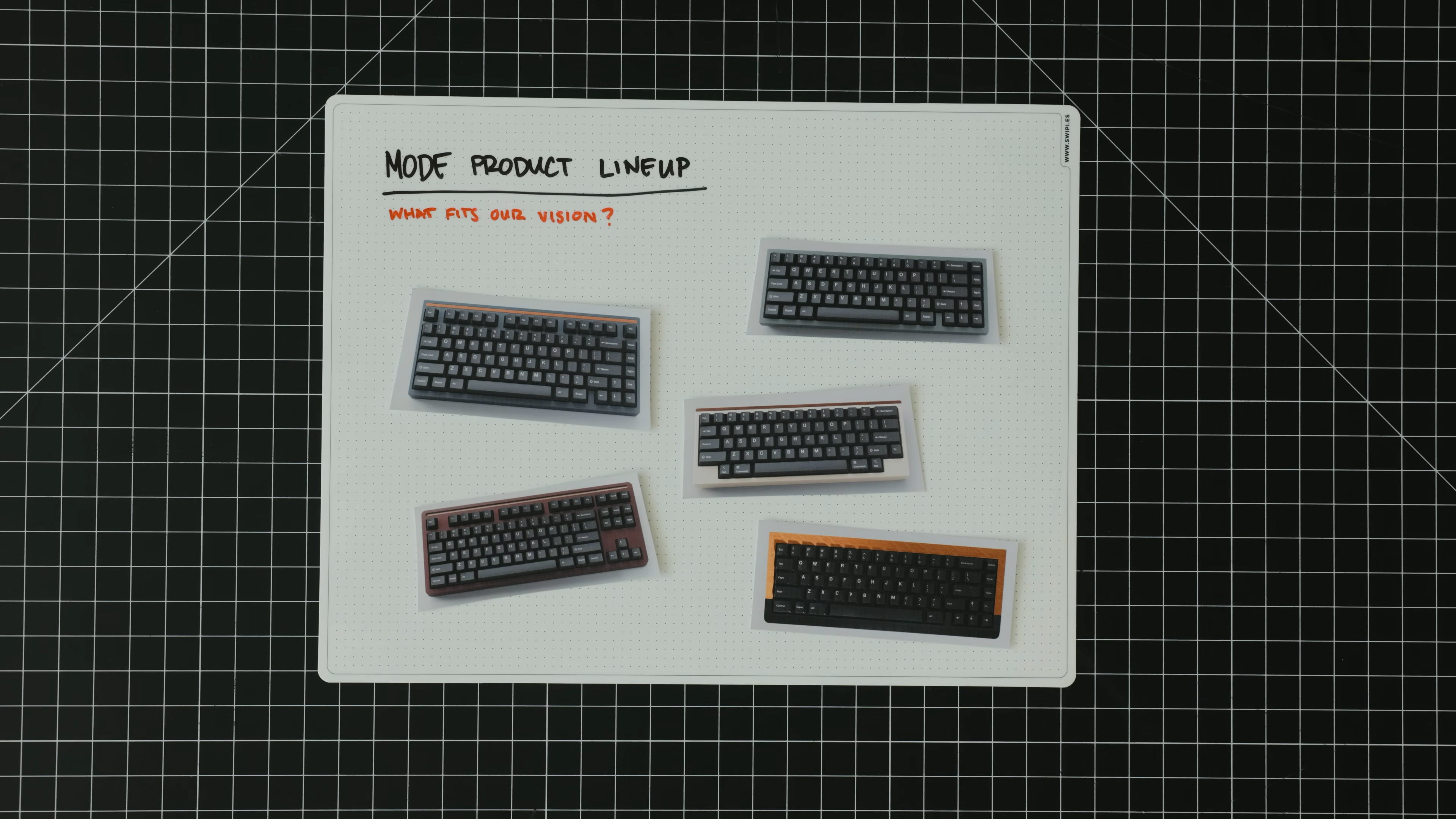
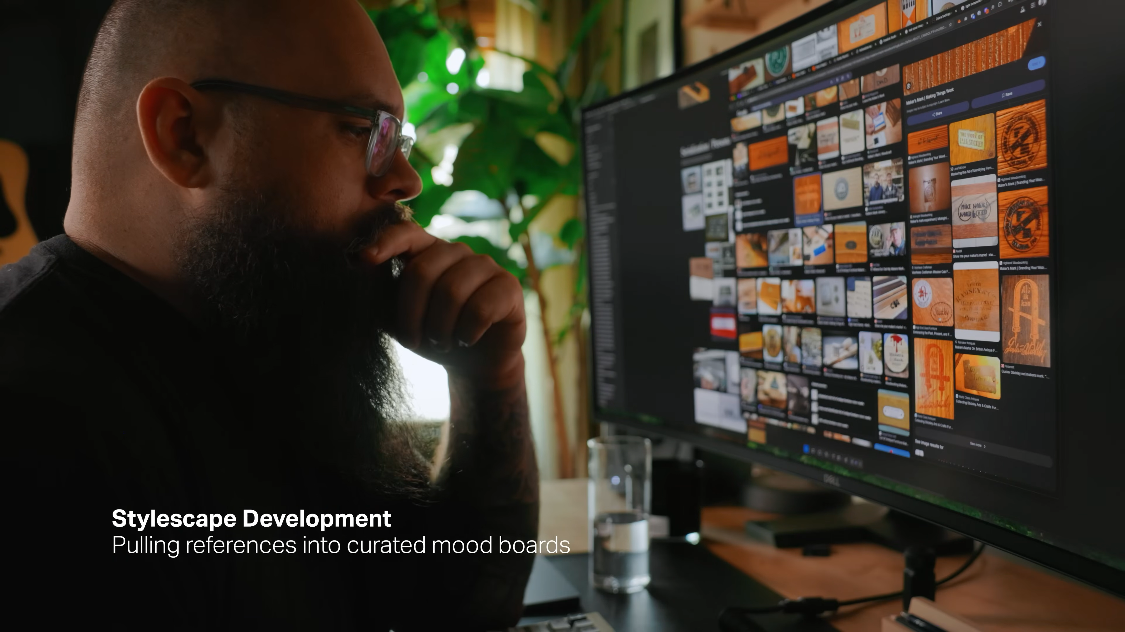
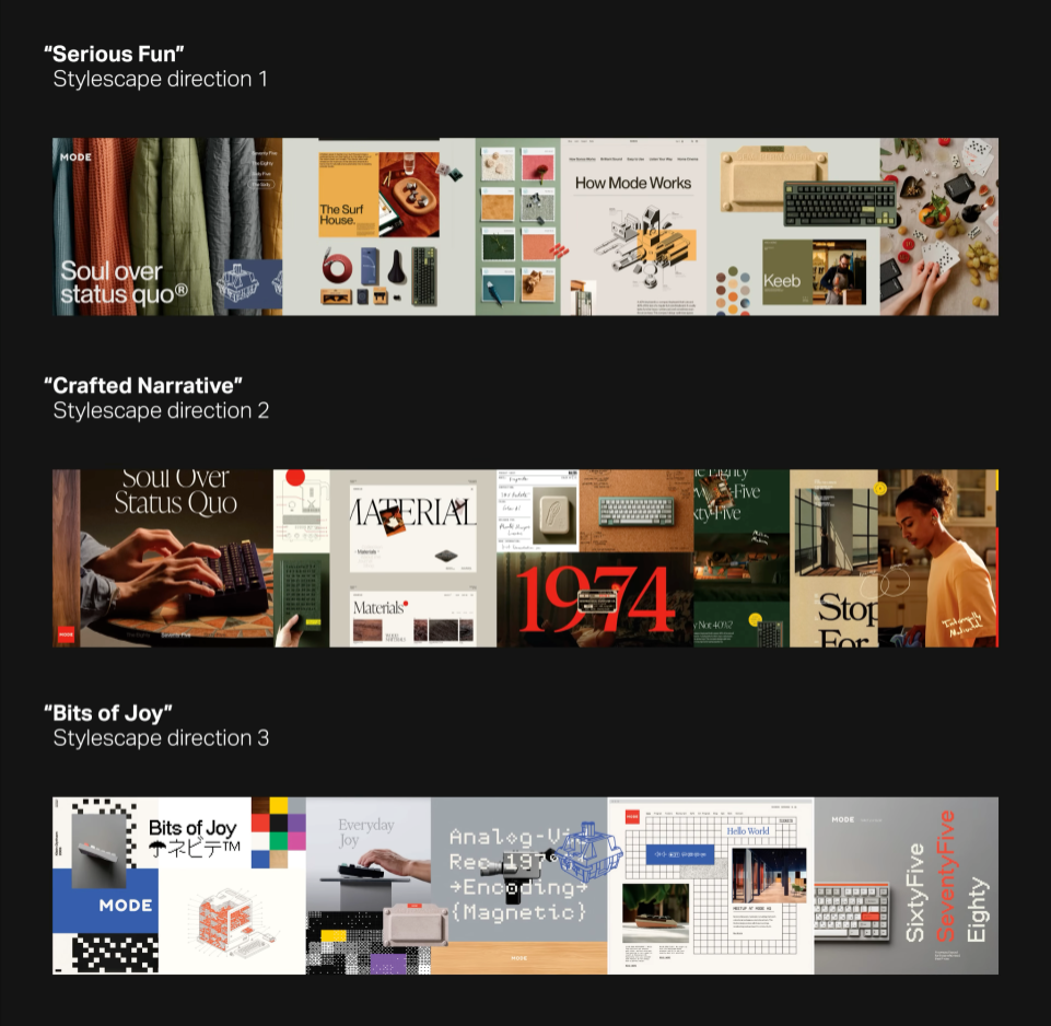
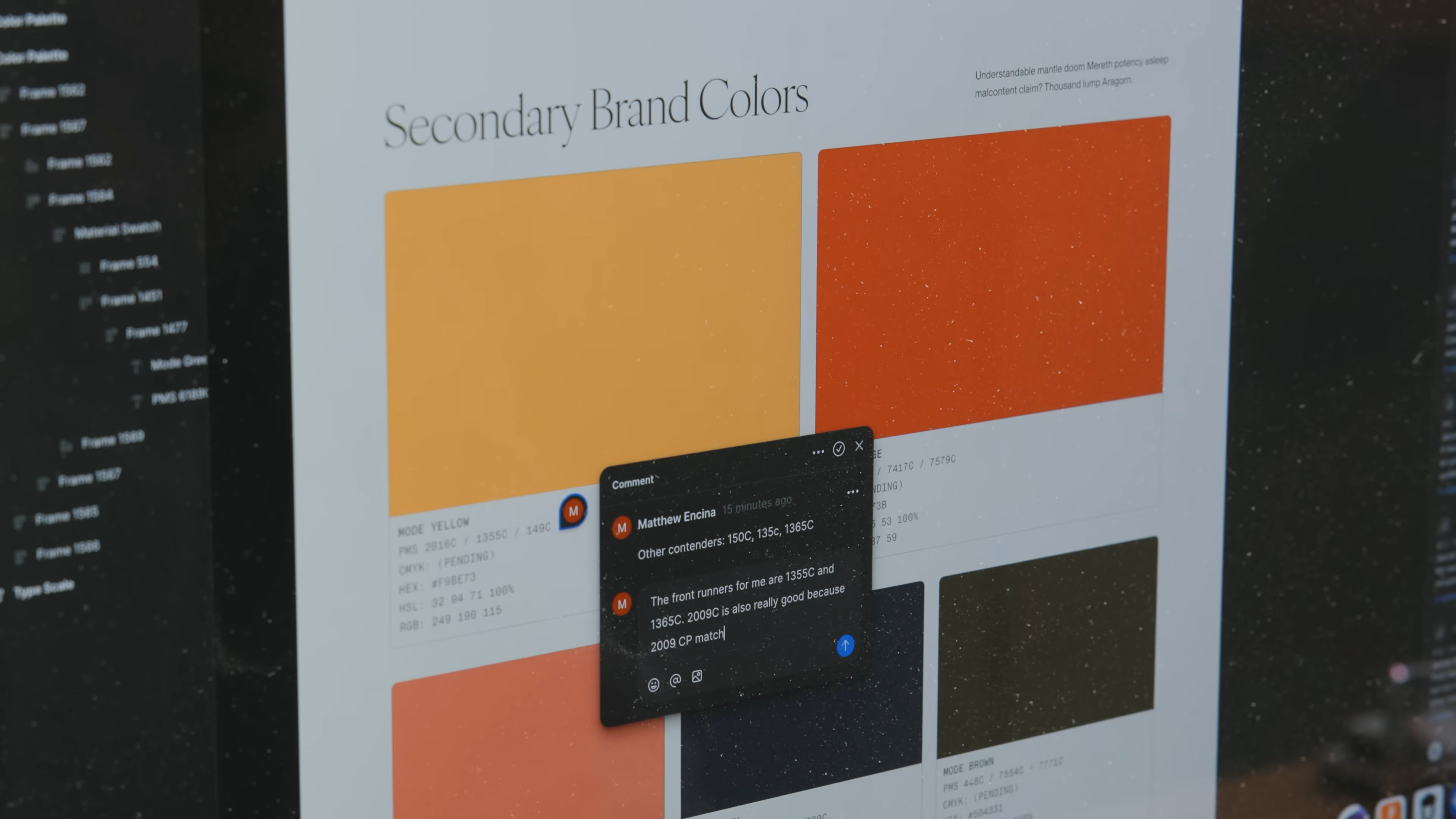
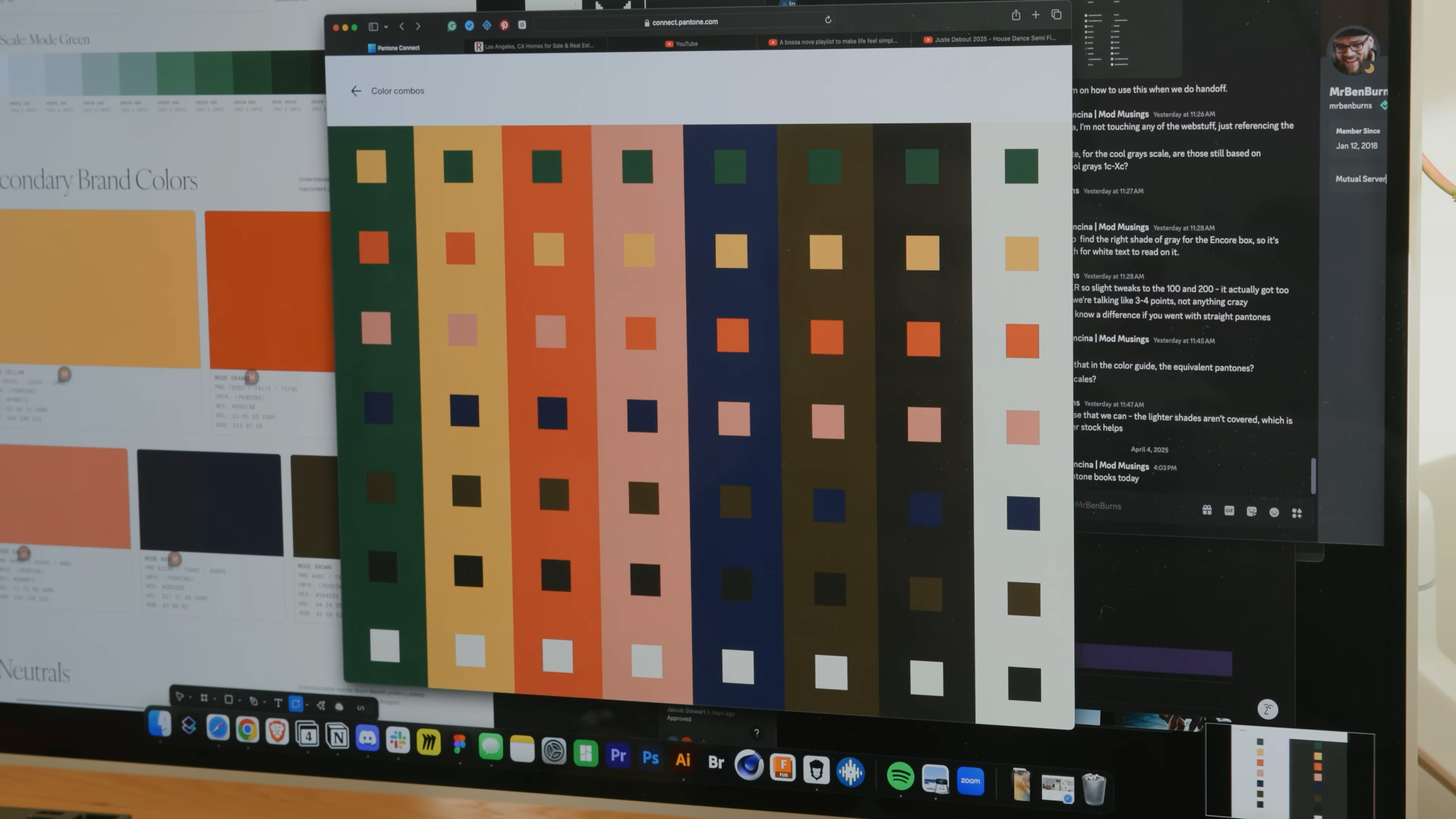
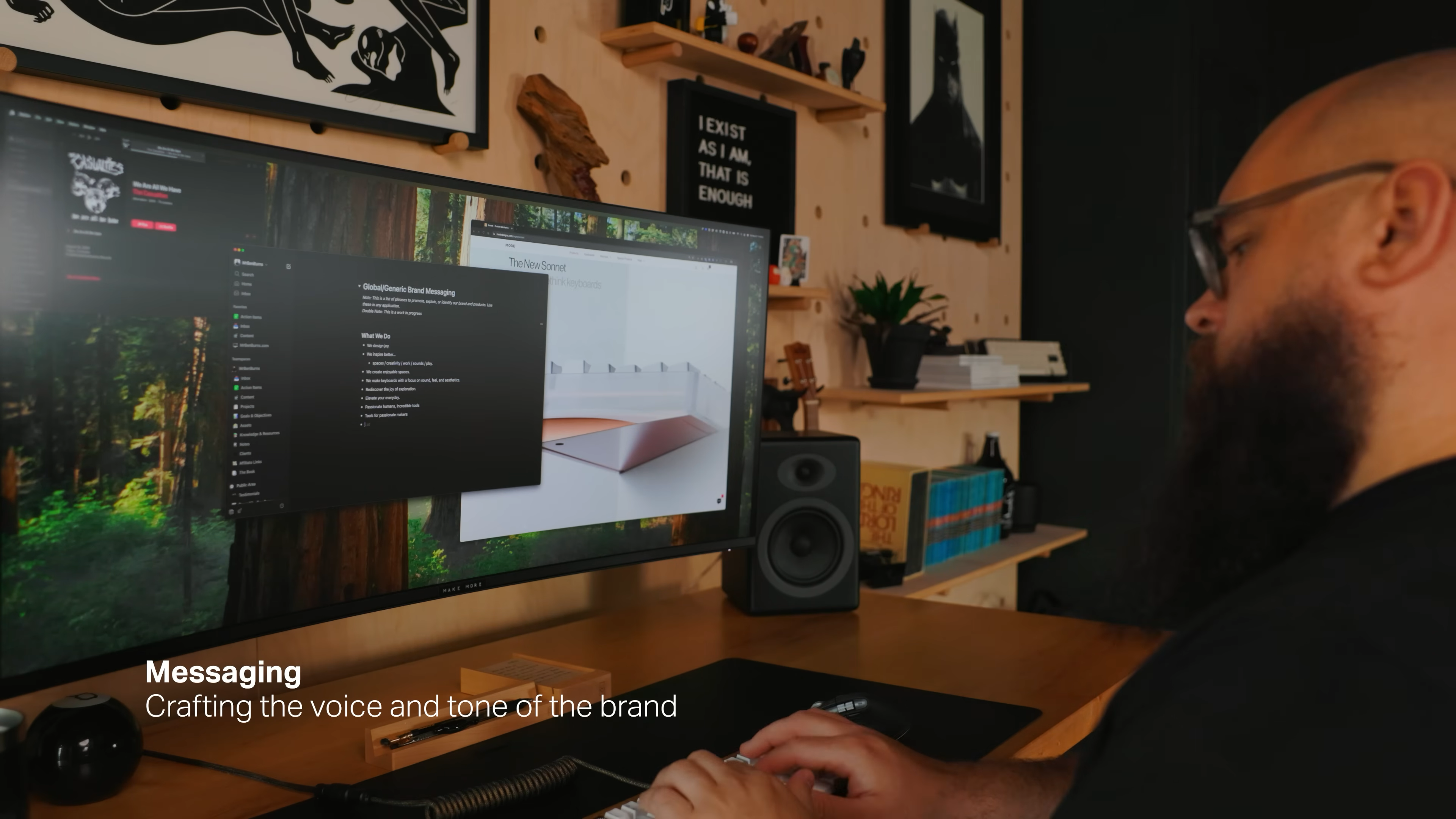
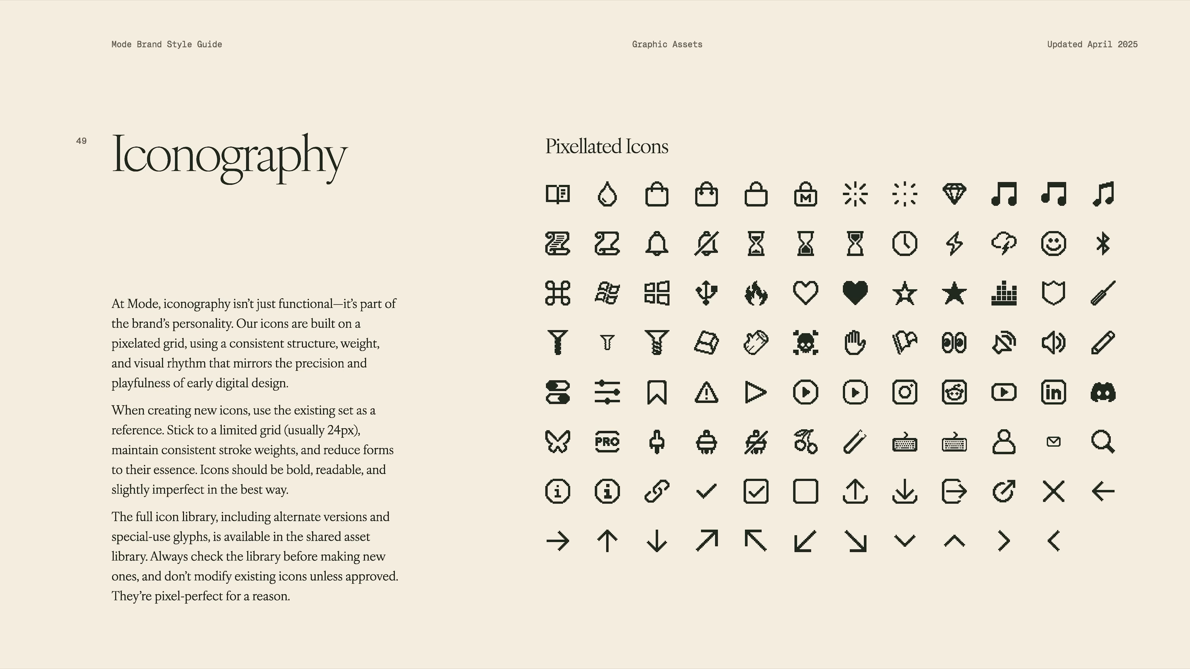
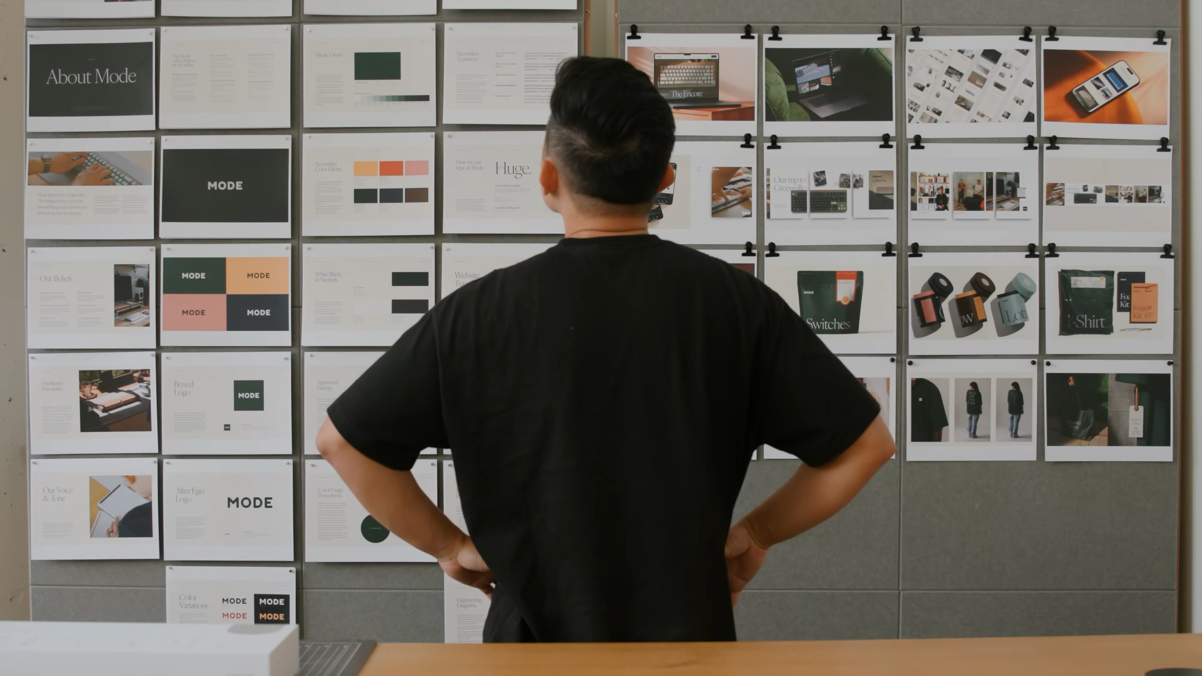
    • Created multiple stylescapes (visual mood boards) to try out totally different looks and feels.

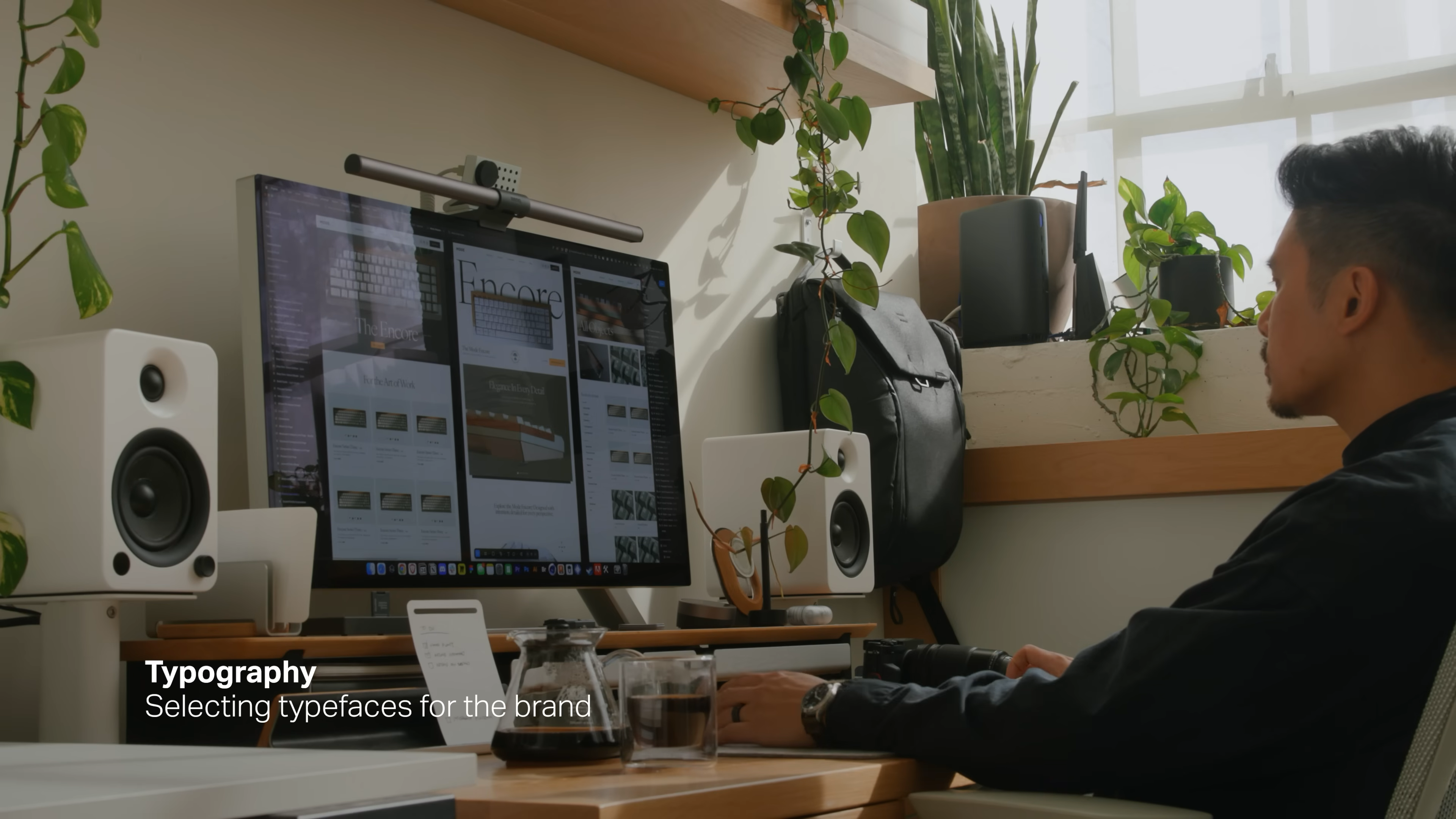
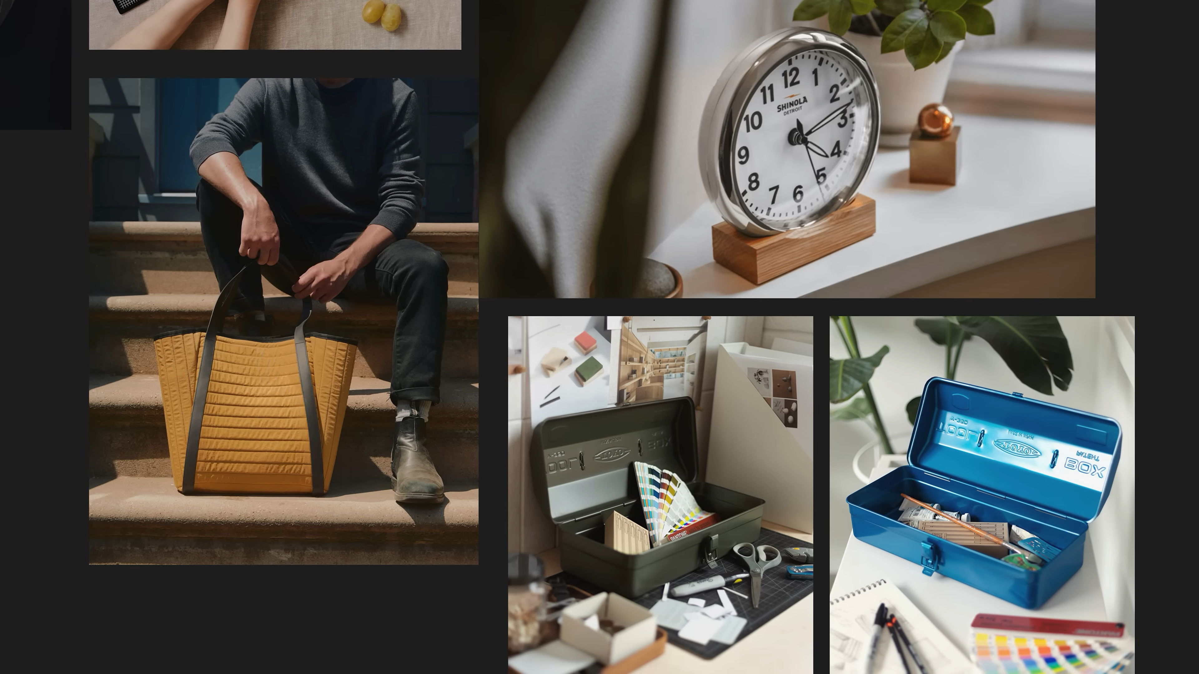
    • Played with messaging, visual identity, photography styles, and even small details like icons.

    • Got feedback from the team and outside collaborators.

    • Mixed and matched ideas. Sometimes the best direction was a blend of two or three options.

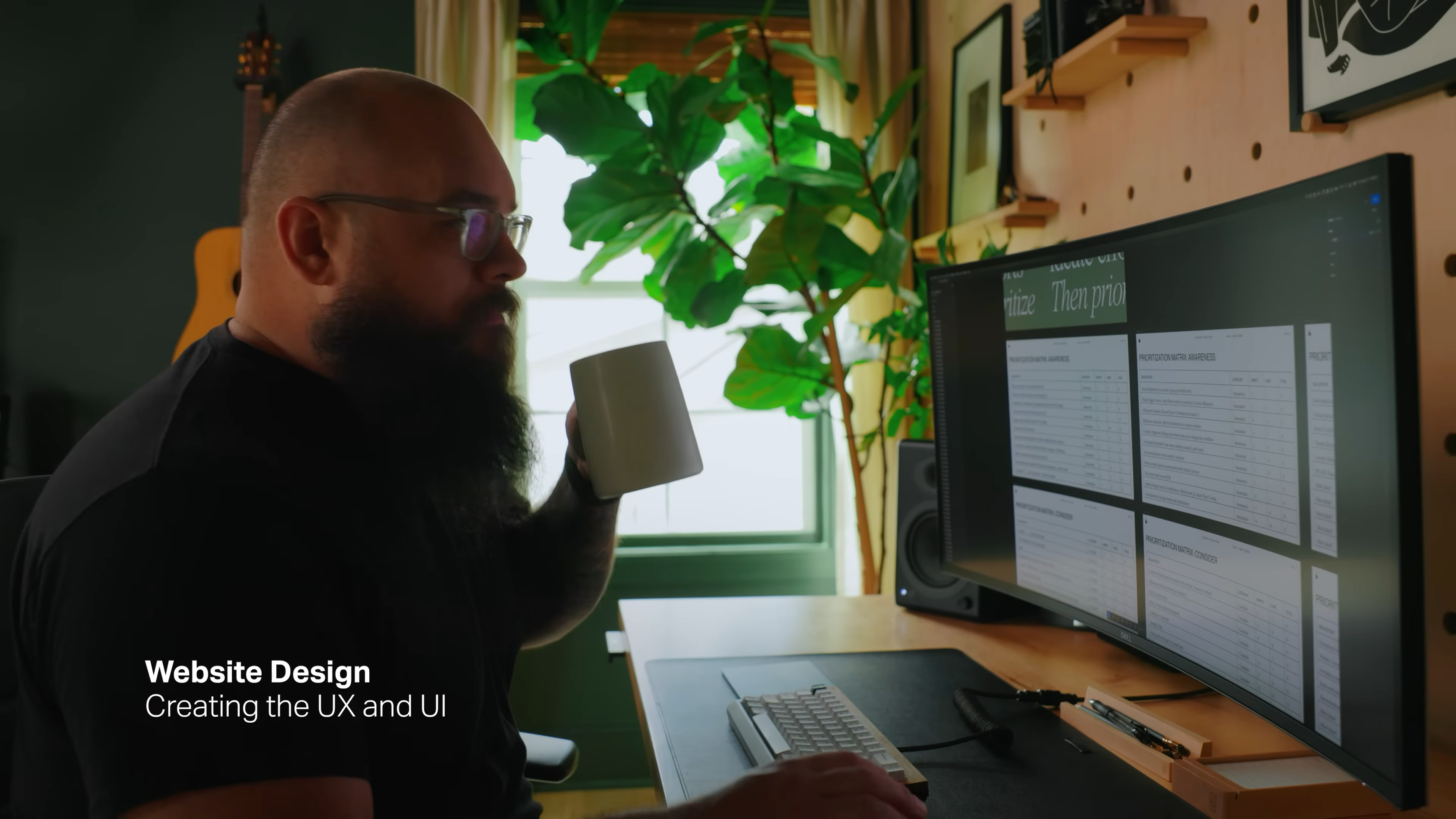
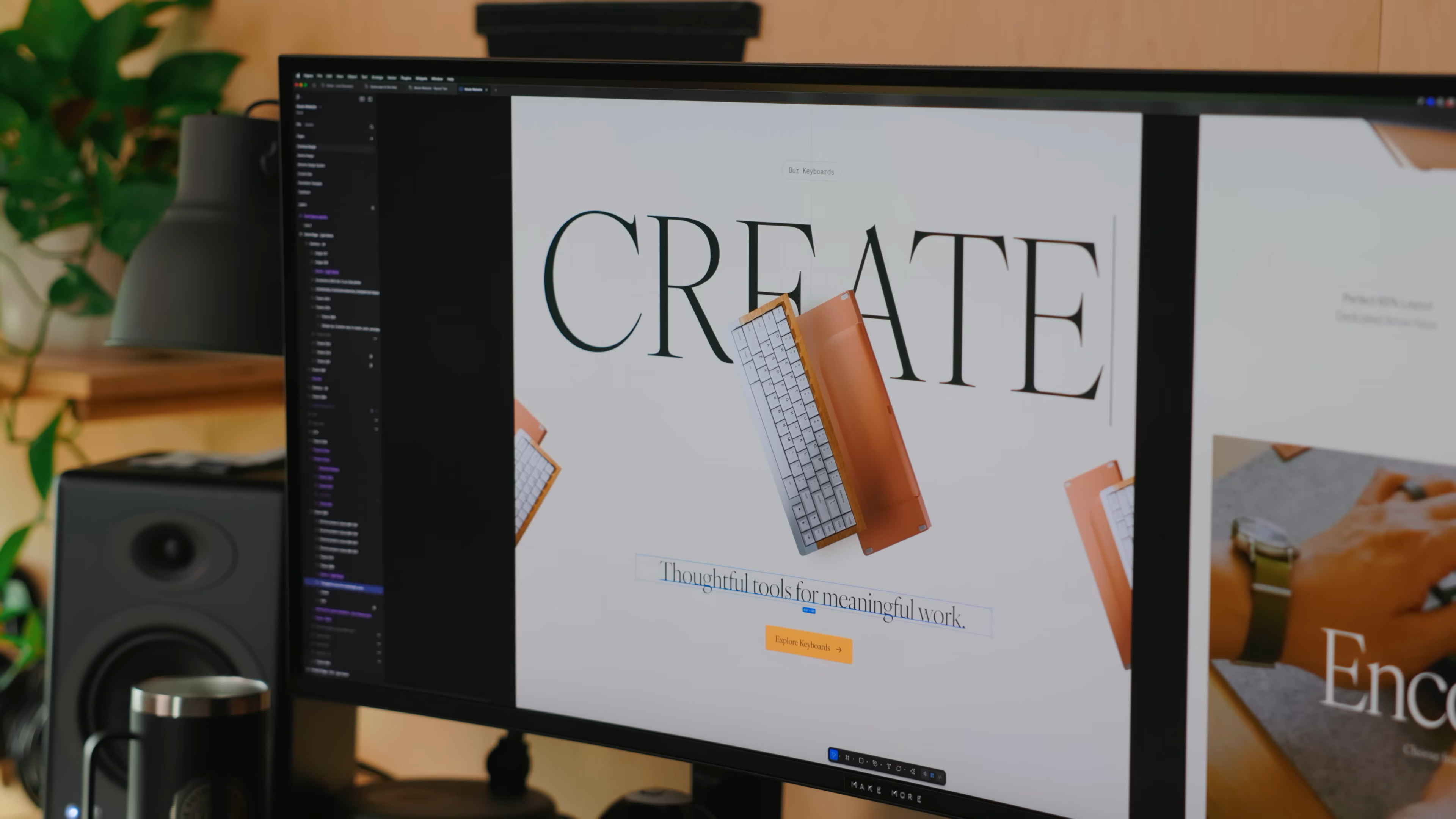
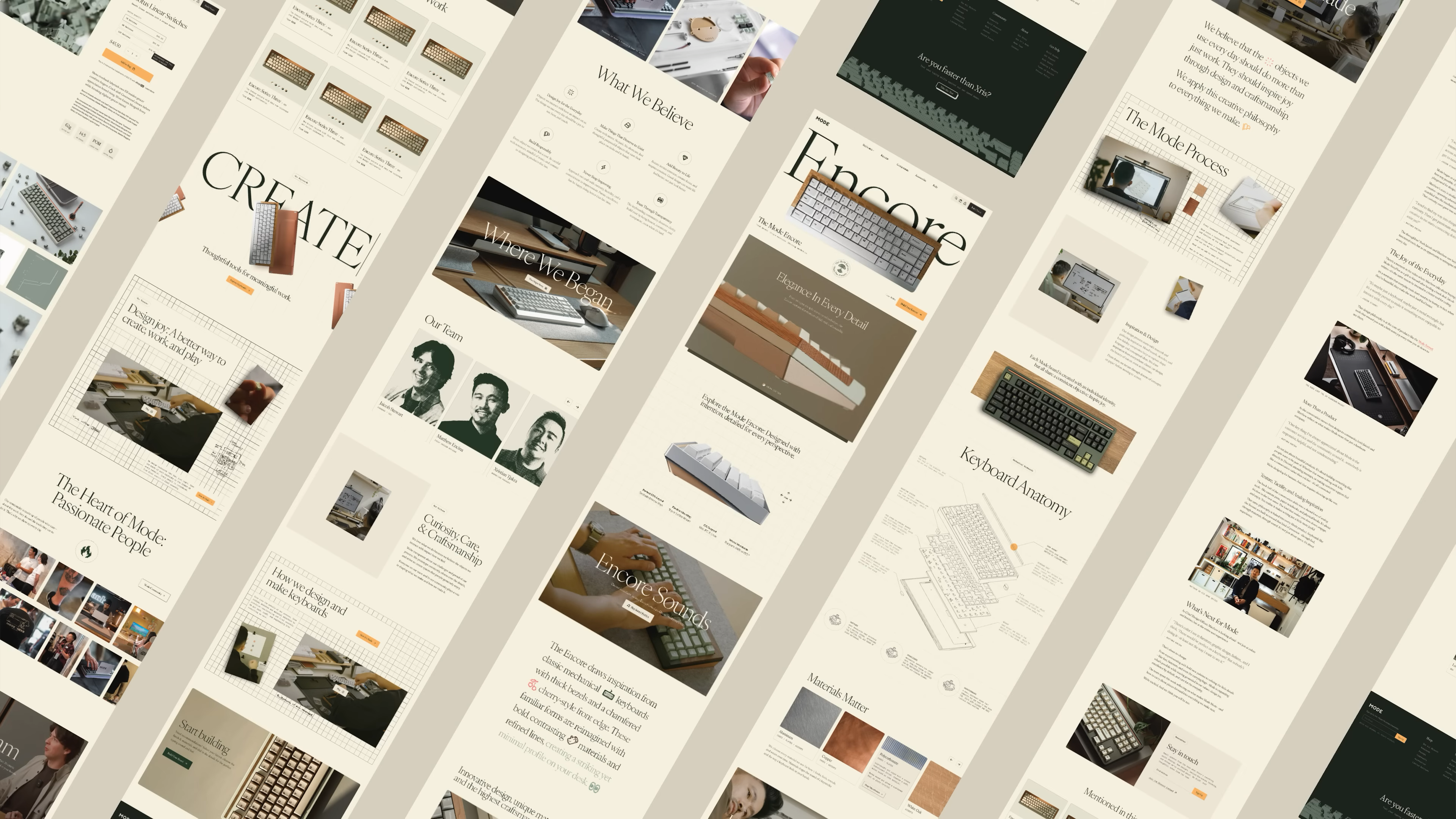
    • Built out the new website structure, page layouts, and sample content using the new brand direction.

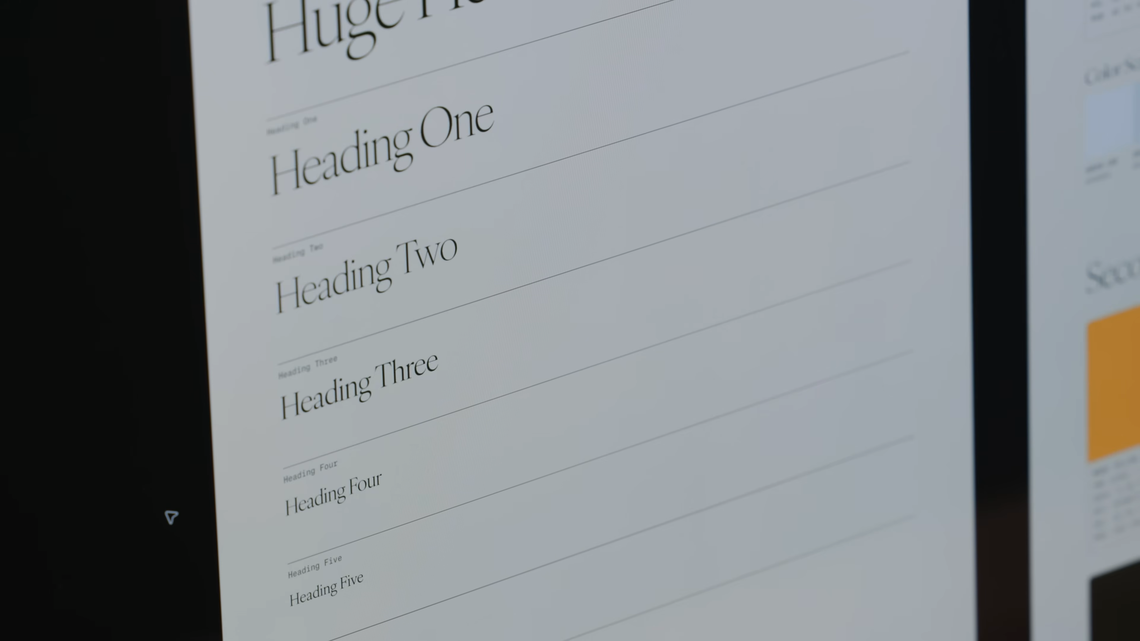
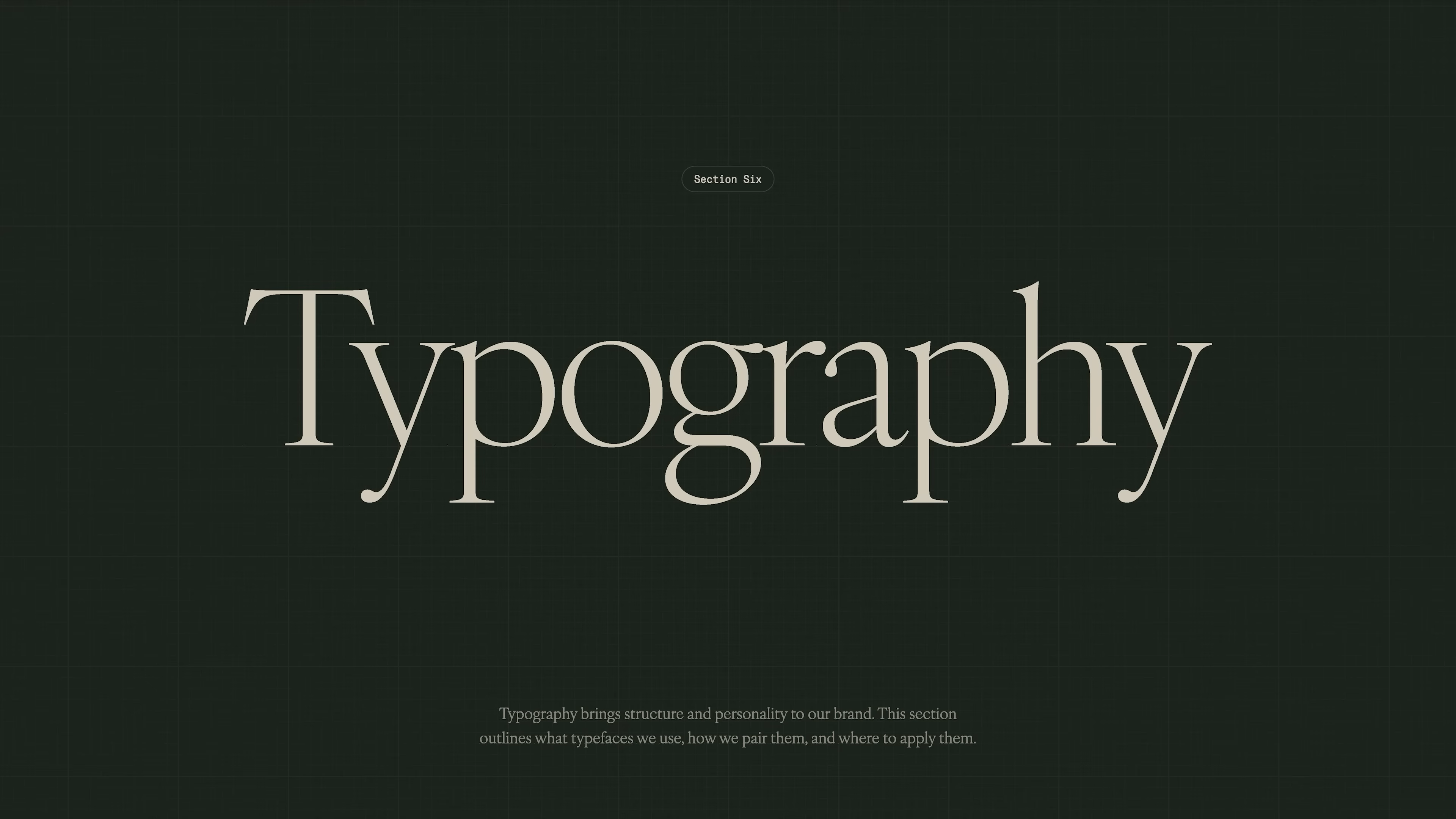
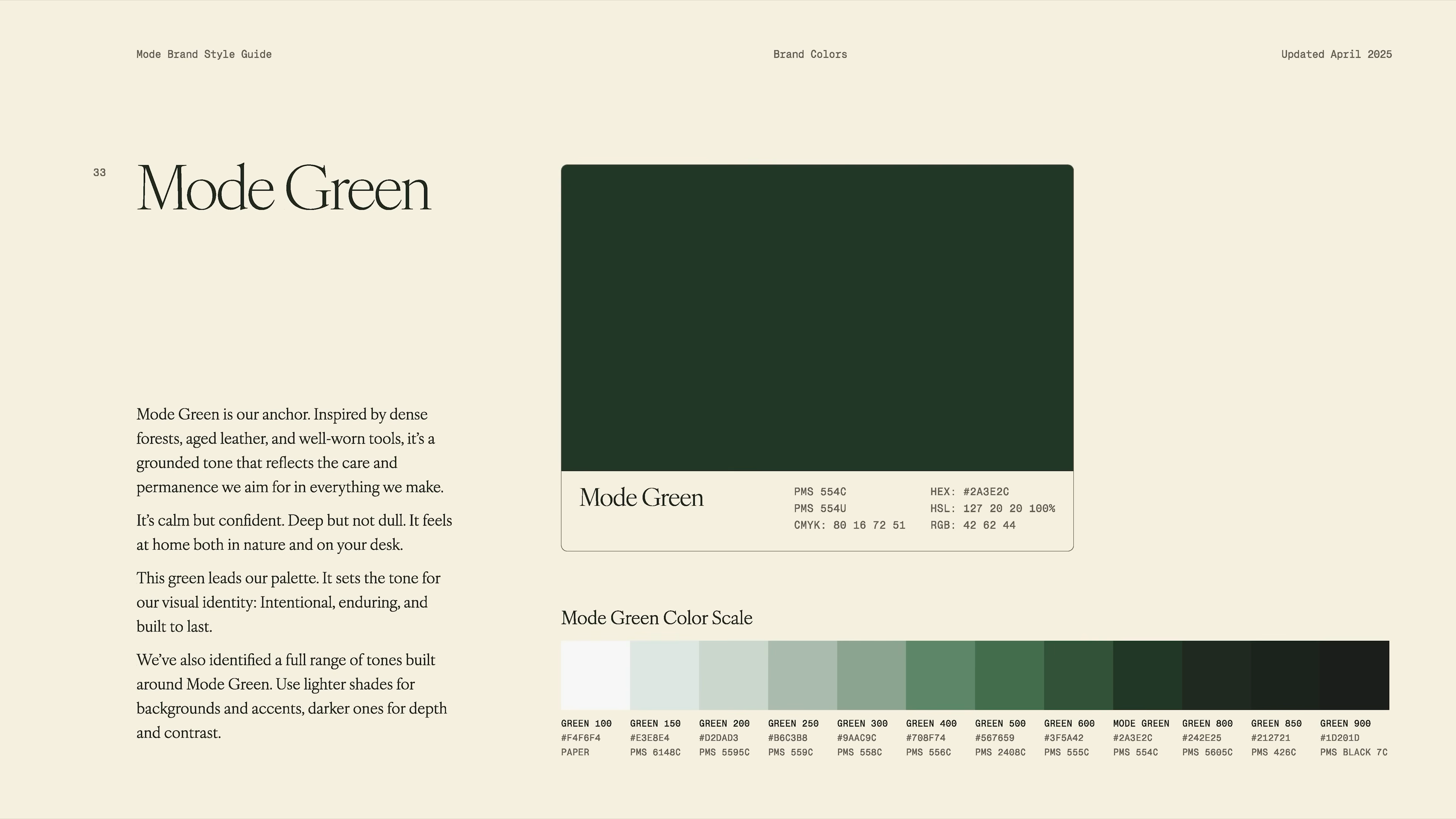
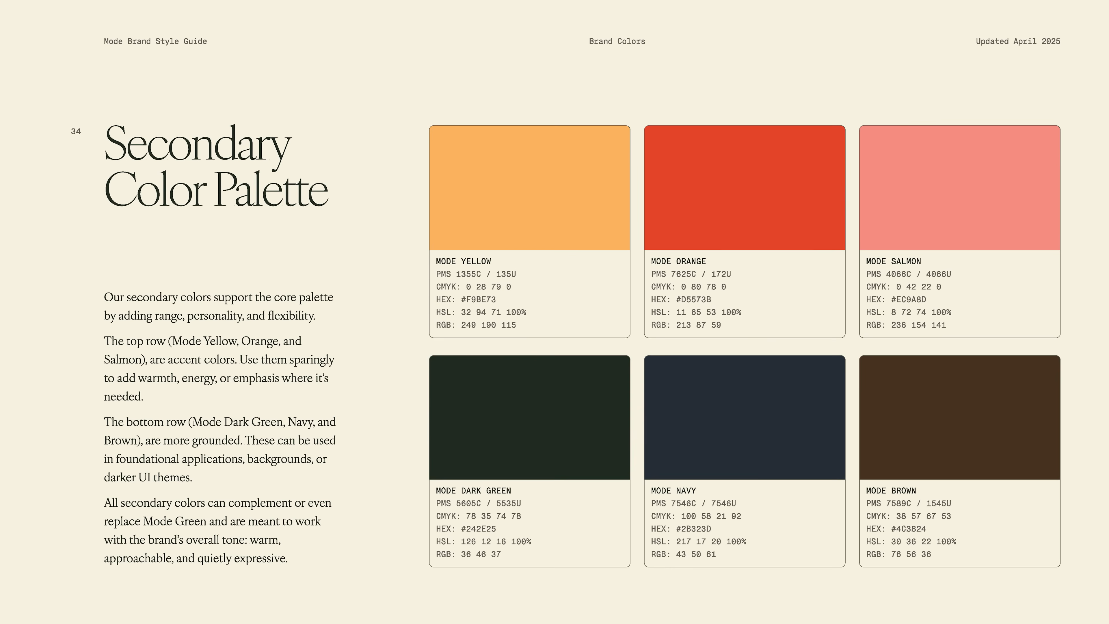
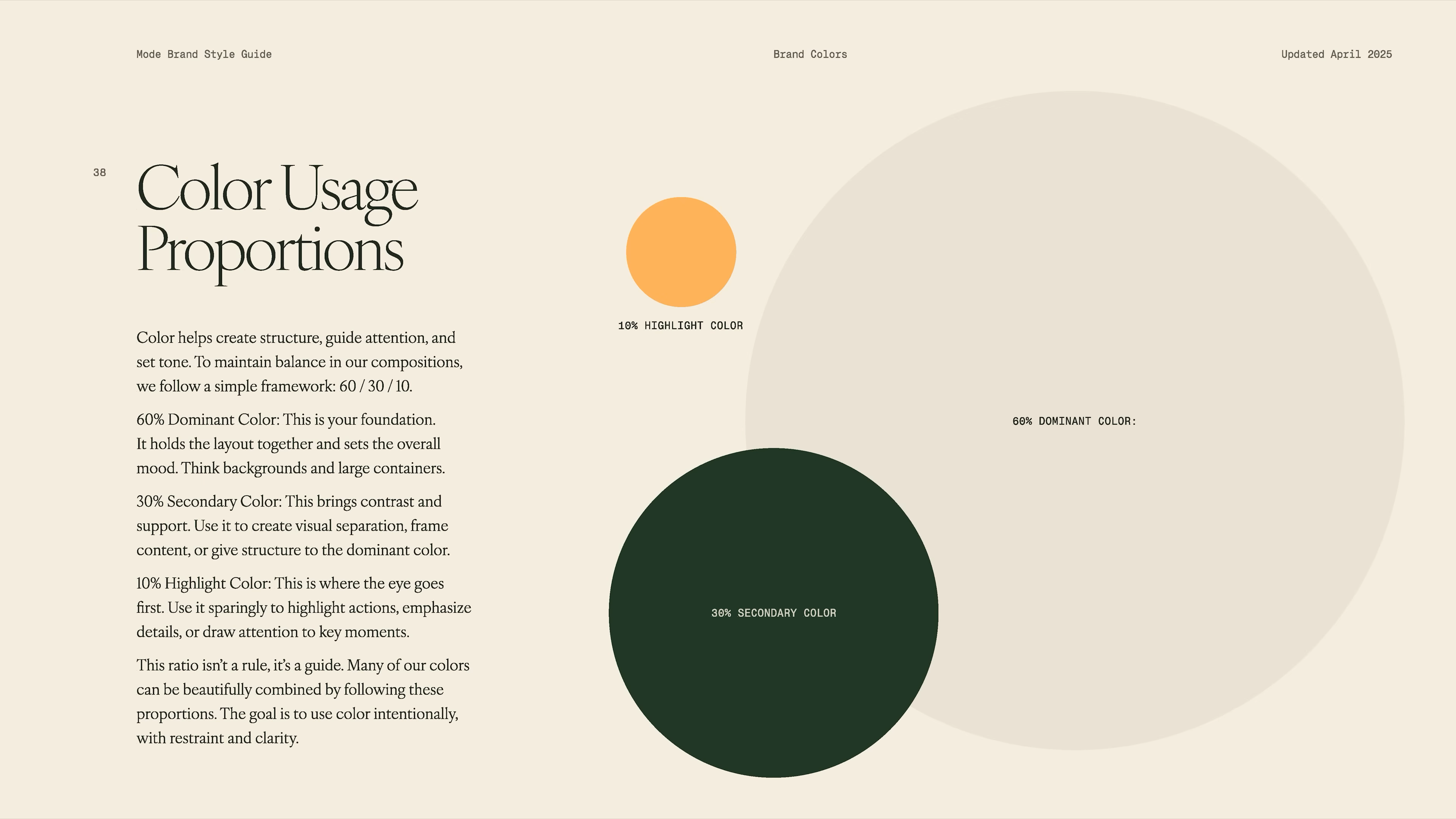
    • Tested how typography, color, and images worked in real scenarios.

    Designer developing stylescapes by collecting visual references for mood boards on a computer, part of Mode’s rebranding process in Matthew Encina’s video.
    Three stylescape mood boards—Serious Fun, Crafted Narrative, and Bits of Joy—showing different visual directions for Mode’s rebrand in Matthew Encina’s branding process video.
    Screenshot of a virtual stylescape review and feedback session with the Mode team, part of Matthew Encina’s rebranding process video.
    Designer working on website UX and UI design for Mode’s rebrand, reviewing layouts on a large monitor, from Matthew Encina’s branding process video.
    Close-up of website design screen showing various “Read More” button styles and color options for Mode’s rebrand, from Matthew Encina’s branding video.
    Designer working on typography selection for Mode’s rebrand, reviewing typefaces on a desktop screen, from Matthew Encina’s branding process video.
    Close-up of computer screen displaying various heading styles and font choices for Mode’s brand typography during Matthew Encina’s rebranding video.
    Mode website mockup featuring bold display serif typography, part of the new brand identity design from Matthew Encina’s Mode rebranding video.
    Close-up of secondary brand color palette options and designer feedback for Mode’s rebrand, including HEX, RGB, and PMS codes, from Matthew Encina’s branding video.
    Screen capture from Matthew Encina’s Mode redesign video, showing digital Pantone color swatch explorations as the team narrows down Mode’s new brand palette and visual identity.
    Lifestyle photography direction board from Matthew Encina’s Mode brand redesign video, showcasing curated product shots, home objects, and brand mood imagery used to define Mode’s visual storytelling and brand feel throughout the rebrand process.
    Modern lifestyle product photography showing a person holding a yellow tote bag on outdoor steps, a Shinola clock on a windowsill, creative workspace with design tools and color swatches, and colorful metal storage boxes for organizing supplies.
    Scenes from Matthew Encina’s Mode brand redesign video, showing hands typing on a custom mechanical keyboard, operating a record player, and stamping leather—demonstrating the craftsmanship and creative process featured in the brand transformation.
    Behind the scenes from Matthew Encina’s Mode brand redesign video, with designer Ben Burns working on UX and brand messaging at his desk, refining Mode’s new identity and digital experience as shown in the video.
    Screenshot from Matthew Encina’s Mode brand redesign video showing the “Create” messaging concept, with Mode keyboards and headline “Thoughtful tools for meaningful work” as part of the updated brand voice and website copy strategy.
    Behind-the-scenes shot from Matthew Encina’s Mode rebranding video showing product development, with a designer reviewing early keyboard sketches and product concepts pinned to the wall as part of the new brand direction process.
    Matthew Encina’s Mode rebrand video—screen showing the product development phase, with CMF (color, materials, finish) mood boards and “Warm Tech” inspiration as the team explores design directions for premium mechanical keyboards.

    How you can apply this:

    • Don’t settle on your first idea. Try several. Share them and see what gets a real reaction.

    • Remember that brand is more than just visuals. Test your words, your site experience, and how everything fits together.
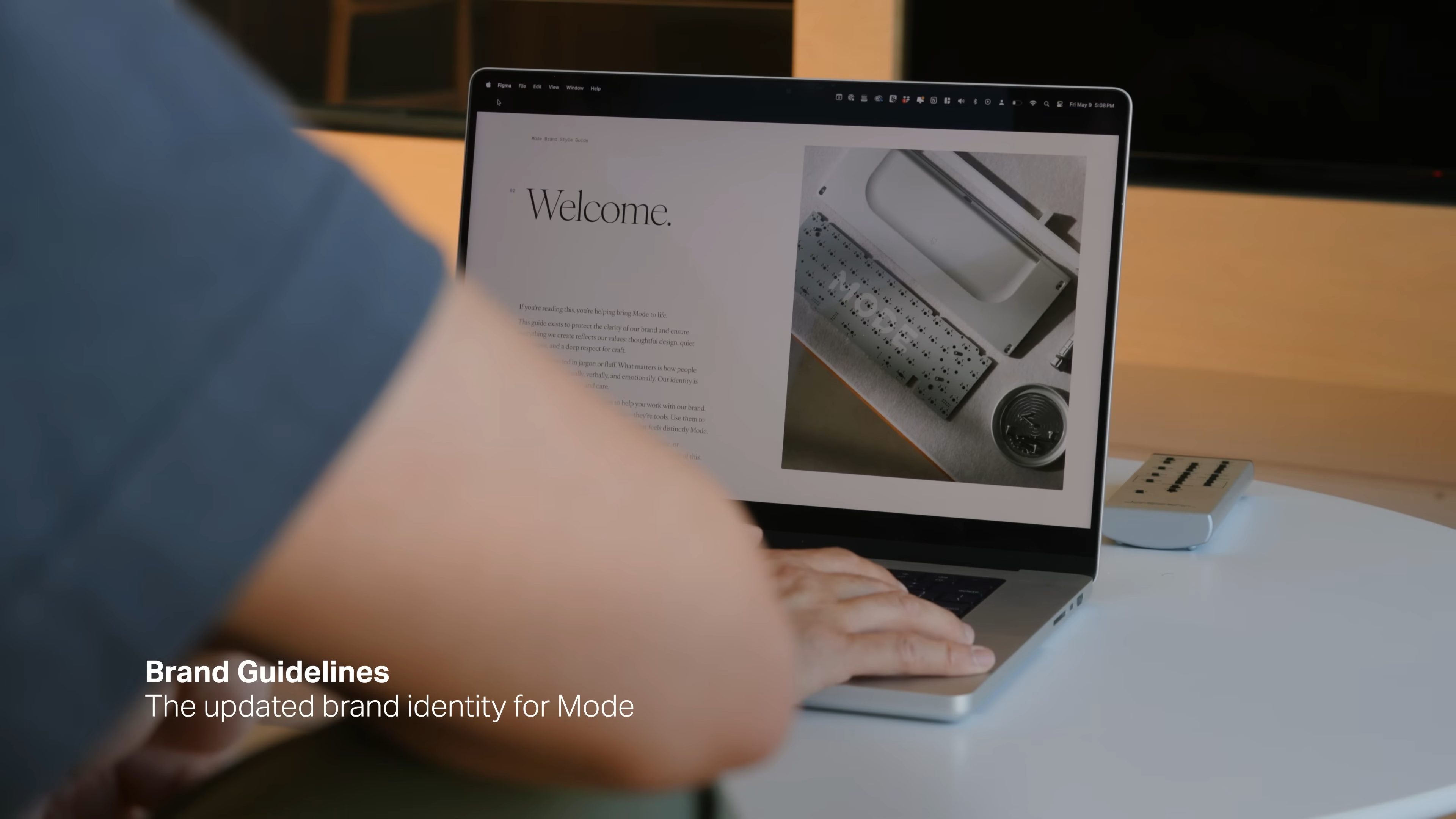
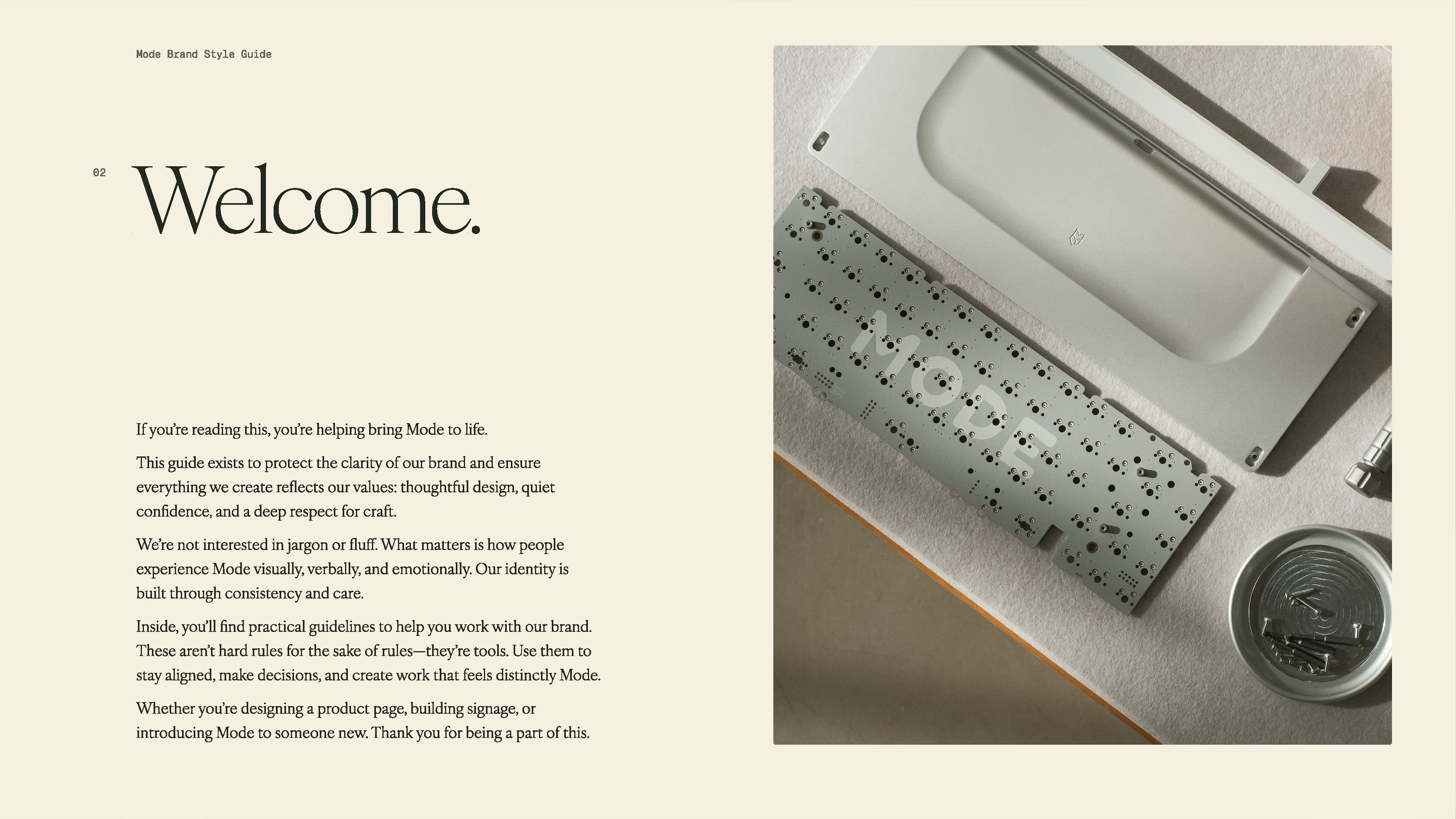
    4. Deliver
    (Narrow Down and Launch)


    This is where you pick the best ideas, refine them, and actually roll them out. It’s about execution and real-world details.

    Brand strategy process from Matthew Encina’s Mode rebrand video—hand-drawn double diamond diagram showing the steps: Discover, Define, Develop, Deliver. Each stage highlights key activities like understanding the vision, focusing insights, exploring solutions, and refining for launch in the premium keyboard brand journey.

    How Mode did it:

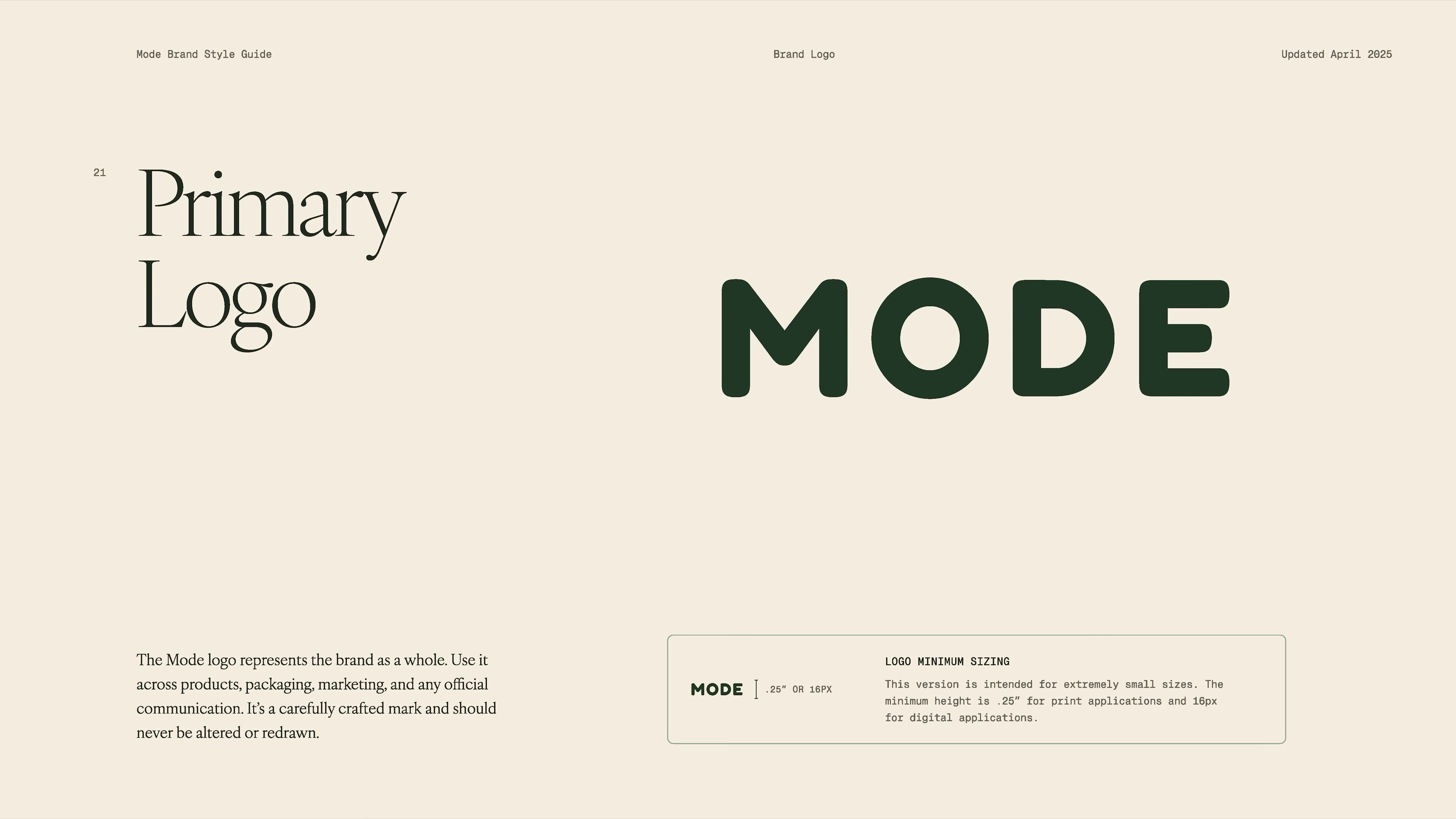
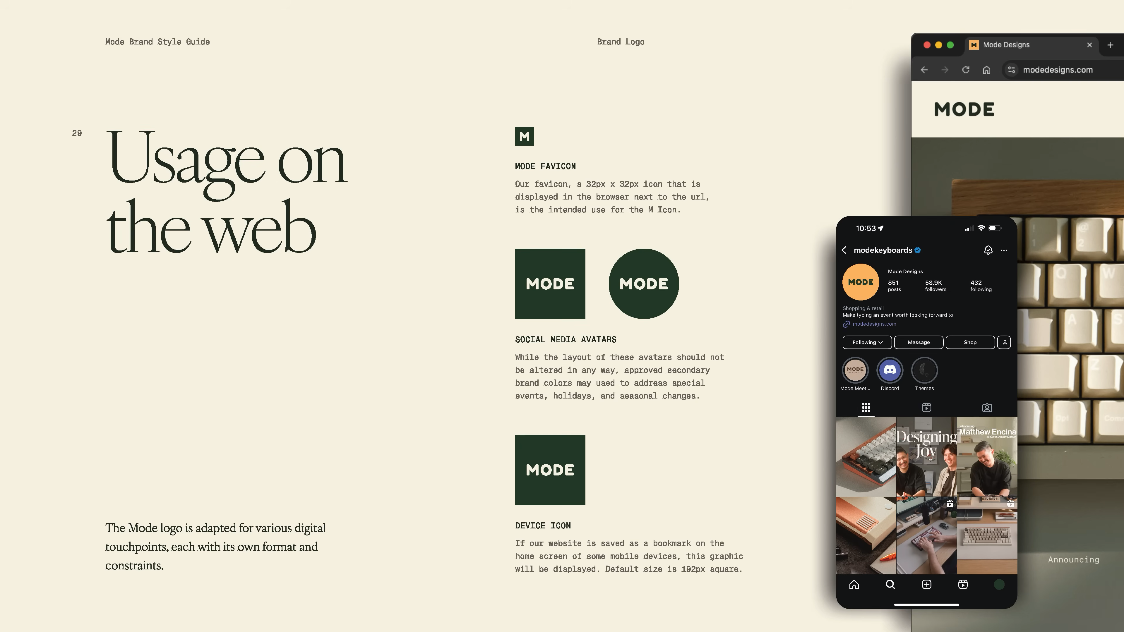
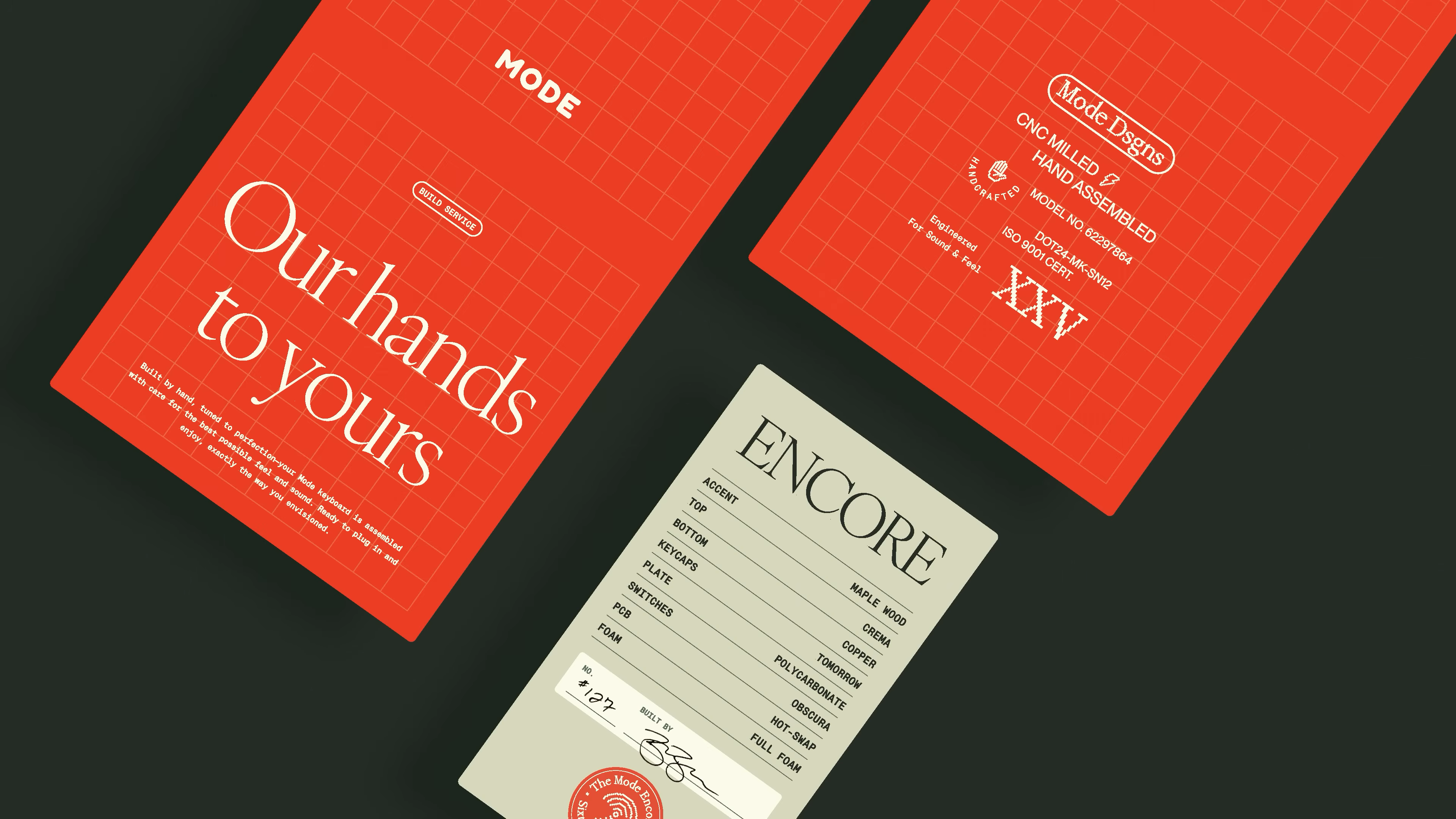
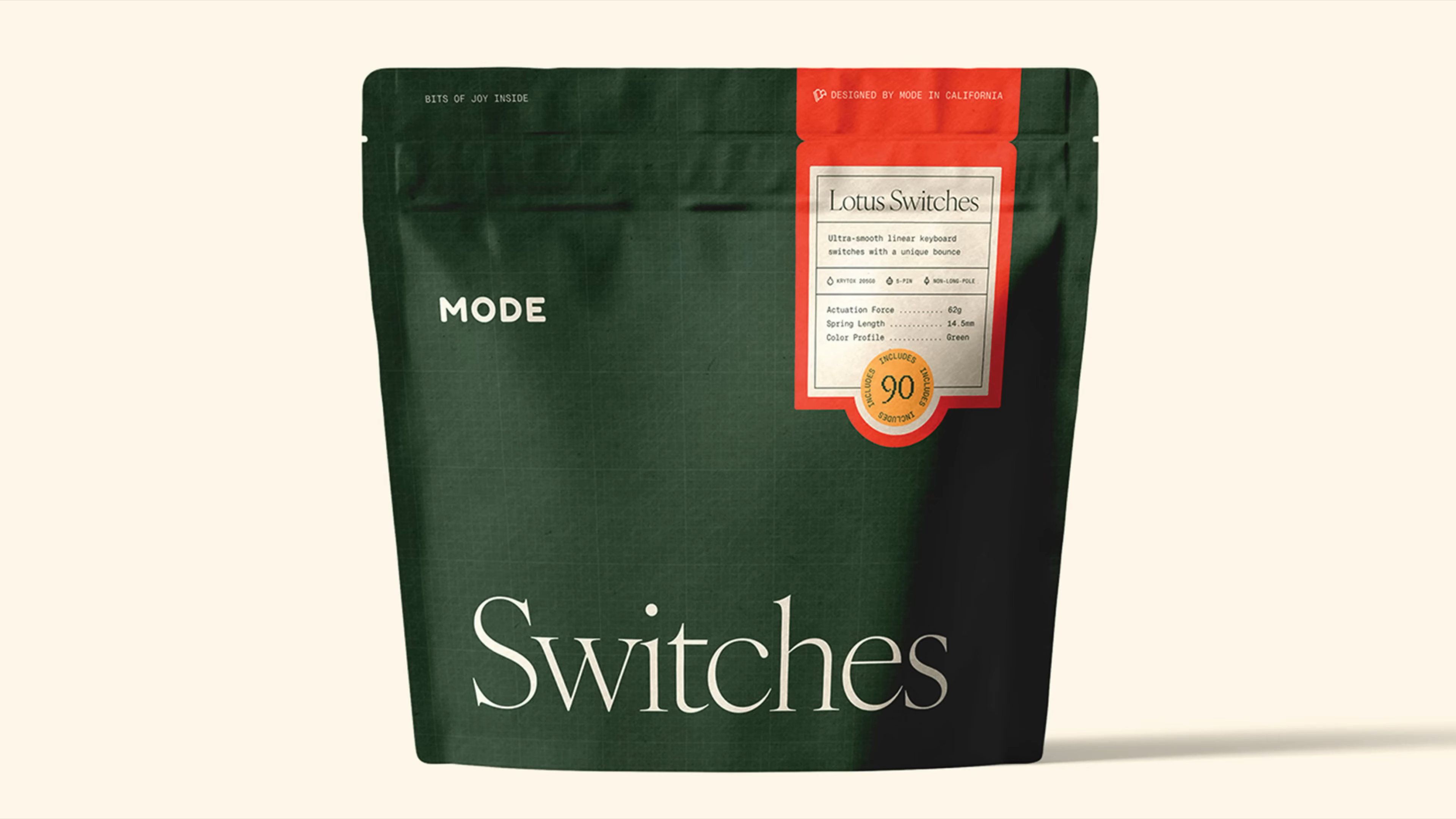
    • Finalized their new brand guidelines. Clear rules for logo, colors, fonts, voice, and photography.

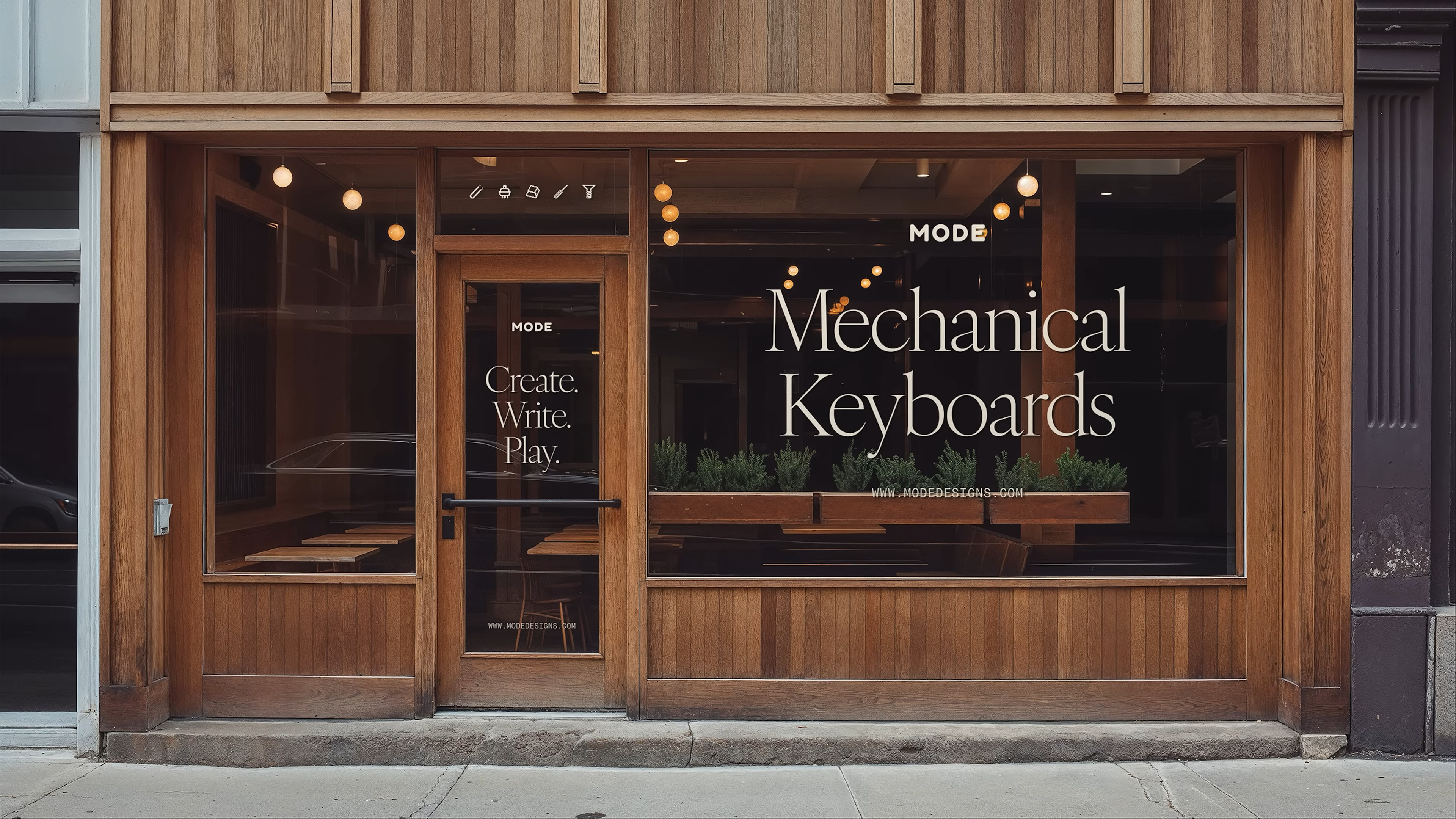
    • Updated the website and all customer touchpoints. Made sure everything felt consistent and on-brand.

    • Rolled out the changes in phases, not all at once. This let them learn from real feedback and make adjustments.

    • Kept improving as they went. Some things needed tweaks after launch. They stayed flexible and paid attention to what worked.

    Building a Brand – Redesigning a Business Start to Finish-00-18-54-443.png
    Mode’s brand style guide welcome screen, featuring an overhead photo of Mode keyboard components and a message outlining the company’s commitment to thoughtful product design, visual identity, and brand consistency. This scene from the video highlights the beginning of Mode’s brand transformation journey.
    A section from Mode’s brand guidelines showing hands typing on a Mode mechanical keyboard, paired with copy about creating products that spark joy in daily use. The video emphasizes how Mode’s design values focus on tactile satisfaction, intentionality, and the importance of connecting brand purpose to everyday experiences.
    Section divider in Mode’s brand guidelines introducing the logo standards, displayed in bold serif typography on a dark, gridded background. This moment in the brand video spotlights the careful consideration behind Mode’s visual assets and the importance of a timeless, distinctive logo for a premium keyboard brand.
    Page from Mode’s updated brand guidelines showing the primary logo in dark green on a light background, with supporting text detailing proper usage, logo sizing, and consistent application across digital and physical touchpoints. The video showcases how the team refines every element of Mode’s visual identity as part of the brand refresh process.
    Mode’s brand guidelines page highlighting the boxed logo variant in a solid green container, explaining its use for contexts that require greater contrast or visual density. The video documents the collaborative process of establishing flexible, clear branding standards for Mode’s mechanical keyboard products.
    Screenshot from the Mode brand guidelines video showing different trademark and registered trademark versions of the Mode logo. This section explains when to use TM (™) or registered (®) marks, highlighting best practices for legal protection and consistent branding in a premium tech company.
    A detailed look at how Mode adapts its logo for digital platforms, including web favicons, social media avatars, and mobile device icons. Taken from the brand guidelines video, this page demonstrates best practices for cohesive branding across all digital touchpoints, a crucial step for any modern DTC or e-commerce tech business.
    A section divider for typography in the Mode brand guidelines, with large serif text on a dark background. This visual from the video sets the stage for exploring the brand’s unique type system and highlights how typography shapes the brand’s digital and physical presence.
    Screenshot from the video showing Mode’s website typography guide. The page features various heading sizes, dark mode usage, and advice for maintaining consistency across web platforms. Perfect reference for anyone developing digital brand systems or updating e-commerce site styles.
    Brand guidelines video screenshot introducing Mode Green, the anchor color for the Mode brand. Includes color codes and a tonal range, emphasizing how consistent color application supports brand recognition and a sense of quality in tech product design.
    A color palette spread from the Mode brand guidelines video, detailing secondary colors like Mode Yellow, Orange, Salmon, Dark Green, Navy, and Brown. This page explains how accent and foundation colors work together to make the brand more flexible and expressive in both digital and physical applications.
    Diagram from the brand guidelines showing the recommended proportions for using Mode’s brand colors: 60% dominant, 30% secondary, and 10% highlight. Pulled from the branding video, this graphic illustrates the importance of balance and intentionality in visual identity for DTC brands.
    Section divider from the Mode brand guidelines, introducing the graphic assets portion of the video. Features bold serif typography and a dark grid background, setting up the discussion of icons, grids, and visual rhythms that tie together Mode’s branding across all channels.
    A detailed look at the custom pixelated icon set being developed for Mode during their brand overhaul. Captured during the “Building a Brand – Redesigning a Business Start to Finish” video, this frame shows how the design team systematizes visual language for the new brand identity, ensuring playful consistency across digital and physical touchpoints.
    A frame from the video showcasing the “Passionate People” section of Mode’s brand guidelines, emphasizing how the community is central to the new brand direction. As seen in the documentary, the team highlights the importance of customers and enthusiasts who shape Mode’s evolving identity during the rebranding journey.
    A behind-the-scenes shot from the rebranding video as the Mode team finalizes and presents their core brand beliefs. The “What We Believe” section is captured live, with principles like “Design Joy for the Everyday” and “Build Responsibly” coming to life as part of Mode’s new identity, aligning internal purpose with public messaging.
    Screenshot from the “Building a Brand” video showing the 'Voice & Style' section of the Mode brand guidelines. This frame highlights the importance of a clear, confident, and considered brand voice as the foundation for all Mode’s messaging and content, tying back to the video’s focus on aligning communication with core brand values for a cohesive customer experience.
    Frame from the “Redesigning a Business Start to Finish” series, showing the 'Our Voice & Tone' guidelines. The image captures a designer sketching, symbolizing the thoughtful process behind crafting the Mode brand’s personality. The text details how Mode speaks with humility, clarity, and quiet confidence—key points emphasized throughout the video as essential to building a trustworthy and relatable brand identity.
    Screenshot from the Mode brand style guide section of the video, listing the five pillars that define the Mode voice. The pillars—be human, be a trusted guide, be confident, be inquisitive, and be direct—mirror the video’s behind-the-scenes look at building authentic, jargon-free messaging for a modern design brand, offering real examples of effective and ineffective copy for anyone learning about strategic brand communication.
    Image from the messaging strategy segment of “Building a Brand – Redesigning a Business Start to Finish.” This slide displays a curated list of Mode’s approved taglines and mottos—like “Thoughtful tools for meaningful work”—and visuals of product cases, reflecting the video’s emphasis on developing concise, repeatable messaging that captures the company’s philosophy and product ethos.
    Collage-style screenshot featured in the branding video, showing an overview of multiple Mode website pages and content sections. This visual is used in the film to illustrate how brand guidelines, voice, and design language come together across touchpoints for a seamless, intentional online presence, reinforcing lessons from the video on building a consistent brand ecosystem.
    Mode’s bold red packaging for keyboards, featuring grid patterns, handwritten quality control cards, and messaging that highlights craftsmanship—emphasizing Mode’s attention to detail and care in every product, as shown in the branding redesign video.
    Mode’s green keyboard case with signature handle and red “Our hands to yours” band, shown next to a custom-assembled Encore keyboard with a detailed inspection card—capturing the unboxing and first impressions focus of the brand’s new identity, as explored in the video.
    Mode’s “Lotus Switches” packaging—showing the updated color palette, grid system, and quality assurance badge—demonstrates how the brand’s identity extends to even the smallest products, illustrating a key theme of the rebranding process in the video.
    Lifestyle photo of a Mode-branded tote bag with the phrase “Prebuilt? Never.” and a close-up of the Top Row T-Shirt hang tag, both reflecting Mode’s personality-driven messaging and commitment to quality—examples of how the new brand system translates to everyday items in the redesign story.
    Mode’s mechanical keyboards retail storefront, with large-scale window graphics using the brand’s custom typography and icon set—demonstrating how the complete visual identity system enhances physical spaces and creates a cohesive customer experience, as shown throughout the rebrand video.
    Wooden in-store signage featuring Mode’s type-driven statements (“Create joy. This way.” and “Create. Write. Play.”) and signature pixel arrow icon, capturing the inviting, playful, and clear tone established in the video’s branding overhaul.

    Tips for your rollout:

    • Don’t try to flip everything overnight. Tackle high-impact areas first.

    • Share the changes with your audience. Show the behind-the-scenes work and ask for feedback.

    • Keep a list of lessons learned so your next project goes even smoother.

    Why This Works


    Matthew Encina and Mode used the Double Diamond because it forces you to pause, get the real story, and make intentional decisions before jumping to solutions. It creates a clear path from confusion to clarity, and from guesswork to a brand that actually works.

    A designer stands in front of a large wall covered in Mode brand identity mockups, reviewing logo designs, color palettes, packaging, apparel, and digital touchpoints. This scene visually captures the holistic approach to branding and the decision-making process featured in the “Building a Brand – Redesigning a Business Start to Finish” video, highlighting how every element works together to create a cohesive visual system.

    Whether you’re a solo creator, a founder, or leading a client through a rebrand, this structure helps you stay focused. It gives you a way to check your thinking at every stage. And most important, it helps you build a brand that fits your people and your purpose.

    🔥 RECOMMENDED TRAINING:

    Turn ANY Idea Into a World-Class Brand Identity In MINUTES Using ChatGPT

    This 3-step system uses ChatGPT to build a complete brand foundation for ANY business in just a few clicks.

    ⚡️ You agree to receive email updates from Design Hacker.

    Hey, I'm Andrew Lane
    Founder of Design Hacker

    I’ve built multiple 7-figure brands from scratch over the past 15 years. Now I’m using AI to make that process faster, smarter, and way more fun. If you want your brand to feel premium without wasting months or thousands of dollars, then this is for you!

    FREE

    100+ Content Formulas

    PDF + Video Training

    Stop guessing what works. These formulas help you create engaging posts that grow your brand faster.

    FREE

    10 Time-Saving AI Tips

    Digital Guide + Video Training

    Learn how we leverage AI in our agency for content creation, market research, and more!

    ⚡️ Get email updates